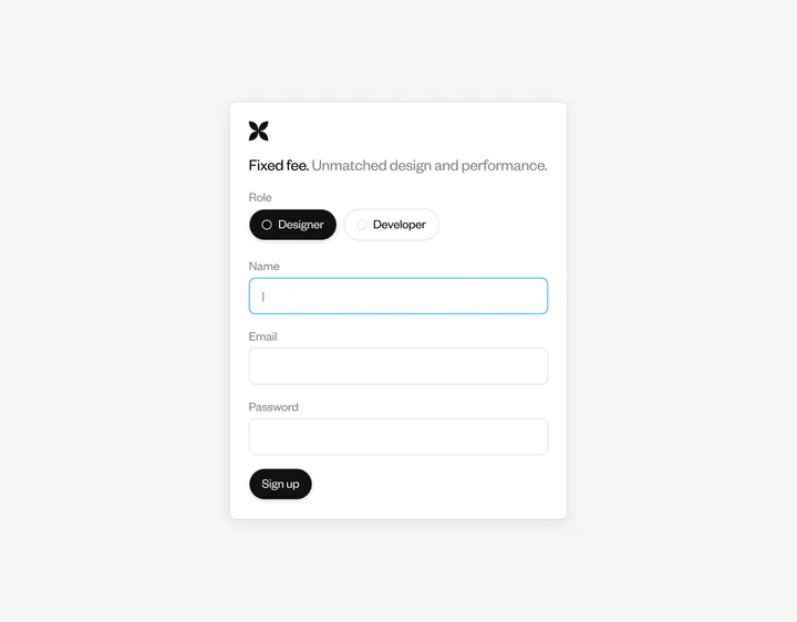
Auto-Onboard: Testimonials — Crafted in @figma & Animations too 🤩🙌 (So, What is Auto-Onboard- Auto-Onboard automates tasks like scheduling, payments, and communication setup, all in one tool. It saves time and money by replacing the need for multiple software solutions) 🙌 Duplicate the @figma file from here- figma.com/design/6mHLlTRaXF5yP6GR7efXrh/Auto-Onboard-Hero-Section-Design?node-id=37-2&t=I8ma8vyvtlGf98JD-1 #buildinpublic #webdesign #autoonboard


3D Map Transition — Made for the #buildshit challenge on X Not perfect, but wanted to get a quick idea out. Made in Framer

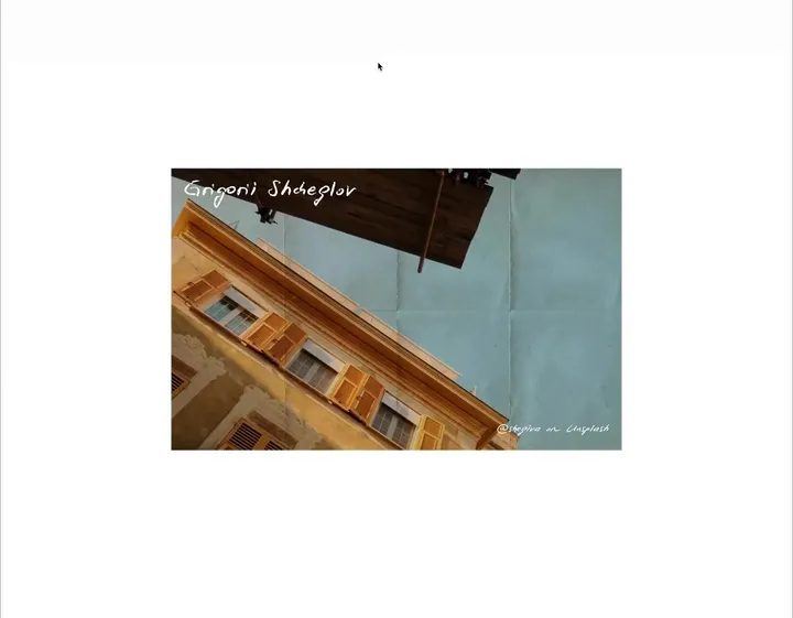
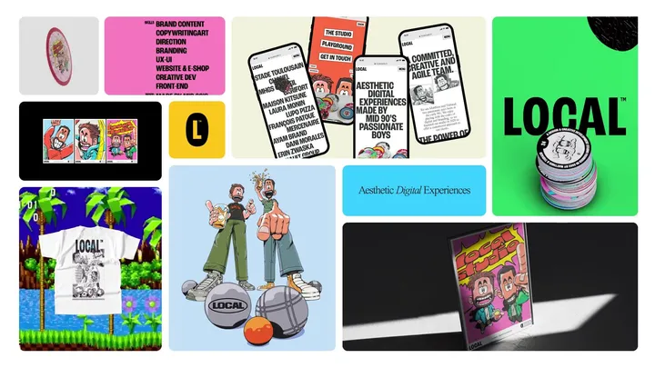
New Ayam™ — For several months, we have accompanied the Ayam™, a leader in Asian grocery, in the redesign of their french website. Our mission has been comprehensive, including the development of a new tone of voice and innovative artistic direction for the sector. #web #illustration #design

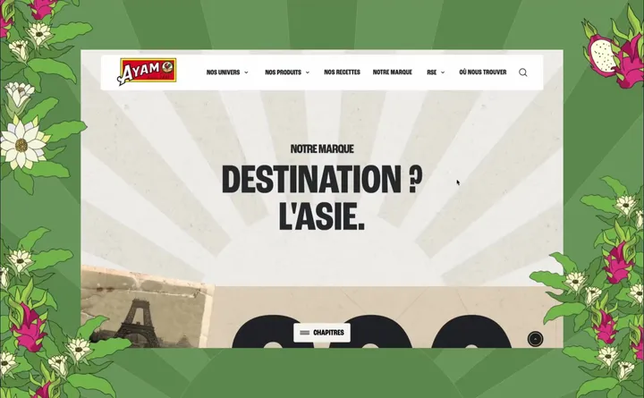
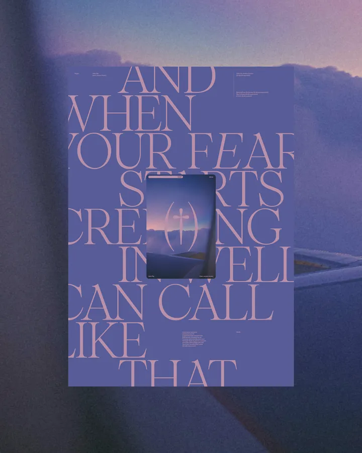
Halo Flip Poster — Poster, type & color exploration. Based on the lyrics from @vegynvegyn "Halo flip". Using @pangram.pangram Pangaia font. #poster #web #typography

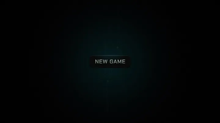
New Game — Dusting off After Effects over the weekend made me realize it’s still the GOAT. It’s truly a canvas with infinite possibilities. Here’s a little thing I made as my first shot on Today’s Design. #gameui #button #aftereffects

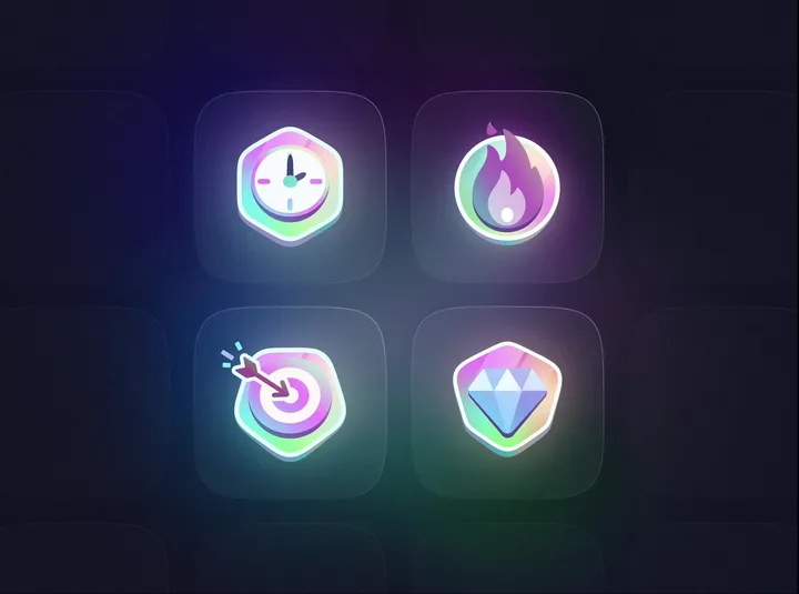
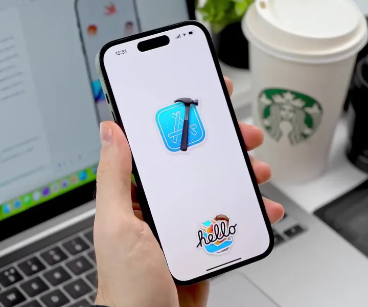
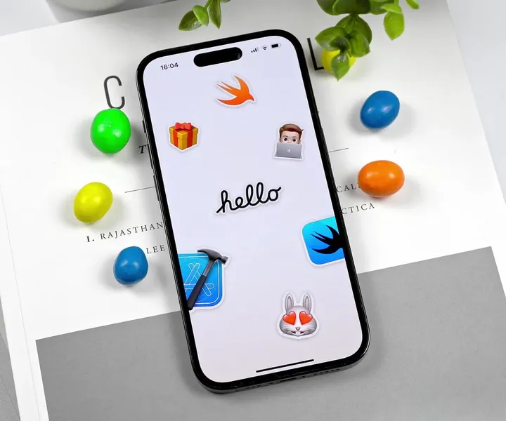
Sticker Wall – Creating holo effect in SwiftUI ✨ — There were so many tiny things to consider when creating the holo effect, that I truly believe these details would have been impossible to prepare for in Sketch or Figma. Details such as: - using an additional dynamic white sparkle layer to create a compelling holo effect - reacting to pitch/roll changes relative to various device positions (e.g. in hand, on table, etc.) - resetting motion values when the device rests for more than 2 seconds with minimal motion - keeping battery and performance in mind - providing "dev/config" controls in context to tweak values just to feel right Hope you'll find this post interesting! 🙌 #swiftui #concept #stickers

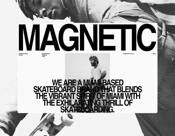
Magnetic — Skateboarding House — Layout and type explorations between projects. Magnetic is a fictional skateboard brand. #branding #web #exploration

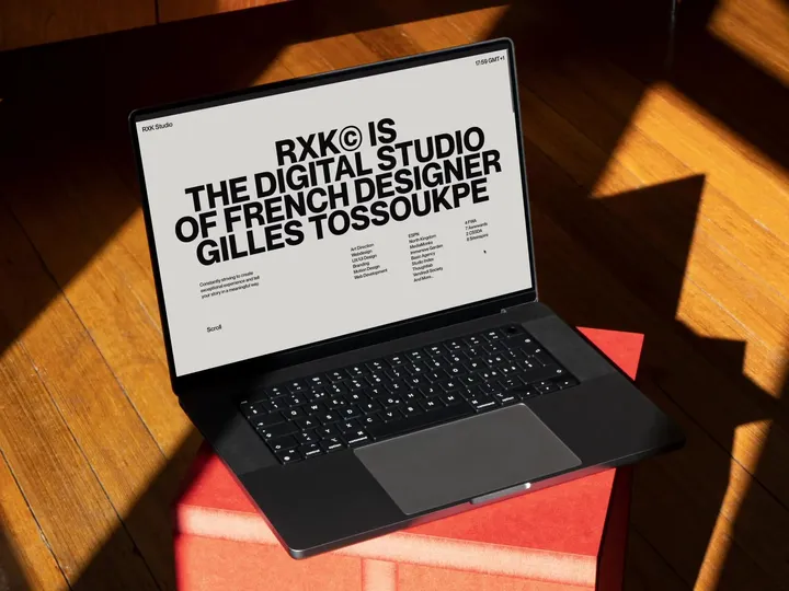
RXK Studio Portfolio — New portfolio made with talented developer, Michael Garcia. Enjoy live website here: ↳ rxkstudio.com #design #portfolio #typography

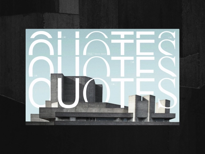
QUOTES#004 — Layout explorations through some famous QUOTES of popular sci-fi books that I have read and appreciated. ↳ Books: 1984 ↳ Author: Georges Orwell ↳ ©Photos: Uve Sanchez, Simone Hutsch, Touann Gatouillat Vergos v/ unsplash #exploration #layout #design

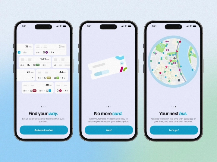
Onboarding animated screens — Onboarding animations for a navigation app, made with Rive ✨ #onboarding #animation #app

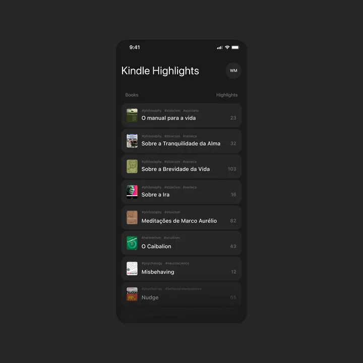
Kindle Highlights Concept — I wish I had a way to sync all my highlights in just one place that allows me to copy or share easily. So, I made this first concept that categorizes my highlights in order. #appdesign #uidesign #darktheme

Sticker Wall – Playing with SwiftUI 😍 — My first ever SwiftUI project trying to recreate Apple iMessage holo stickers ✨ Huge thank you for Philip Davis for his incredible course, Janum Trivedi and Alex Widua for the open source projects and Gavin Nelson for the inspiring prototypes! 🙌🔥 #swiftui #concept #stickers

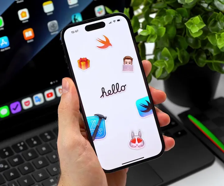
Sticker Wall – Mesh Transform using Shaders 😍 — One of my favorite parts of Apple iMessage Sticker interaction is actually the Mesh Transform effect and how you "peel" stickers on and off from the surface. It's so satisfying. 💯 Thanks to Janum Trivedi and Alex Widua's code, I was able to get kind of close to this solution. 🤩 #swiftui #concept #stickers

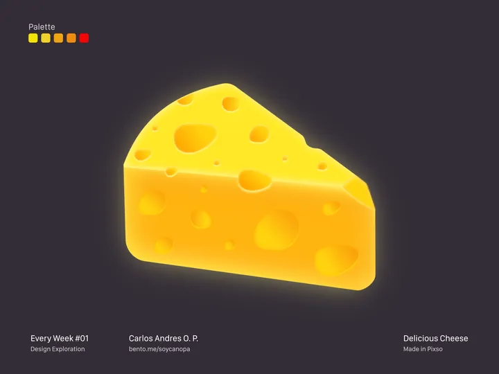
Delicious Cheese — Hey Hey Hey 👋, On weekends, it’s about doing illustration, this time it’s about a delicious cheese, the truth is that cheese is one of my weaknesses, in all its presentations. This project was finished in Pixso, what do you think of the final result? #pixso #illustration #uidesign

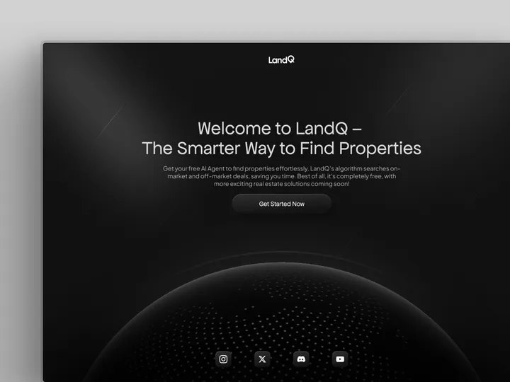
Hero Section Design - LandQ — designed this Sleek and Minimal Hero Section Website with some 3D Elements for AI Property Finder #landingpage #webdesign

