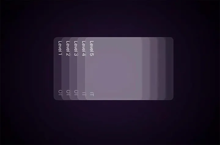
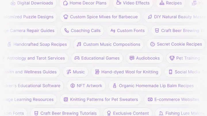
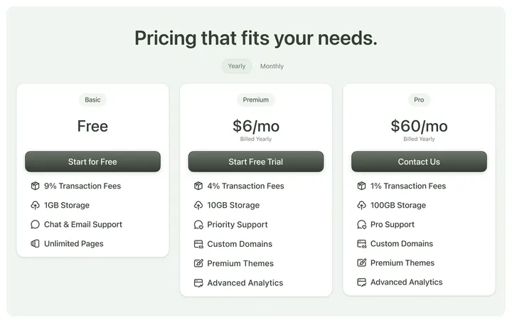
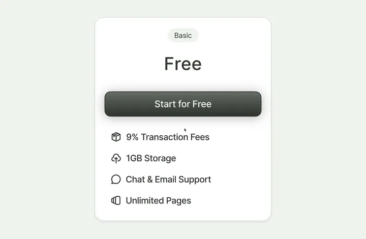
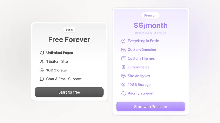
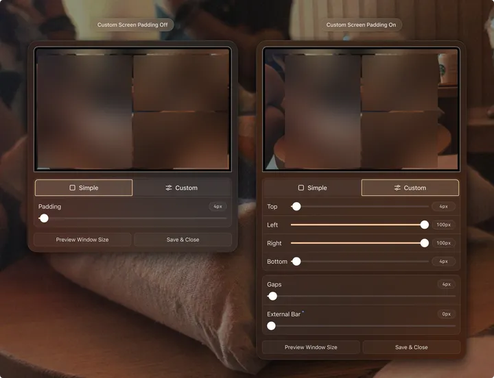
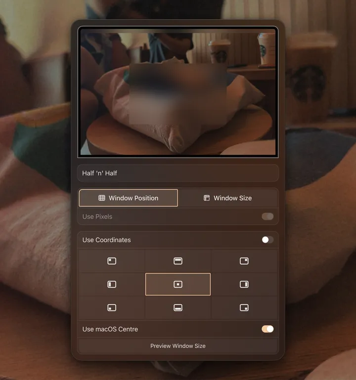
Pricing Section — Part two of sections from a client's website I designed. Small flex, all the corners you see here are smoothened, and are also smooth on the web.
muse.io, if you'd like to take a look
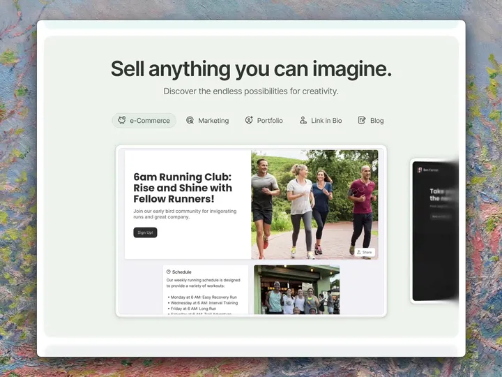
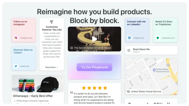
Feature Example Section — A section from a client's website I designed, displaying their building block style approach to web design
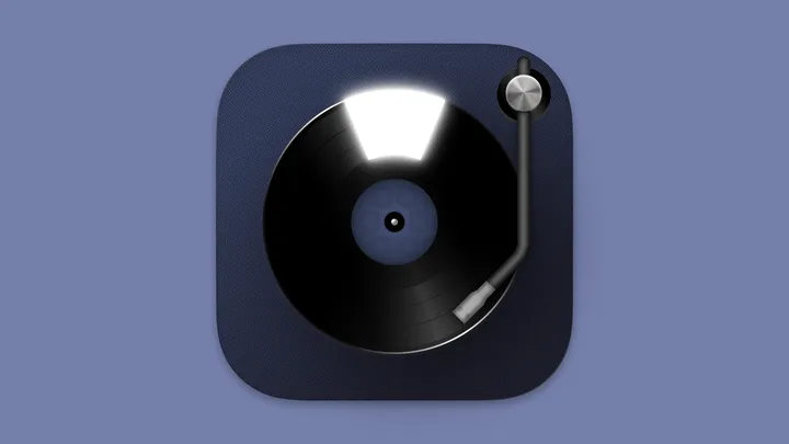
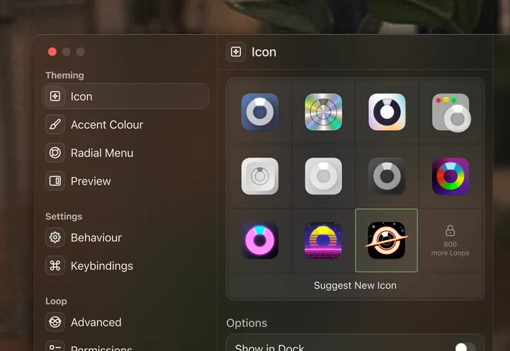
Loop App Icon — My first app icon I've ever made. 1651 layers. Full Autolayout. 99.87% SVG
Glowy Button 💚 — I've been using Framer for the past 3 weeks; made it my mission to smooth every corner I see. This is one of the culminations of that.
Windows 11 Icons — Found these old things from 2021, made for my taskbar, when I still used to use Windows. Do they still hold up today?
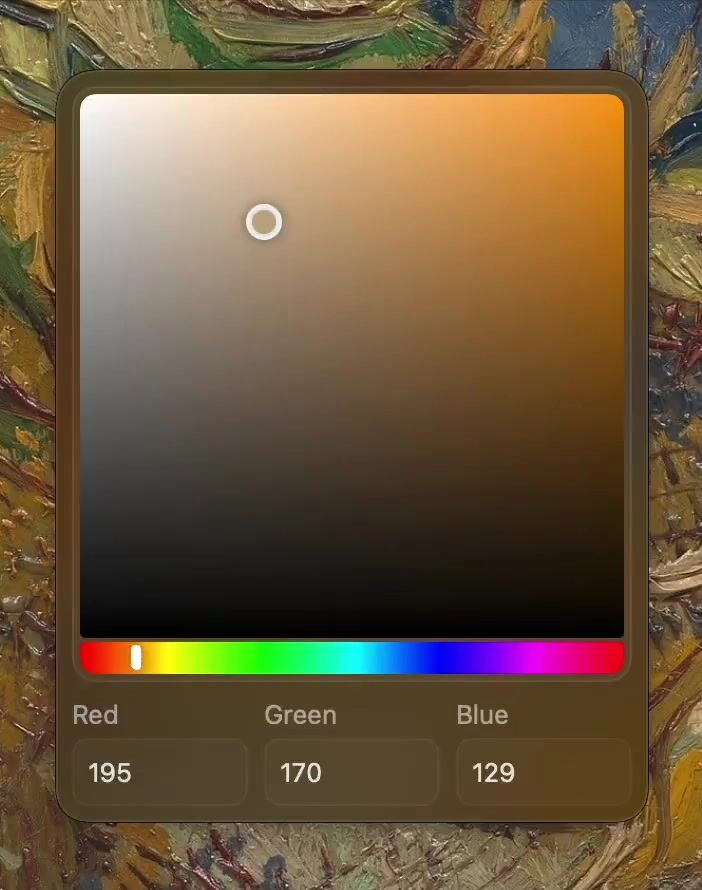
Malleable Hue Slider — For Loop, an app I designed, the hue slider gets rounded at the end, so in turn the grabber adapts when it reaches it 🙃
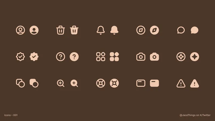
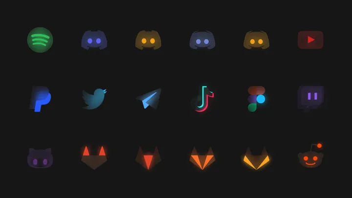
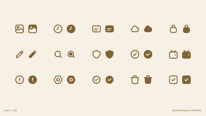
Icons Part 2 — How do these icons make you feel? Do you think they'd fit anywhere nice?
First Effort at Icons! — My first time making icons! Please give feedback if you have any! Wondering if I should make more.
Using eyebrows for Pricing Options 👀 — I've fallen in love with eyebrows (yes, they're called eyebrows), being in every play they can be, using them here to identify Basic vs Premium
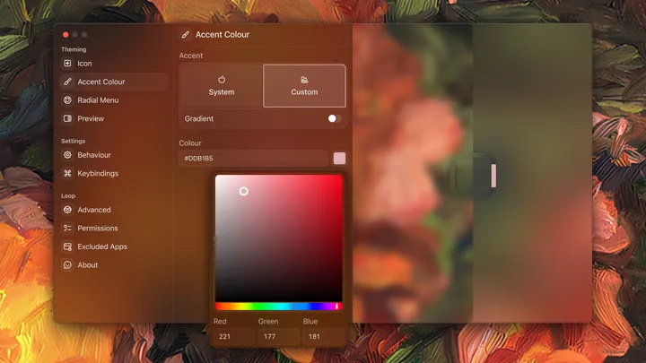
🖌️ Theming Tab for Loop — Made a custom colour picker for an app I'm redesigning, particularly fond of the rounded colour slider :)

