SmashX logo — SmashX is a startup founded by an experienced team of market experts, software developers and designers. They develop white label mobile apps for various industries that help build brand engagement and facilitate the brand user in their daily work.


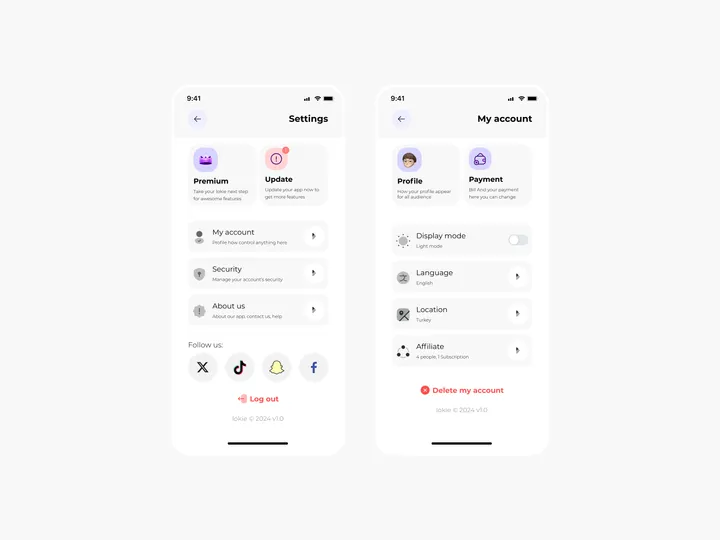
Settings Page for Mobile App - Lokie App — ◑ Design Elements: Clean Layout: The screens maintain a clean and organized layout, ensuring clarity and ease of use. Consistent Typography: The use of consistent fonts and font sizes enhances readability. Iconography: Icons represent various settings and categories, aiding quick recognition. Color Scheme: The light mode employs a soft color palette, reducing eye strain. #appdesign #figma #settings

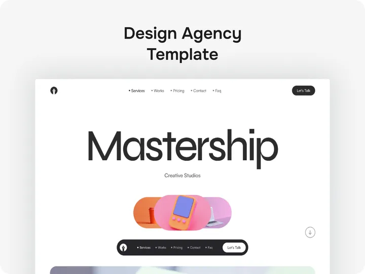
DesignOrbit – Where Your Vision Comes to Life — DesignOrbit is crafted to reflect your passion, connect with hearts, and turn first impressions into lasting impact. Made for dreamers who build boldly: ✅ Fully Webflow-editable – make it yours, effortlessly ✅ Elegant, modern design – beauty with purpose ✅ Fast & mobile-optimized – flawless everywhere ✅ Smooth animations & CMS-ready – bring your content to life 🔗 Live Preview: shm.to/designorbit-30-04-2025 #webflow #creativetemplate #designwithheart

Budgetify is Now Live on Webflow! — A clean, high-performance website template built for finance startups, SaaS platforms, and tech businesses ready to grow. Launch quickly, impress professionally, and drive conversions—without writing a single line of code. 🔑 Key Features ✔ Fully customizable with Webflow ✔ SEO-optimized for better visibility ✔ Conversion-focused CTA sections ✔ Smooth animations & interactive elements ✔ Webflow CMS for easy content updates ✔ Fast, responsive, and mobile-ready 👉 Explore Budgetify on Webflow: dub.sh/budge-WEB #webflowtemplate #saaswebsite #fintechdesign

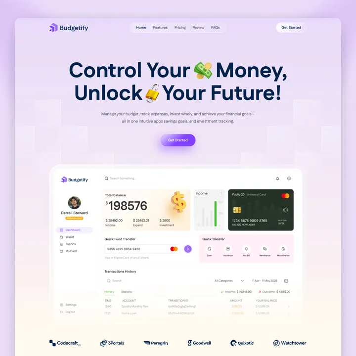
DesignOrbit – Bring Your Creative Vision to Life — Your brand deserves a bold, beautiful stage. DesignOrbit is a high-impact Webflow designed to showcase your creativity and make a lasting impression-before a single word is read. What’s Inside: ✅ Fully customizable in Webflow ✅ Modern, premium design ✅ Fast-loading & mobile-optimized ✅ Smooth animations and CMS-ready 🔗 Grab DesignOrbit now: shm.to/designorbit-30-04-2025 #webflow #creativewebsite #designtemplate


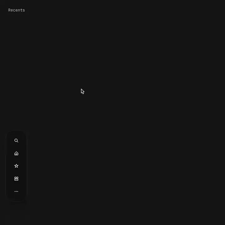
Proximity menu concept — The best click is no click. Before you say it, yes, I know this would make the area under the menu unusable. No it will not work for mobile. This is a desktop app that where that area is void of anything. This would be used as a secondary navigation, primary is a different, keyboard centric element. The goal is to not have navigation take up visual noise, so the content of the app can be focused on. Still debating using this, but I think if done correctly it could work well.

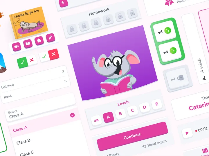
Design toolkit visual revamp — For a reading app that aims to develop reading habits and comprehension in children from kindergarten to elementary school utilizing technologies. #app #mobile #illustration

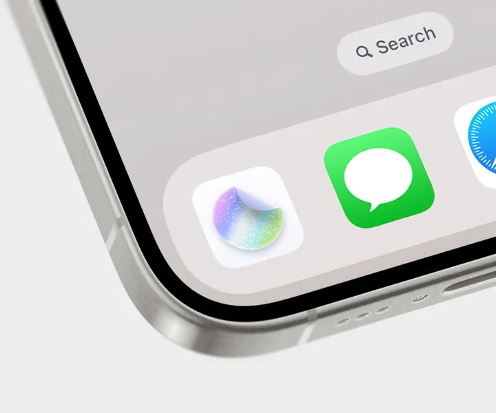
New StickerWall app icon created in Sketch ✨ — It's been so long since I've practiced creating app icons 💎 The new app icon is part of the entire StickerWall package available on Lemon Squeezy 👇 danielkorpai.lemonsqueezy.com/buy/392b7659-e9cb-4995-a84a-24965585b701 #mobile #iphone #appicon

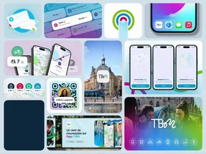
TBM, app design & branding ✨ — Bordeaux's public transport navigation app, rebranding and app design. Proud to offer a better mobility experience in the city where I was born ✨. #bento #app #navigation

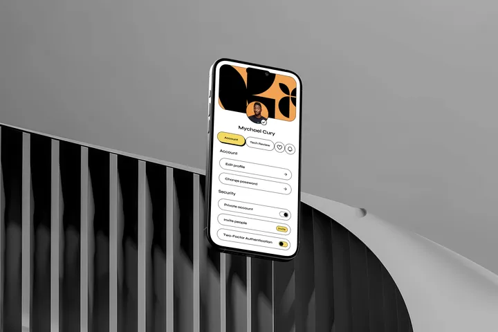
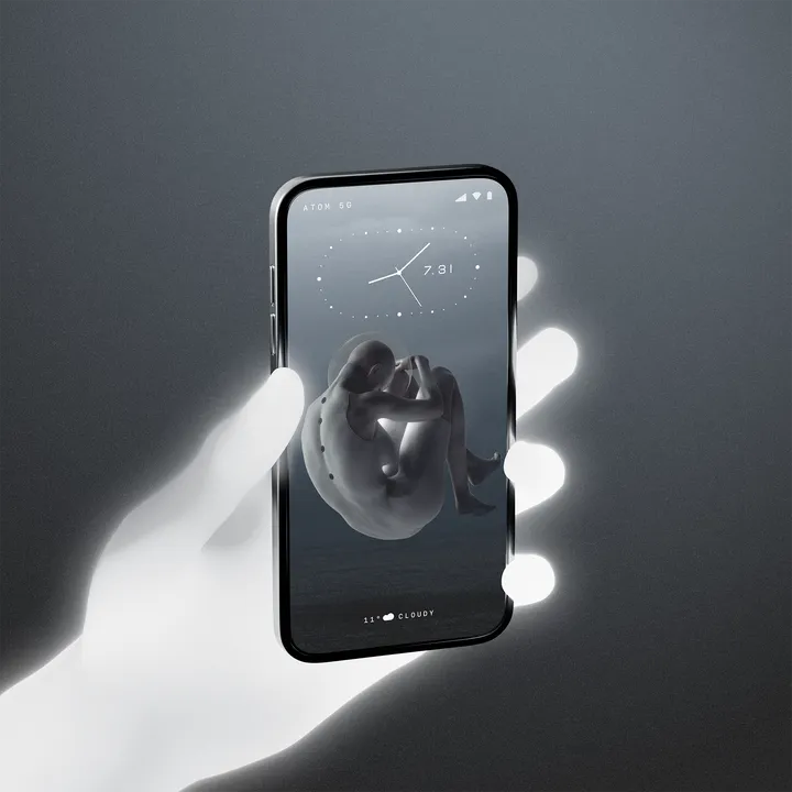
VOID - Mockup / UI / Wallpaper — This one i have done everything just for fun. Created the mockup in 3D using Blender, Minimal UI created in Figma, and the wallpaper artwork using Photoshop, and put all together in Photoshop. (Maybe i will animate this one too). #mobile #app #design

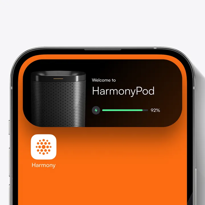
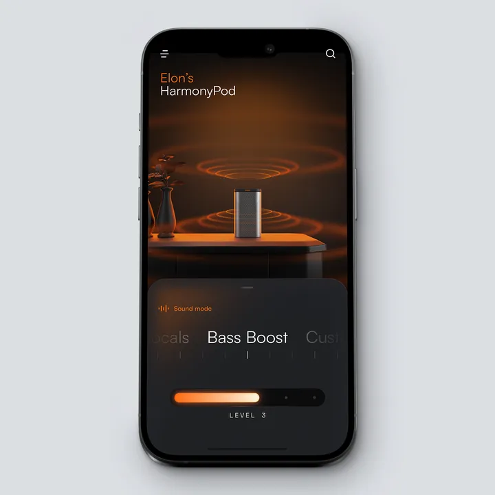
Sound Mode - Harmony Pod — UI of Sound Mode of the Harmony Pod. In this project i'm designing the product, Website, 3D, Motion and the UI. #app #mobile #product

[CONCEPT/WIP] Globoplay Home Redesign — Redesign of the biggest Brazilian streaming service. The goal is to create a homepage that show the users their most accessed pages right on the first viewport, mixing the exploration and consumption phases, allowing them to watch live TV (our value proposition) without taking them out of the homepage environment, increasing playtime metric. #mobile #visualdesign #ui

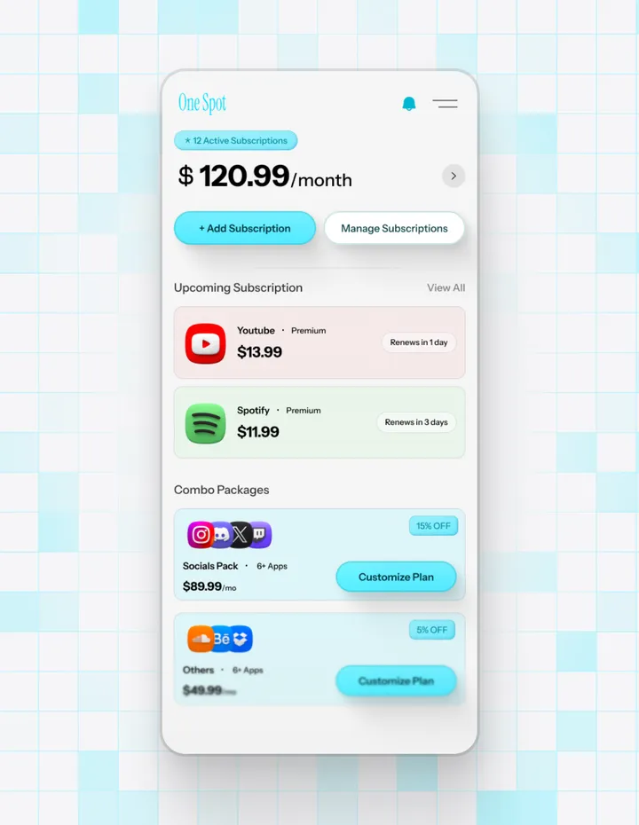
One Spot - App Design — Introducing a clean, user-friendly app design for managing all your subscriptions in one place. Concept Design #app #appdesign #mobile

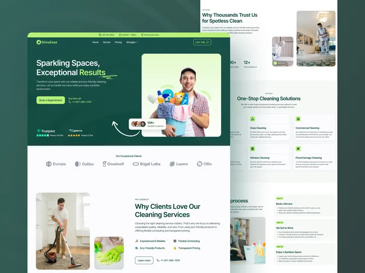
SineEase - Cleaning Agency Web Design — Hello Everyone! SineEase Cleaning Agency Web Design is a sleek, user-friendly web design that showcases cleaning services and driving bookings. It is ideal for residential, commercial, and specialty cleaning businesses, Freelancers, and startups. It presents services, pricing, and booking processes. Fully customizable and mobile-optimized, SineEase is perfect for agencies and web designers seeking a versatile, high-performing cleaning agency website. Key Features: ✣ Clean Design ✣ Fully Responsive ✣ 100% Customizable ✣ Simple booking process ✣ SEO-optimized design ✨ Update your visual experience with Grabui! Explore More: grabui.com #uiux #cleaning #management

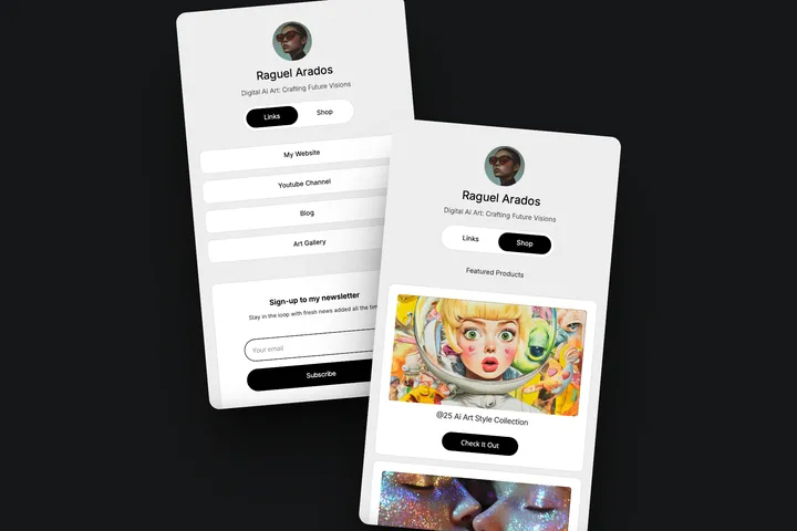
BLOS - Minimal Link In Bio Carrd Template FREE — FREE BLOS Minimal Mobile Link In Bio Site Carrd Template for carrd.co perfect for social media profiles to consolidate multiple links into a single, accessible hub. Get it here: pixasquare.gumroad.com/l/blos #websitetemplate #carrd #webdesign

