Process illustration — Concept illustration of a data analytics process that involves various tools and software.

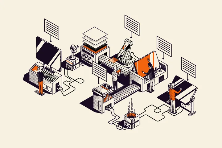
Process illustration — Concept illustration of a data analytics process that involves various tools and software.


Linksvoor logo exploration — Exploring logo concepts for Studio Linksvoor, a Dutch event agency. 'Linksvoor' translates to 'front left'.


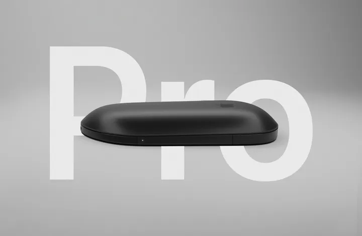
Magic Mouse Pro — Concept for a New Magic Mouse Pro: Created using Blender, Photoshop and After Effects, I have attempted to address some issues that the community wants to be resolved with this device. #apple #ai #motion


Magic Mouse Pro — Concept for a New Magic Mouse Pro: Created using Blender, Photoshop and After Effects, I have attempted to address some issues that the community wants to be resolved with this device. #web #3d #apple

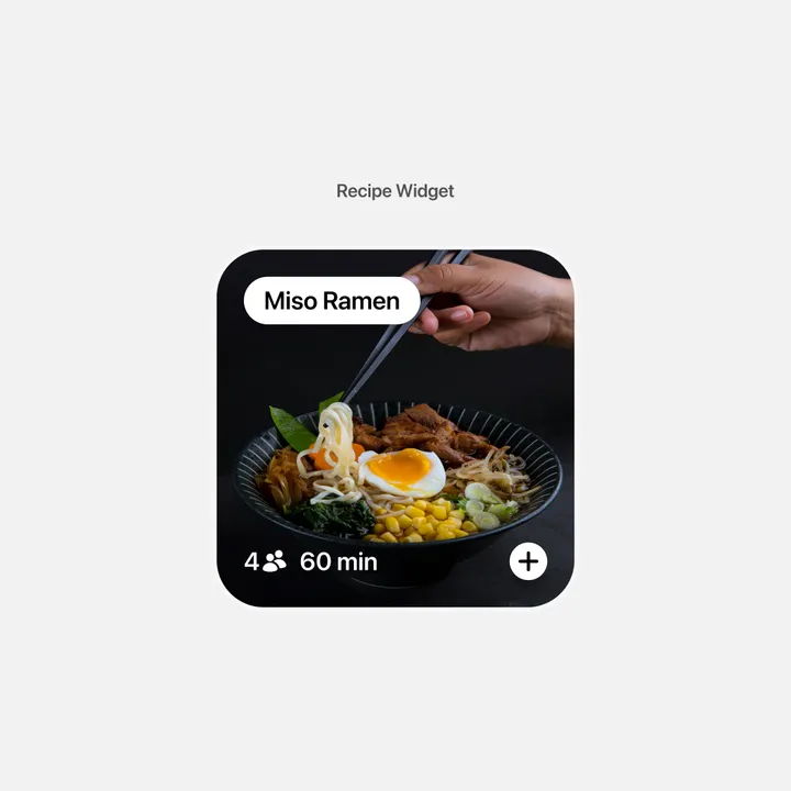
Recipe Widget — This is a concept for a recipe widget that I designed today. I'm exploring various widget ideas that I might incorporate into Waffle, a visual organization app, in the future. #widget #recipe

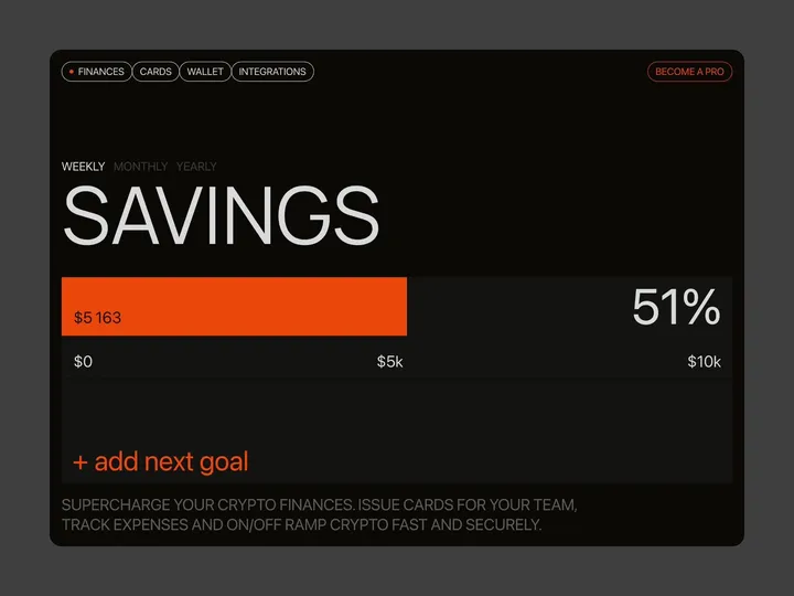
Brutal finance tracker — Check out our latest brainchild, the "Finance Tracker" app. This isn't your average budgeting tool—it's a design concept crafted in Figma and animated with Jitter, built to do more than just monitor your stash. It’s here to push your financial goals from dreams to reality with an interface so slick, it'll make your bank account look good. #web #fintech #appdesign

Sticker Wall – Playing with SwiftUI 😍 — My first ever SwiftUI project trying to recreate Apple iMessage holo stickers ✨ Huge thank you for Philip Davis for his incredible course, Janum Trivedi and Alex Widua for the open source projects and Gavin Nelson for the inspiring prototypes! 🙌🔥 #swiftui #concept #stickers

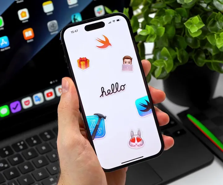
Sticker Wall – Creating holo effect in SwiftUI ✨ — There were so many tiny things to consider when creating the holo effect, that I truly believe these details would have been impossible to prepare for in Sketch or Figma. Details such as: - using an additional dynamic white sparkle layer to create a compelling holo effect - reacting to pitch/roll changes relative to various device positions (e.g. in hand, on table, etc.) - resetting motion values when the device rests for more than 2 seconds with minimal motion - keeping battery and performance in mind - providing "dev/config" controls in context to tweak values just to feel right Hope you'll find this post interesting! 🙌 #swiftui #concept #stickers

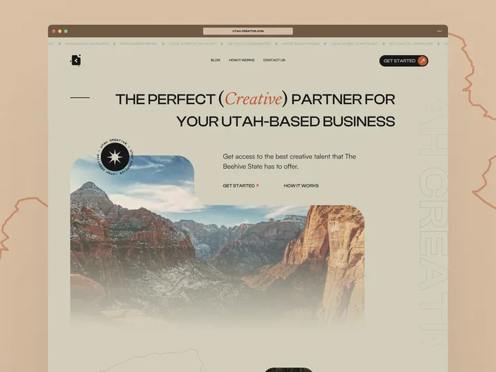
Utah Creative - Hero section of landing page — Some web work I was doing for a buddy's creative business concept. #web #landingpage #webdesign

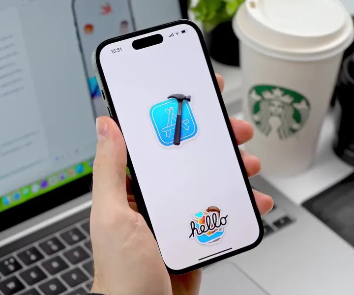
Sticker Wall – Mesh Transform using Shaders 😍 — One of my favorite parts of Apple iMessage Sticker interaction is actually the Mesh Transform effect and how you "peel" stickers on and off from the surface. It's so satisfying. 💯 Thanks to Janum Trivedi and Alex Widua's code, I was able to get kind of close to this solution. 🤩 #swiftui #concept #stickers

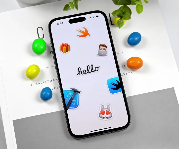
Something cool — Fun stuff with colors and layouts. Yes I like cards. #artdirection #concepts #inspiration

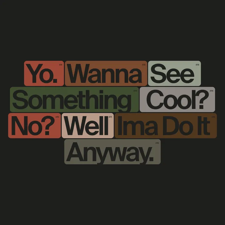
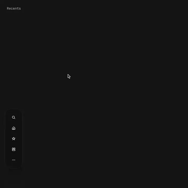
Proximity menu concept — The best click is no click. Before you say it, yes, I know this would make the area under the menu unusable. No it will not work for mobile. This is a desktop app that where that area is void of anything. This would be used as a secondary navigation, primary is a different, keyboard centric element. The goal is to not have navigation take up visual noise, so the content of the app can be focused on. Still debating using this, but I think if done correctly it could work well.

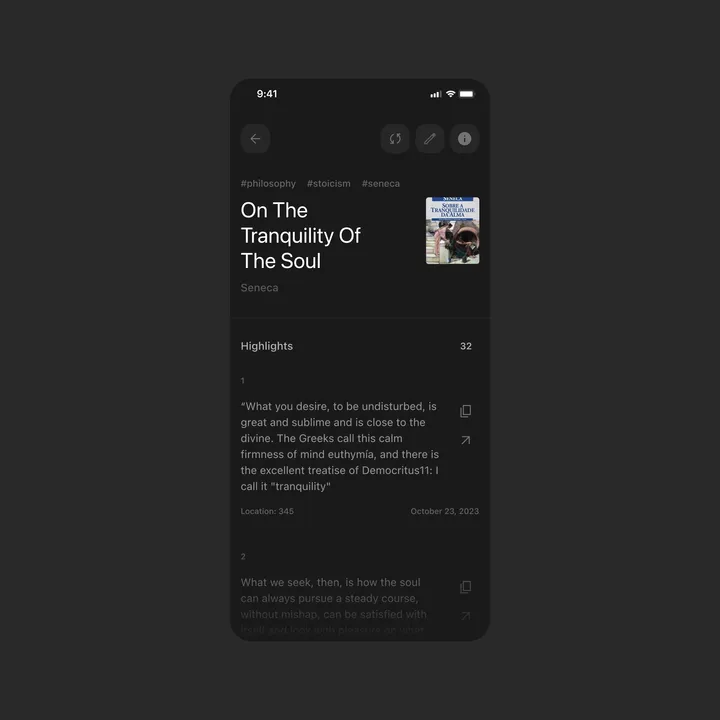
Detail Page for Kindle Highlights — This is a concept design for the Kindle Highlights app idea I posted before. When you enter a book, you see all your notes and can share or copy them to your clipboard. #appdesign #list #quotes

Radinol concept sketch — I've always aspired to have my own radio show, and this was a fun, quick exploration of what that could look like visually. While I'm not sure if this is the final design, I liked it enough to share.

Discovery Canyon — Symbol created for a luxury hotel located in the Aparados da Serra National Park, one of the biggest tourist attractions in southern Brazil. The concept refers to the canyons that exist there.

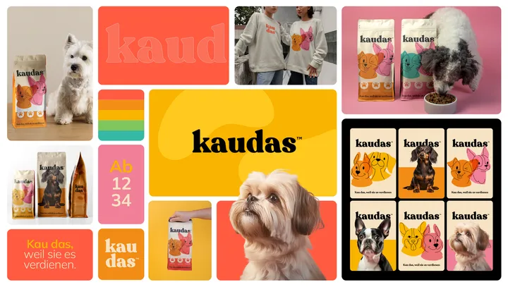
Bento for Kaudas — Visual Brand concept created for Kaudas, a fresh new dog food company. With its playful, layered, custom typography and clean design, the brand conveys the deliciousness and joy awaiting your furry best friend at every meal. #visualidentity #bento #packaging

Logo based Pattern — I love designing patterns based on Logos. And often a sleek motion can help introduce the concept. This one was for a creative archviz studio called Studio F. #motion #brand #logo


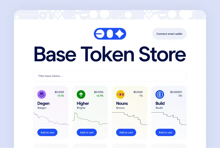
Base Token Store Front Page UI — Demonstrating a powerful idea that you can purchase a token or an NFT as easily as in any other e-commerce site This is an exploratory concept design which got a dev inspired and got developed and available at www.basetokenstore.com

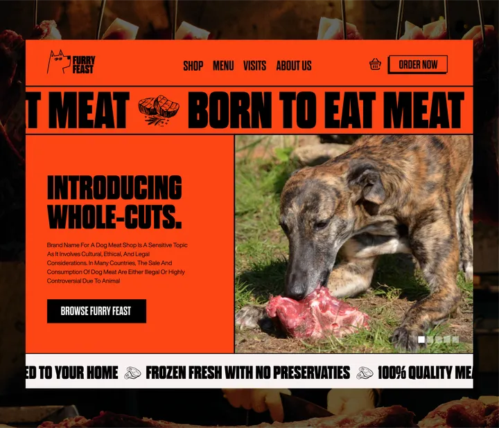
Concept Website Design for Meat shop — I just wrapped up the UI design for Furry Feast! 🐾🍖 It’s all about showcasing top-quality meats with a smooth and easy shopping experience. Browse the menu, order fresh, preservative-free cuts, and enjoy the sleek, user-friendly layout. Check it out! #uidesign #webdesign

