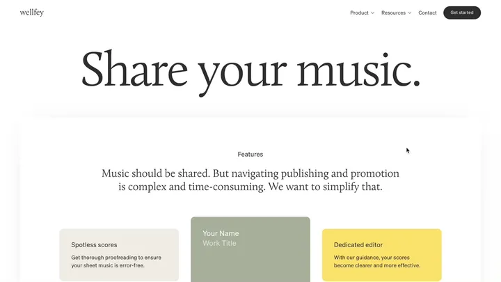
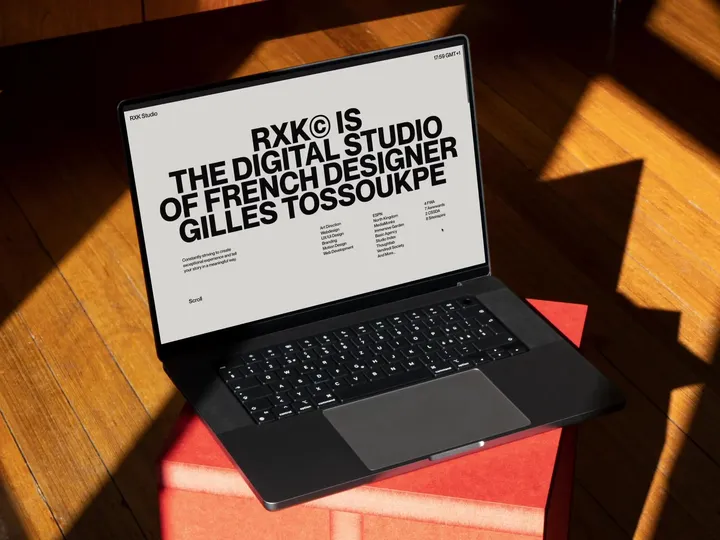
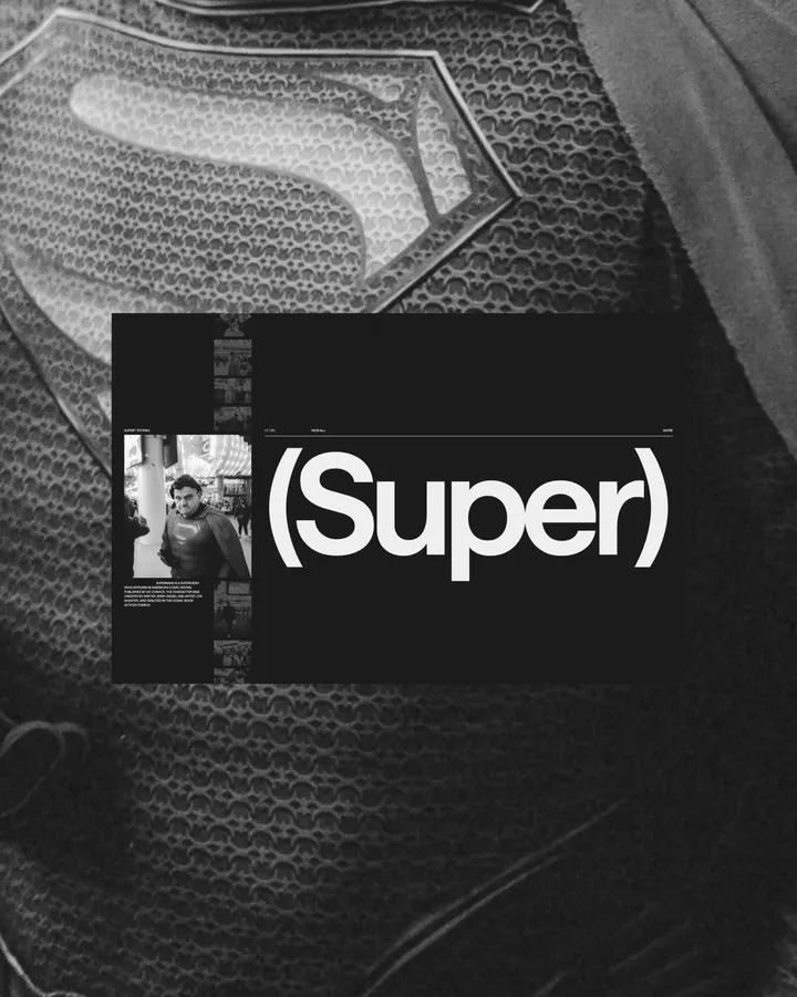
TECHZO is Making Waves!🔥 — We’re beyond excited about the incredible response to our latest Webflow template! Seeing creative agencies and studios redefine their online presence with TECHZO has been truly rewarding. 🙌
Why Agencies Love TECHZO:
✅ Striking, modern typography that demands attention
✅ Sleek, dark-themed aesthetics for a high-end look
✅ Storytelling-driven design that captivates clients
✅ Fully responsive and optimized for maximum conversions
🚀 Experience TECHZO in action! → 🔗 bit.ly/4gZHRgt
🔥 Don’t miss out—elevate your brand and transform your website with TECHZO today!
#webflow #webdesign #creativeagencies
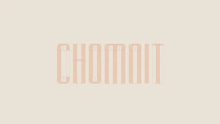
Chocco Mint — Grid construction for Chocco Mint characters typography (with little optical adjust)
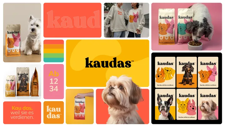
Bento for Kaudas — Visual Brand concept created for Kaudas, a fresh new dog food company.
With its playful, layered, custom typography and clean design, the brand conveys the deliciousness and joy awaiting your furry best friend at every meal.
#visualidentity #bento #packaging
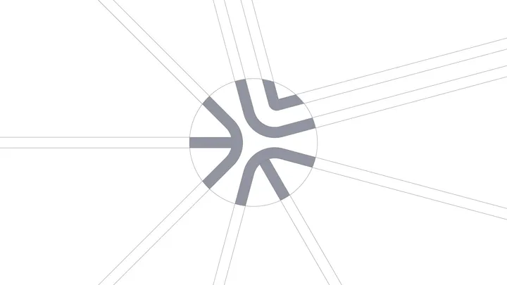
Design Dissolve | Symbol Construction — The Keep Up Agency logo was developed with the aim of representing the strategic stages of the agency's services. The symbol is made up of three arrows that form a figure similar to a target, symbolizing the setting of goals and obtaining results. Each arrow represents a key element: strategies, tactics and objectives, culminating in a central target that illustrates the focus on results and success. The sans-serif typography chosen for the logo complements the symbol, ensuring a timeless and balanced appearance.
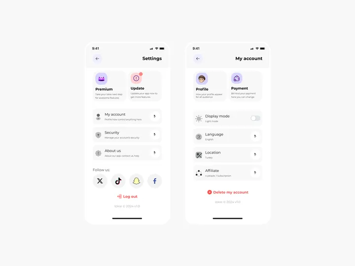
Settings Page for Mobile App - Lokie App — ◑ Design Elements:
Clean Layout: The screens maintain a clean and organized layout, ensuring clarity and ease of use.
Consistent Typography: The use of consistent fonts and font sizes enhances readability.
Iconography: Icons represent various settings and categories, aiding quick recognition.
Color Scheme: The light mode employs a soft color palette, reducing eye strain. #appdesign #figma #settings


