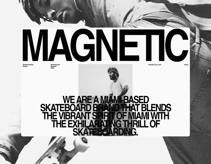
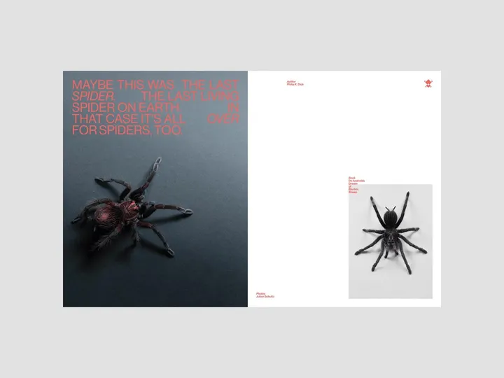
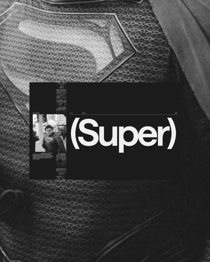
QUOTES#001 — Layout explorations through some famous QUOTES of popular sci-fi books that I have read and appreciated.
↳ Books: Do Androids Dream of Electric Sheep
↳ Author: Philip K. Dick
↳ ©Photos: Julian Schultz v/ unsplash
Concept Website Design for Meat shop — I just wrapped up the UI design for Furry Feast! 🐾🍖 It’s all about showcasing top-quality meats with a smooth and easy shopping experience. Browse the menu, order fresh, preservative-free cuts, and enjoy the sleek, user-friendly layout. Check it out!
#uidesign #webdesign
Nubuilt Architecture Agency Website Framer Templ — Hello Everyone!
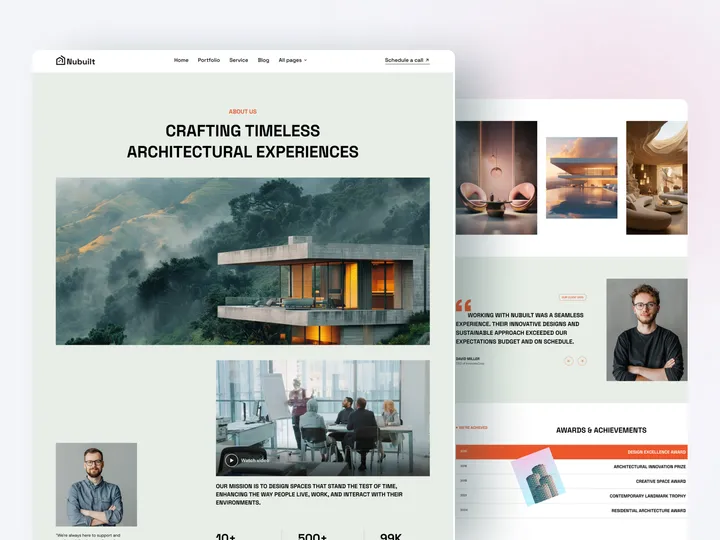
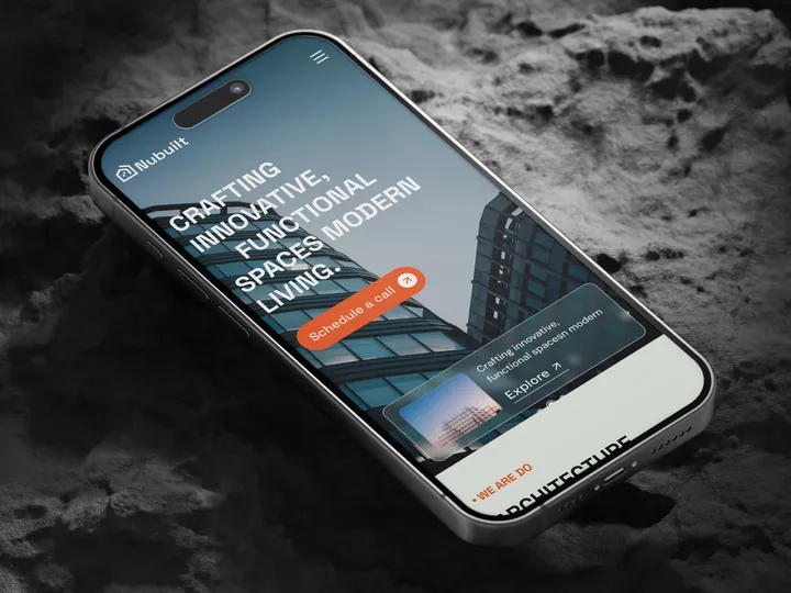
Nubuilt is an excellent backbone for architecture and interior designers. It is powered by Grabui Templates that can fit most websites' needs. Nubuilt’s main focus is modern interior design.
Therefore, an organized layout and high-quality design elements will make a website look friendly and highly functional. This platform covers an architecture portfolio template, which will help a pro show their work significantly.
✨ Update your visual experience with Grabui!
Explore More: www.framer.com/marketplace/templates/nubuilt
#uiux #website #webdesign
Nubuilt Architecture Agency Website Template — Hello Everyone!
Nubuilt is an excellent backbone for architecture and interior designers. It is powered by Grabui Templates that can fit most websites' needs. Nubuilt’s main focus is modern interior design.
Therefore, an organized layout and high-quality design elements will make a website look friendly and highly functional. This platform covers an architecture portfolio template, which will help a pro show their work significantly.
✨ Update your visual experience with Grabui!
Explore More: www.framer.com/marketplace/templates/nubuilt
#uiux #website #webdesign
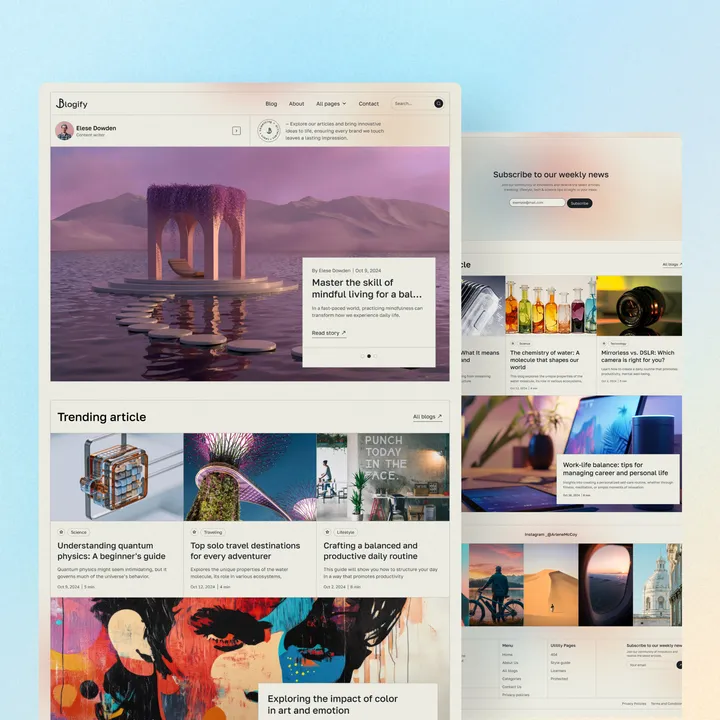
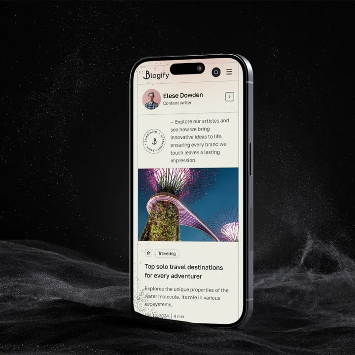
Blogify Blogging Agency Website Template — Hello Everyone,
Blogify is a modern, high-quality layout designed specifically for personal bloggers, small businesses, and content-driven companies that want to showcase their writing and stories. It offers powerful customization options and a striking design, ensuring aesthetics and functionality for quickly establishing a professional website. With Blogify, you can confidently create a strong online image and enhance your digital presence. Launch your new blog in minutes and start making an impact with Blogify!
✨ Update your visual experience with Grabui!
Explore More: grabui.com/product/blogify
#uiux #webdesign #websitetemplate
Consultify Agency Website Template — Hello Everyone!
Consultify is the ultimate Framer/Webflow template for marketing consultants, brand strategists, and professionals in IT, business, SEO, tech, and global consultancy. Perfect for building a strong brand identity, Consultify features polished, visually engaging layouts to showcase your expertise in brand strategy, marketing, and consulting. With multiple homepage options, dedicated service pages, and an intuitive design, Consultify is ideal for consultants and agencies looking to impress clients, share success stories, and grow their reach. Elevate your consulting business with Consultify—stand out, attract clients, and build your future today!
✨ Update your visual experience with Grabui!
Explore More: grabui.com/product/consultify
#uiux #website #websitetemplate
NovaAI — Technology Website Design — NovaAI proudly presents NovaChat, a @framer -approved AI-powered platform designed to revolutionize customer interactions and enhance operational efficiency.
Exclusive Deal! Use code "NIOVA35" for 35% off!
Key Features:
Modern, sleek design with captivating layouts tailored for interior designers and creatives.
Fully responsive (Desktop, Tablet, Phone) for seamless client browsing on any device.
Customizable sections to showcase your design projects, services, and portfolio effortlessly.
Optimized for performance and SEO to ensure fast loading and higher search rankings.
Quick and easy setup to launch your website or presentation in no time.
👉 Grab it here: bit.ly/4bLl86P
#novaai, #novachat, #aipowered
Launch Your Finance or SaaS Business in Minutes — Budgetify – an Officially Approved Framer Template!
Limited-Time Offer: Use code BUDGETIFY25 to get 25% OFF
Budgetify is a modern, high-converting Framer template designed for budgeting apps, fintech startups, and financial consulting services. With a clean layout, smooth animations, and interactive elements, it delivers a seamless user experience that builds credibility and drives conversions.
Key Features:
✔ No-Code Customization
✔ SEO-Optimized
✔ Conversion-Focused CTAs
✔ Smooth Animations & Interactivity
✔ Framer CMS Integration
✔ Fast Loading Speed
👉 framer.com/marketplace/templates/budgetify
#framer #fintech #saas
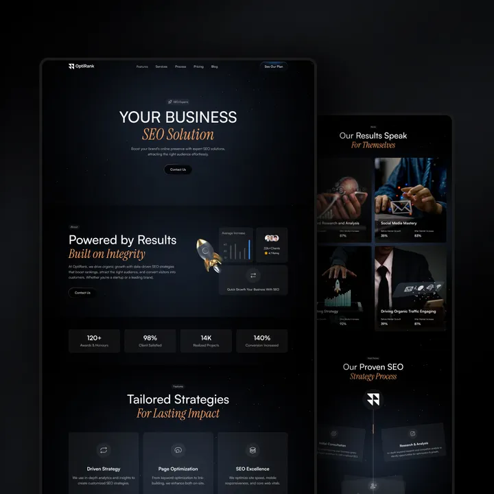
OptiRise: The Webflow -Approved Template Built t — Your SEO & marketing agency deserves a website that works as hard as you do. OptiRise is a performance-driven template designed to:
✅ Dominate SEO – Built-in best practices to rank higher, faster
✅ Convert Visitors – Strategic layouts designed for lead generation
✅ Impress Clients – Sleek, professional showcase for your portfolio & services
✅ Integrate Effortlessly – CRM, analytics, and tools ready to connect
✅ Launch in Minutes – Customizable templates, no coding needed
👉 shm.to/qQ9OaSi
#seoagency #webflowexperts #highconverting
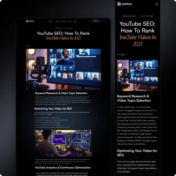
OptiRise – The Webflow Approved Design — Your SEO and marketing agency needs more than just a good-looking website — it needs one that drives results. OptiRise is a high-performance Webflow template built to help you scale with ease.
🔍 SEO-Optimized – Built-in best practices to boost your rankings faster
🎯 Lead-Focused Design – Proven layouts that convert visitors into clients
✨ Client-Ready Look – Professional, clean design to showcase your services and portfolio
🔗 Tool-Friendly – Seamlessly integrates with CRMs, analytics, and marketing tools
⚡ Quick Launch – Fully customizable with zero coding required
👉 Start growing today: shm.to/OptiRise-29-04-2025
#seoagency #webflowtemplate #leadgeneration
OptiRise — The Webflow -Approved Design. — Your SEO and marketing agency deserves more than just a good-looking website — it needs a site that drives results.
OptiRise is a high-performance Webflow template designed to help you scale, convert, and impress.
🔍 SEO-Optimized — Built-in best practices to boost your search rankings
🎯 Conversion-Focused Design — Proven layouts that turn visitors into clients
✨ Client-Ready Aesthetic — Sleek, professional design to showcase your services and portfolio
🔗 Tool-Friendly — Effortless integration with CRMs, analytics, and marketing platforms
⚡ Fast & Flexible Launch — Fully customizable, no coding required
👉 Get started today: shm.to/OptiRise-29-04-2025
#seoagency #webflowtemplate #conversionfocused

