Kindle Highlights Concept — I wish I had a way to sync all my highlights in just one place that allows me to copy or share easily. So, I made this first concept that categorizes my highlights in order. #appdesign #uidesign #darktheme

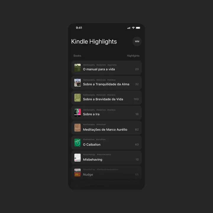
Kindle Highlights Concept — I wish I had a way to sync all my highlights in just one place that allows me to copy or share easily. So, I made this first concept that categorizes my highlights in order. #appdesign #uidesign #darktheme


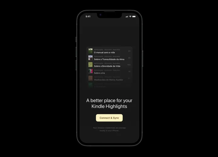
Kindle Highlights — Connect & Sync — This is an open page inviting users to connect their Kindle accounts to start the highlights synchronization. #appdesign #darktheme #onboarding

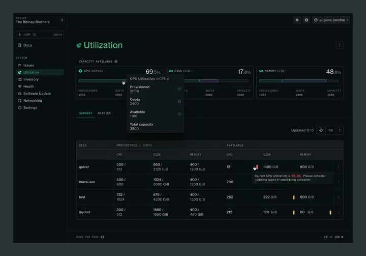
Capacity and Utilization summary — Hey everyone! I'm really excited to join this community! I've been hard at work lately on delivering a great user experience at oxide.computer. Finally getting a chance to share a sneak peek at the revamped Capacity and Utilization pages I've been working on. There are more exciting updates coming soon, so stay tuned! #product #darktheme #saas

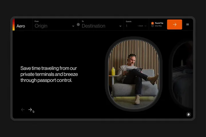
Component for marketing page — It's a component created to showcase the company's benefits on the homepage. #web #darktheme #components

