Detail Page for Kindle Highlights — This is a concept design for the Kindle Highlights app idea I posted before. When you enter a book, you see all your notes and can share or copy them to your clipboard. #appdesign #list #quotes

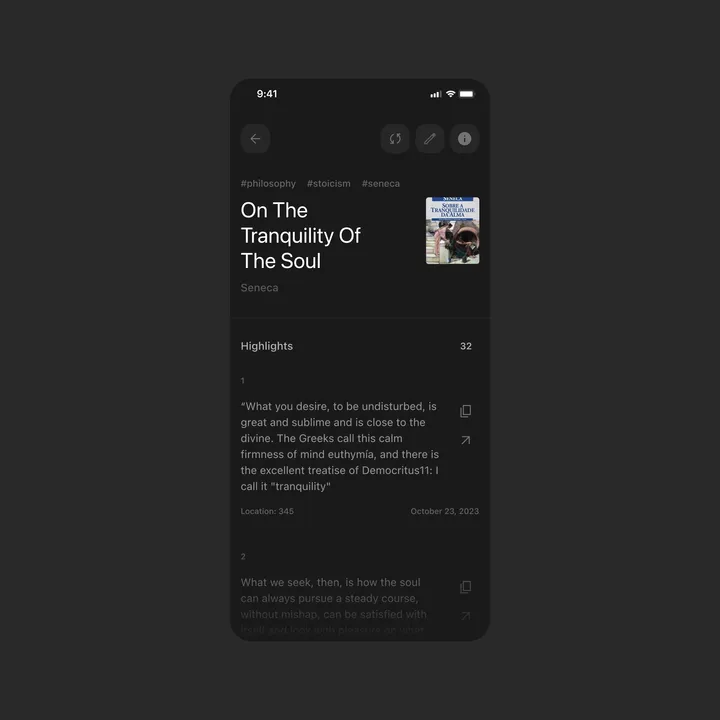
Detail Page for Kindle Highlights — This is a concept design for the Kindle Highlights app idea I posted before. When you enter a book, you see all your notes and can share or copy them to your clipboard. #appdesign #list #quotes


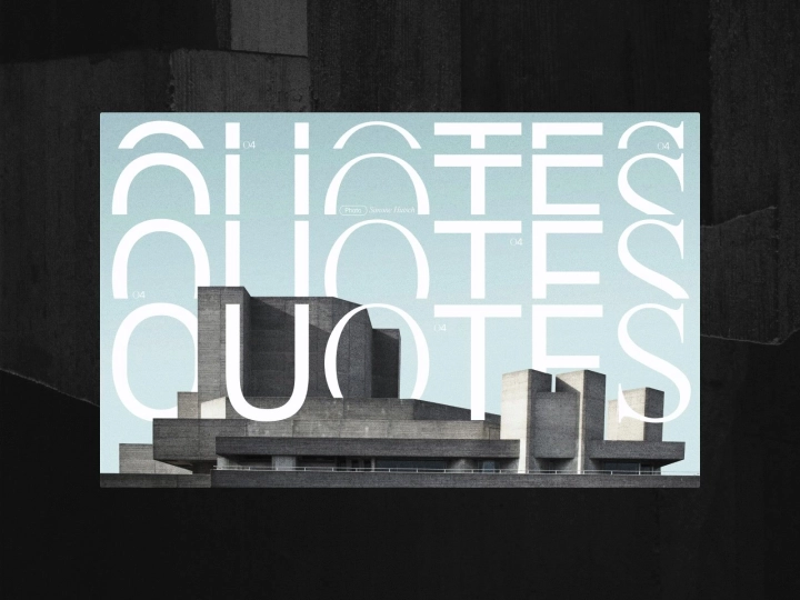
QUOTES#004 — Layout explorations through some famous QUOTES of popular sci-fi books that I have read and appreciated. ↳ Books: 1984 ↳ Author: Georges Orwell ↳ ©Photos: Uve Sanchez, Simone Hutsch, Touann Gatouillat Vergos v/ unsplash #exploration #layout #design

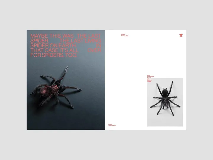
QUOTES#001 — Layout explorations through some famous QUOTES of popular sci-fi books that I have read and appreciated. ↳ Books: Do Androids Dream of Electric Sheep ↳ Author: Philip K. Dick ↳ ©Photos: Julian Schultz v/ unsplash

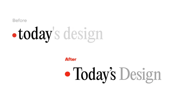
Today's Design logo — Great to see a new site enter the fray. To celebrate the inauguration of the site, I'll evaluate its logo. I can see what @giel is attempting to do here with the logo, turn the "today" into a sort of implicit UI element in the form of a day indicator. I observe that he wants to center the circle with the x-height, in that the evenness of the height lends itself to the centered red indicator. But day indicators of this sort, especially in this context would seem to call for title case or sentence case. Moreover, elsewhere in the UI, headings set in PP Editorial New are set in sentence case. In this subtle revision, I've cleaned up the kerning, adopted title case, and used a matching ellipse rather than a standard circle, which comes off as somewhat generic. Most importantly, I've used a curly quote rather than the straight quote used which is an incorrect usage, and curly quotes look more elegant to boot. Cheers to Giel on the launch.

