Kindle Highlights Concept — I wish I had a way to sync all my highlights in just one place that allows me to copy or share easily. So, I made this first concept that categorizes my highlights in order. #appdesign #uidesign #darktheme

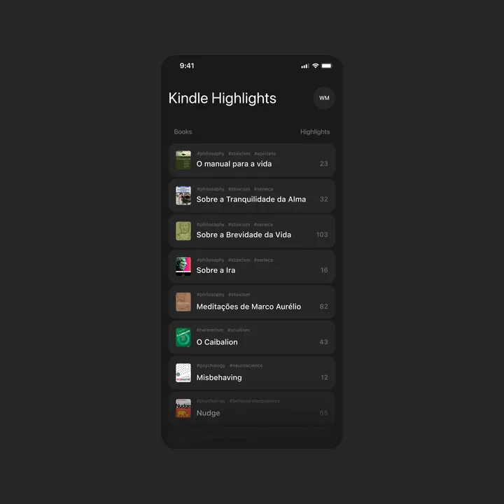
Kindle Highlights Concept — I wish I had a way to sync all my highlights in just one place that allows me to copy or share easily. So, I made this first concept that categorizes my highlights in order. #appdesign #uidesign #darktheme


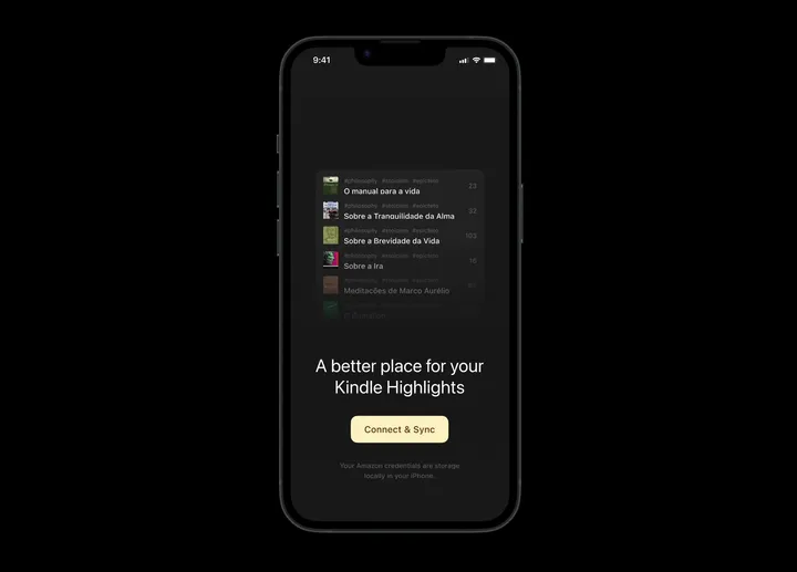
Kindle Highlights — Connect & Sync — This is an open page inviting users to connect their Kindle accounts to start the highlights synchronization. #appdesign #darktheme #onboarding

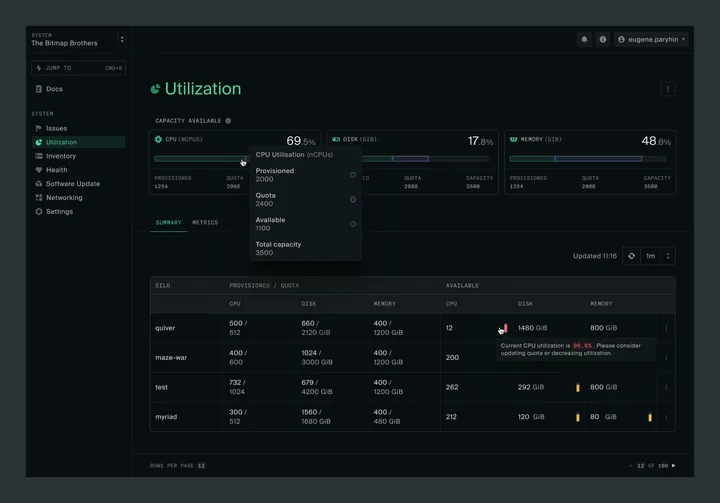
Capacity and Utilization summary — Hey everyone! I'm really excited to join this community! I've been hard at work lately on delivering a great user experience at oxide.computer. Finally getting a chance to share a sneak peek at the revamped Capacity and Utilization pages I've been working on. There are more exciting updates coming soon, so stay tuned! #product #darktheme #saas

Component for marketing page — It's a component created to showcase the company's benefits on the homepage. #web #darktheme #components

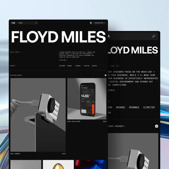
Floyd Miles Designer Portfolio Template Dark — Discover the perfect blend of simplicity and sophistication with our 𝗙𝗹𝗼𝘆𝗱 𝗠𝗶𝗹𝗲𝘀 𝗣𝗼𝗿𝘁𝗳𝗼𝗹𝗶𝗼 𝗧𝗲𝗺𝗽𝗹𝗮𝘁𝗲. Tailored for designers who appreciate clean lines and a modern aesthetic, this template offers an elegant platform to showcase your work. #uiux #website #websitetemplate

TECHZO is Making Waves!🔥 — We’re beyond excited about the incredible response to our latest Webflow template! Seeing creative agencies and studios redefine their online presence with TECHZO has been truly rewarding. 🙌 Why Agencies Love TECHZO: ✅ Striking, modern typography that demands attention ✅ Sleek, dark-themed aesthetics for a high-end look ✅ Storytelling-driven design that captivates clients ✅ Fully responsive and optimized for maximum conversions 🚀 Experience TECHZO in action! → 🔗 bit.ly/4gZHRgt 🔥 Don’t miss out—elevate your brand and transform your website with TECHZO today! #webflow #webdesign #creativeagencies


AnyRoadmap - Hero design — Designed this roadmap website with a sleek dark theme and glowing accents for a modern, eye-catching look. #design #landing #webdesign


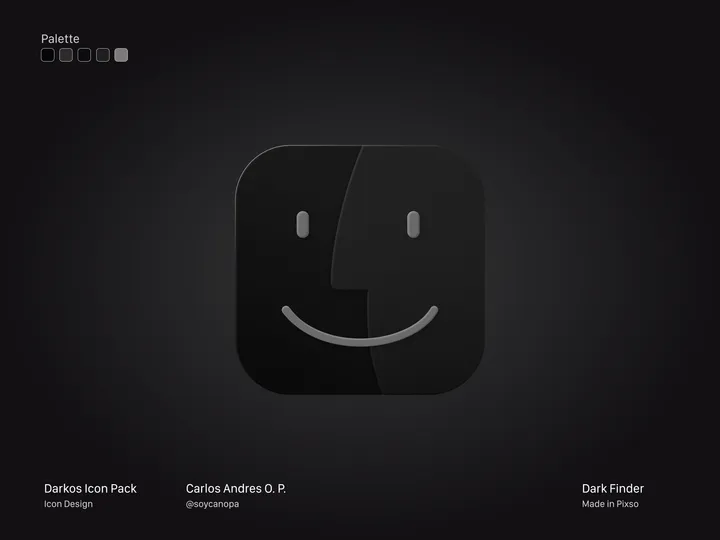
Finder Dark Version — Hey Hey Hey 👋, And this is how the first icon turned out, in this case, the Finder from my #icon pack in progress called DarkOS or DarkMaul; I still haven't decided on the name. It's a true dark version of many #apps icons in #macos Version 1.0 will have around 50 initial icons, but I plan to add more later.

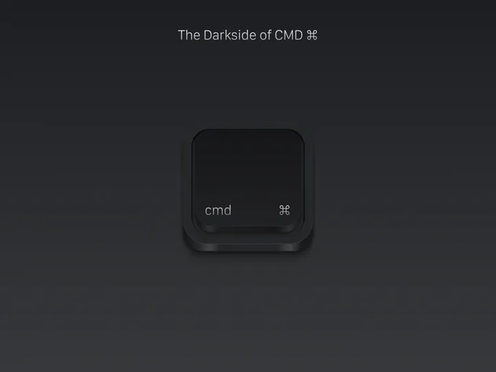
The Darkside of CMD ⌘ — Because light coexists harmoniously with darkness, neither can exist without the presence of its counterpart. This phenomenon becomes a fundamental component of universal equilibrium, integrating itself deeply into the very essence of existence. Here I share with you the Dark version of my Mac keyboard CMD icon, completely made in Figma.

