CTA Section Design — Recently I designed this Modern and Minimal CTA Section for Nocodetalks website's, Checkout the Full website here - nocodetalks.co #website #framer #figma

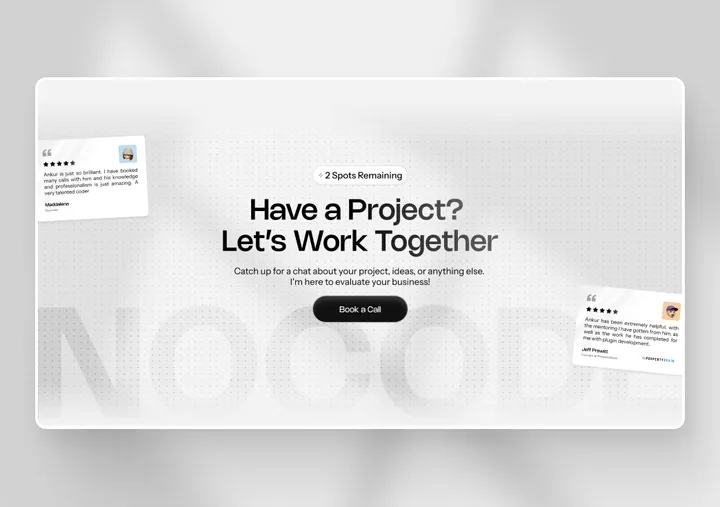
CTA Section Design — Recently I designed this Modern and Minimal CTA Section for Nocodetalks website's, Checkout the Full website here - nocodetalks.co #website #framer #figma


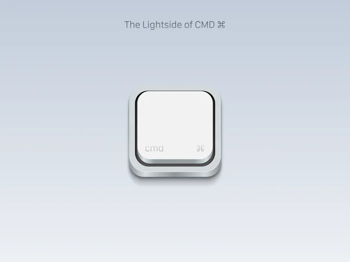
The Lightside of CMD — Project about the key that differentiates two systems, but has a very interesting background, the symbol used to enter commands in macOS operating systems. I guess you could say it’s one of the most important keys on the keyboard, and in fact the most representative of all the keys on a macOS keyboard. Project all done in Figma.

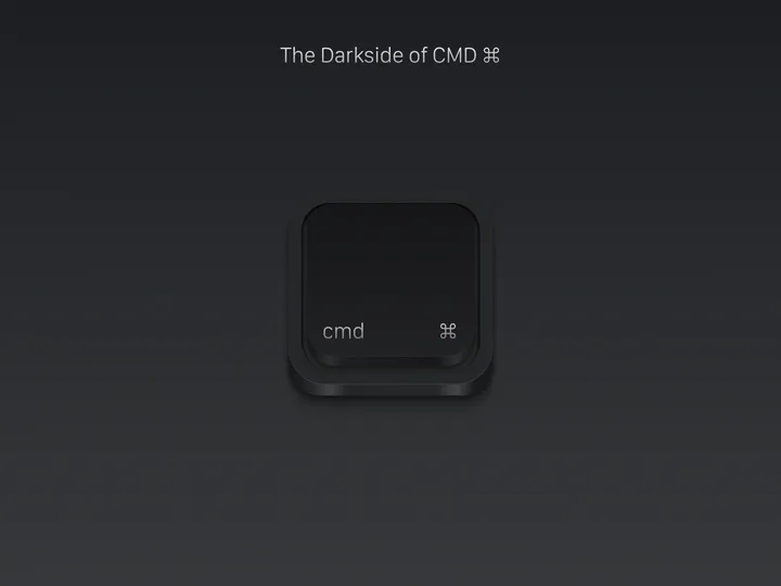
The Darkside of CMD ⌘ — Because light coexists harmoniously with darkness, neither can exist without the presence of its counterpart. This phenomenon becomes a fundamental component of universal equilibrium, integrating itself deeply into the very essence of existence. Here I share with you the Dark version of my Mac keyboard CMD icon, completely made in Figma.

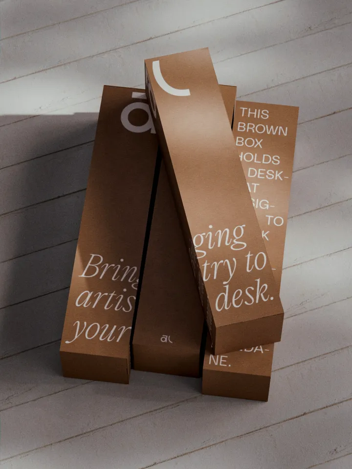
Akuko Labs Deskmat Packaging — Plain cardboard boxes are cheaper to produce, costing nearly half as much as fully printed boxes. I also find them more elegant, especially with white ink accents. Win-win. Designed in Figma, rendered in Blender.

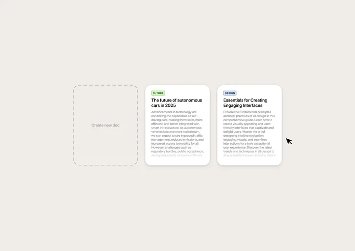
Drag-and-drop interaction for document archival — Quick mockup I made in Figma to get the idea out of my head. No project in mind. Just for fun. :)

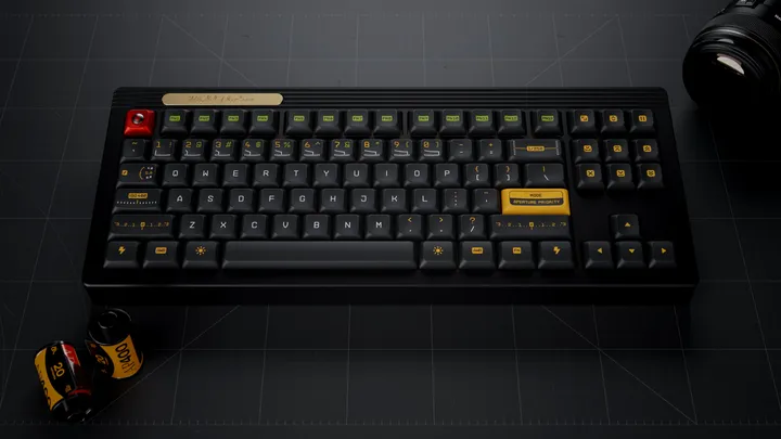
Working on kitting for a new keycap set — With Gestalt production finish I am working on my next keycap set, inspired by vintage photography and vintage photography lens hence the name Aperture Priority. This set was designed in Figma and I created a custom legends based on a monotype technical typeface. I also included familiar photography UI elements as novelty keycaps. #3d #mechanicalkeyboard

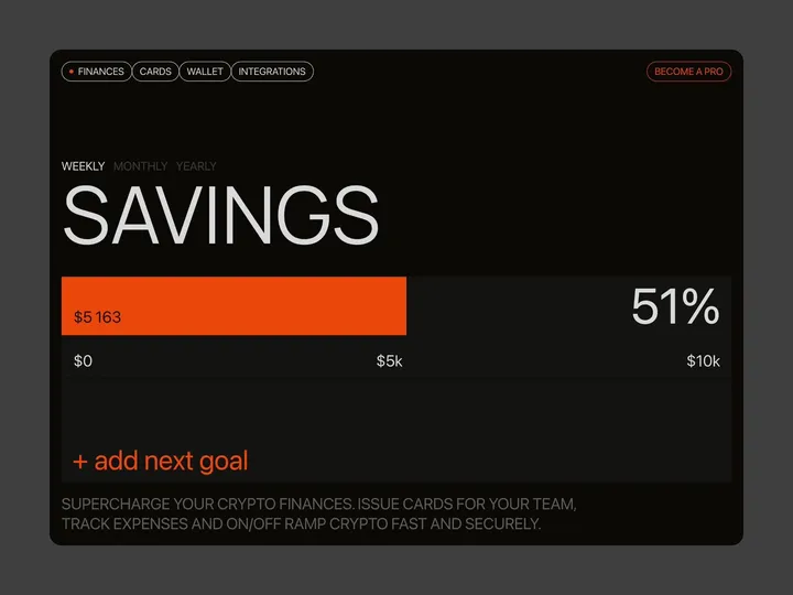
Brutal finance tracker — Check out our latest brainchild, the "Finance Tracker" app. This isn't your average budgeting tool—it's a design concept crafted in Figma and animated with Jitter, built to do more than just monitor your stash. It’s here to push your financial goals from dreams to reality with an interface so slick, it'll make your bank account look good. #web #fintech #appdesign

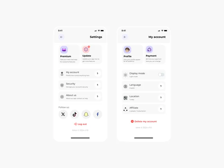
Settings Page for Mobile App - Lokie App — ◑ Design Elements: Clean Layout: The screens maintain a clean and organized layout, ensuring clarity and ease of use. Consistent Typography: The use of consistent fonts and font sizes enhances readability. Iconography: Icons represent various settings and categories, aiding quick recognition. Color Scheme: The light mode employs a soft color palette, reducing eye strain. #appdesign #figma #settings

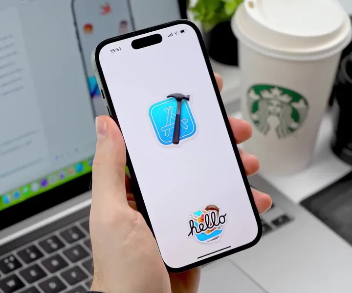
Sticker Wall – Creating holo effect in SwiftUI ✨ — There were so many tiny things to consider when creating the holo effect, that I truly believe these details would have been impossible to prepare for in Sketch or Figma. Details such as: - using an additional dynamic white sparkle layer to create a compelling holo effect - reacting to pitch/roll changes relative to various device positions (e.g. in hand, on table, etc.) - resetting motion values when the device rests for more than 2 seconds with minimal motion - keeping battery and performance in mind - providing "dev/config" controls in context to tweak values just to feel right Hope you'll find this post interesting! 🙌 #swiftui #concept #stickers

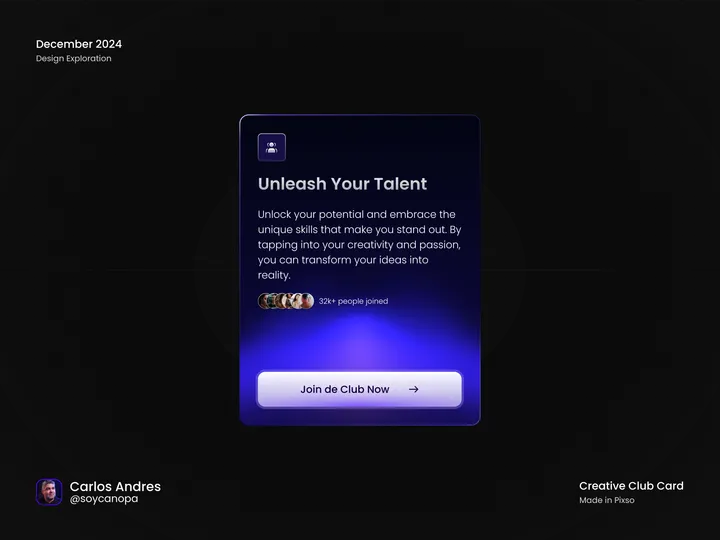
Creative Club Card — Hey Hey Hey 👋, Visual exploration of the week, having fun playing with shapes, effects, layer blending modes, gradients, and other little things, all done in Pixso which, likewise, can be replicated in Figma. #web #app #product

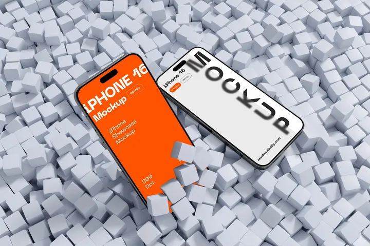
iPhone 16 Mockup — MockupDaddy provides a high-quality iPhone 16 Mockup for designers and developers to present their app interfaces and UI designs with professional precision. This mockup is offered in Photoshop format, featuring a resolution of 5000x3333 pixels at 300 dpi, ensuring superior visual clarity. Its smart object layers allow for effortless customization, enabling users to replace designs easily to suit their specific project needs. With its sleek and modern presentation, the iPhone 16 Mockup is an essential tool for crafting visually stunning mockup showcases. Beyond the standard version, MockupDaddy offers additional options such as clay-style mockups and Figma-compatible files to cater to different creative needs. These variations expand the utility of the iPhone 16 Mockup, making it adaptable to diverse presentation styles, from client presentations to portfolio enhancements. By using these mockups, designers can elevate their work and communicate their ideas more effectively.

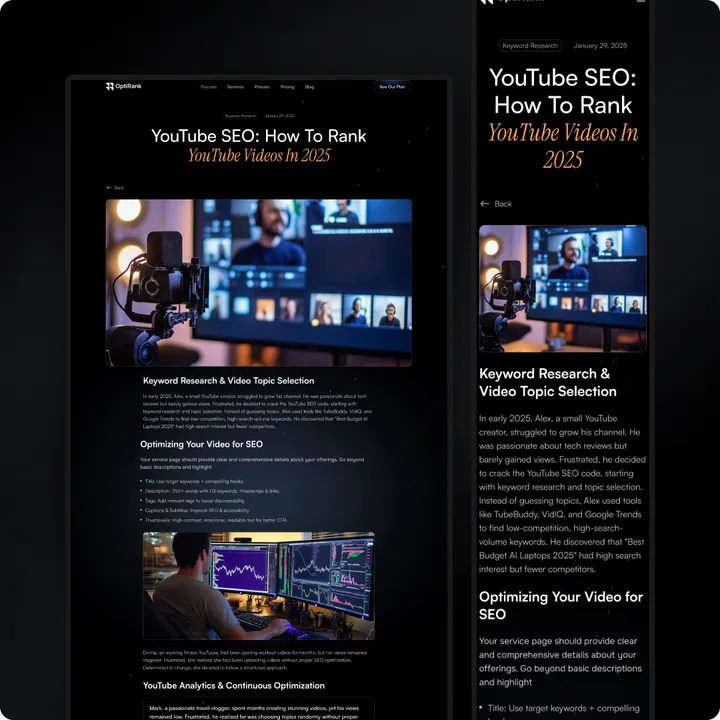
OptiRank – The Ultimate SEO Agency Template! 🌐 — Boost your SEO agency with OptiRank, a sleek, responsive, and conversion-focused Framer template. ✨ Why OptiRank? ✅ Clean, professional design ✅ Conversion-optimized CTAs ✅ SEO-ready: fast, structured, schema-friendly ✅ Easy integrations: analytics, CRMs, forms ✅ Fully customizable (Framer/Webflow + Figma) ✅ Lifetime support & updates Perfect for startups or agencies to attract clients and grow. 👉 Get it now: grabui.com/product/optirank #seoagency #digitalmarketing #businessgrowth

Just Launched on @framer Marketplace! 🎉 — Fitnix – The ultimate gym & trainer template. Made for fitness coaches, personal trainers, and wellness pros ready to grow online. 💪 Promote your services, classes & programs 📱 Fully responsive and SEO-ready ⚡ Fast, smooth, and built to convert 🧩 Easy CMS setup with pre-designed layouts 🎨 Includes Figma files & step-by-step tutorials Launch a stunning, high-impact website in minutes—zero code required. 👉 Check it out: shm.to/fitnixFR #framertemplate #fitnix #gymwebsite


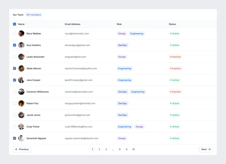
Simple Table UI — A dead-simple Table UI component made in #figma with components and variables. #webdesign #appdesign

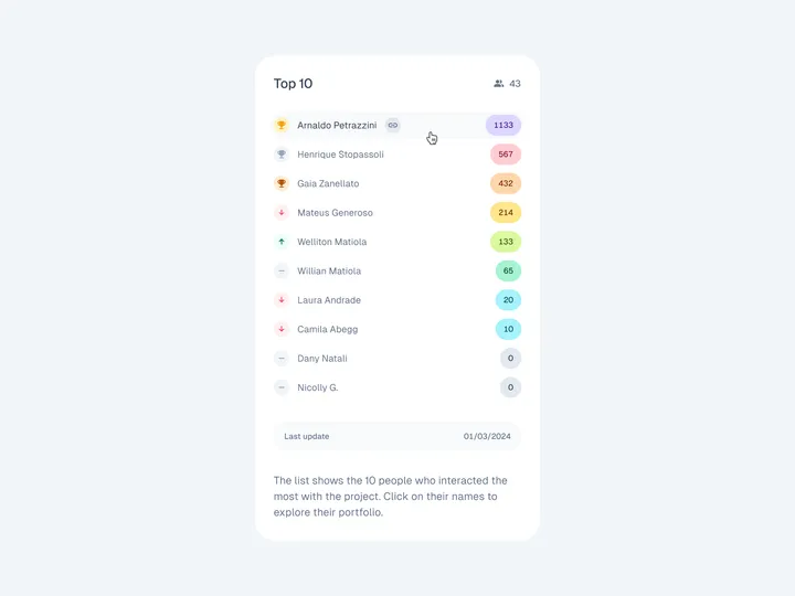
Leaderboard UI — Leaderboard for a personal project where I teach design lessons on how to design UI components on Figma. The more exclusive lessons or extras the student buys, the more points he gets. If you like my work, consider following me on Twitter twitter.com/willianmatiola 😊 #leaderboard #table #list

bauplan logo and landing page — Bauplan is a small startup trying to simplify data infrastructure management. The team asked me to refresh their logo and website. We envisioned a playful Bauhaus look with modern elements. I designed the page in Figma and developed it in Framer.


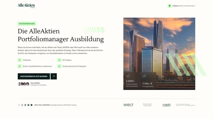
Alle Aktien — Hero section for Alle Aktien. — Alle Aktien is an European equity research provider specializing in professional equity analyses and long-term investment ideas. #web #ui #figma

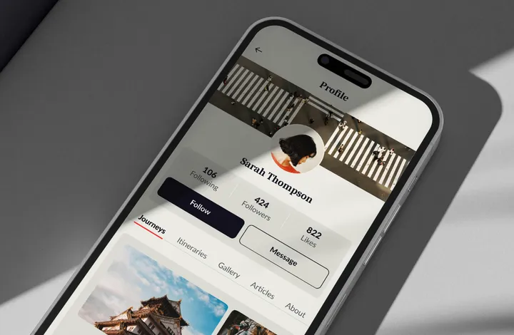
Journi - app design — Journi is a UI/UX design project I developed, where I created a dedicated space on the profile to organize and share each trip in a well-segmented and streamlined way, allowing users to relive and share their adventures uniquely. www.behance.net/gallery/175447827/Journi-UIUX-Design #ui #figma #appdesign

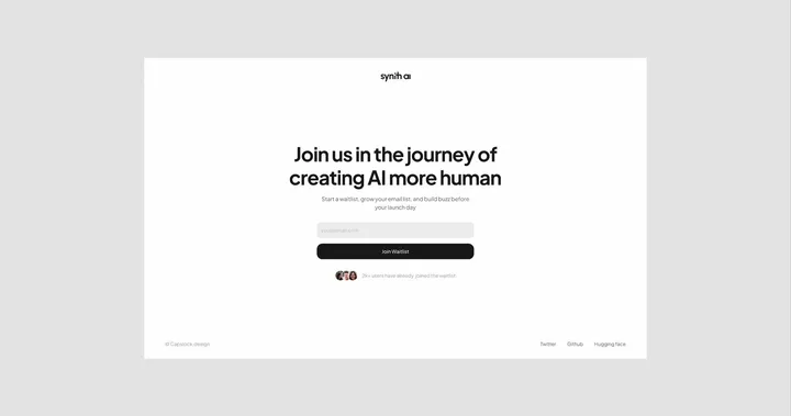
Synth - AI SaaS Design Brandkit (Light) — This kit is designed for startups or individuals looking to launch or refresh their brand with a sleek, professional minimal look. This all-in-one kit includes everything you need to establish your brand's presence. Preview full kit: www.capslock.design/brand-kits/synth-light _________________________ What's Inside: Website designed in Figma Developed in Framer Pitch Deck Client Onboarding Doc Letter Head Business Card Social Media Covers Brand Guide _________________________ Kit Features: Light Theme Minimal Design 100% Customizable Just Change Content Professionally Designed _________________________ If you need any help along the way, just reach out to me at: hey@capslock.design

