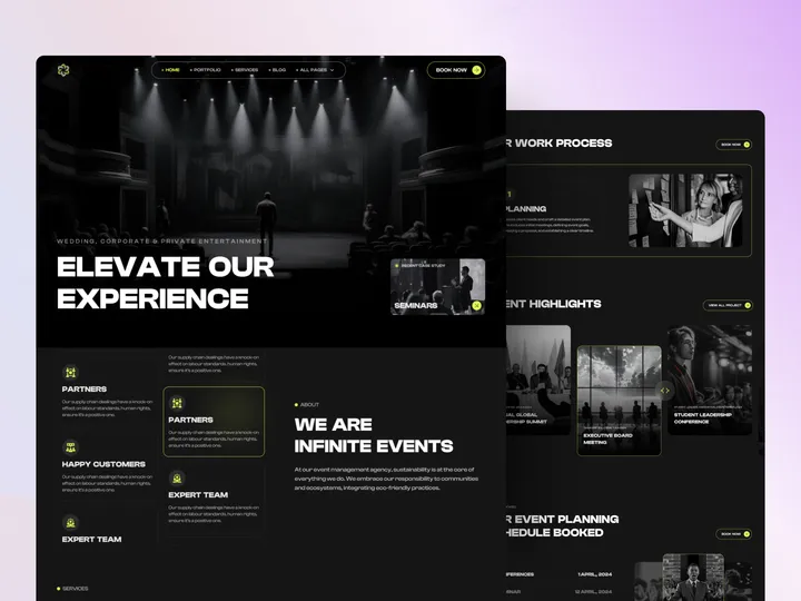
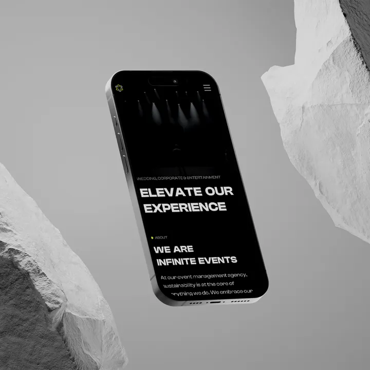
Eventistry – Ultimate Template for Event Website — Hello Everyone!
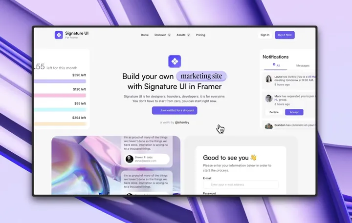
Eventistry is your go-to template for creating a professional, engaging, and dynamic website. With its sleek design, Eventistry ensures that your event stands out and leaves a lasting impression. The modern aesthetic combined with intuitive navigation provides a seamless user experience, making it easy for attendees to find the information they need. Plus, Eventistry offers a high level of customization, allowing you to tailor every aspect of your event website to match your brand and your business's unique needs.
✨ Update your visual experience with Grabui!
Explore More: grabui.com/product/eventistry
#uiux #website #webdesign
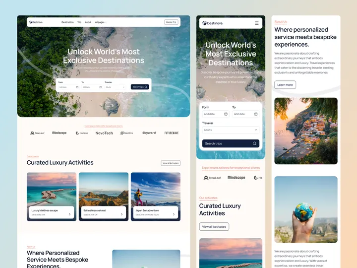
Destinova Travel Agency Web Design — Hello Everyone!
Destinova Travel Agency Web Design sets a new standard for travel agency websites by combining beautiful design with easy-to-use features. This creates a great user experience with stylish visuals, simple navigation, and interactive elements that inspire travel.
Destinova offers customized tours and travel packages that are perfect for luxury and corporate travel professionals. It works well for showcasing unique trips, destinations, and special offers. For these reasons, it’s the best choice for any online travel agency, providing an attractive web presence.
✨ Update your visual experience with Grabui!
Explore More: grabui.com/product/destinova
#uiux #travelwebsite #webdesign
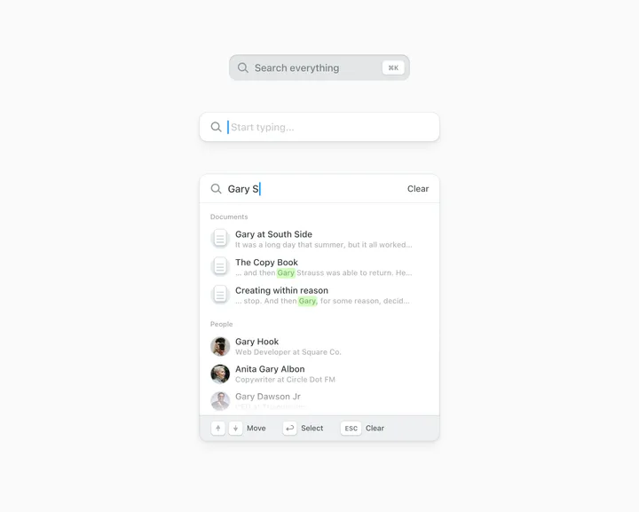
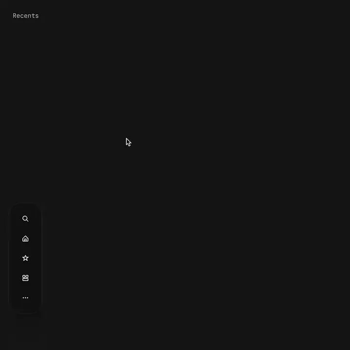
Command Palette — Three states for in-app search, with keyboard shortcuts, and navigation. Using SF as the typeface, and all the icons were custom made for this.
#search #cmdk #web
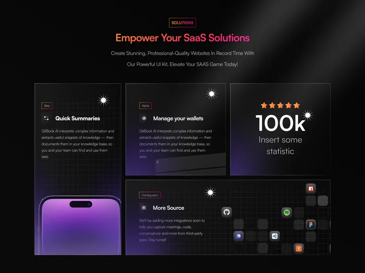
Bento Design for SaaS Website — Feature Blocks:
Quick Summaries: Provides industry insights in one place, encouraging users to build upon existing knowledge.
Manage Your Wallets: Offers analytic reports and smart notifications for informed decision-making. More Source: Encourages exploration and learning. Statistics Section: Positioned to the right, it showcases impressive stats to build credibility. Perspective: The design prioritizes readability, user engagement, and brand identity.
Remember, as a UI/UX designer, user-centricity and intuitive navigation are paramount. These screens aim to empower users while maintaining a visually appealing experience. 🚀#web #product #bento
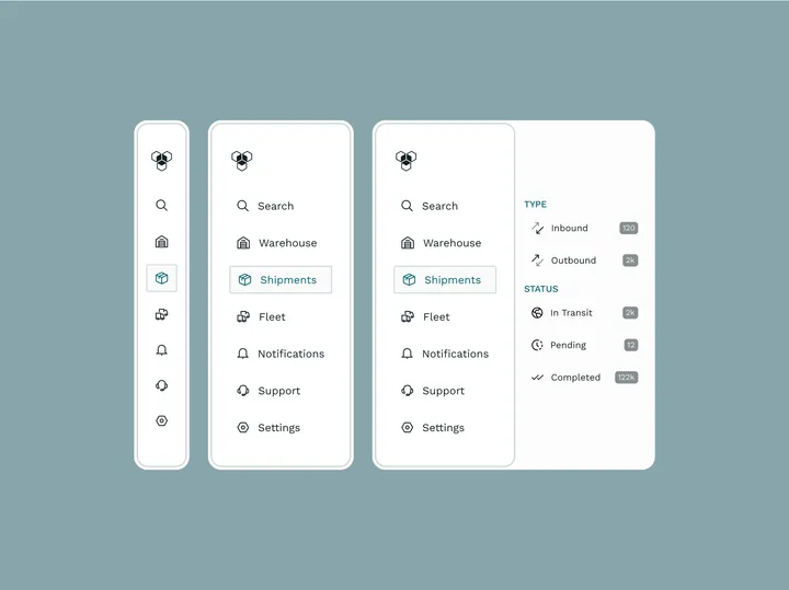
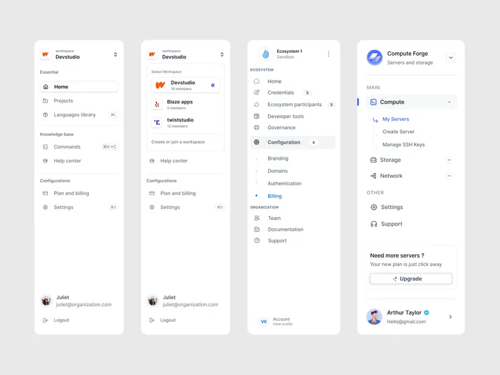
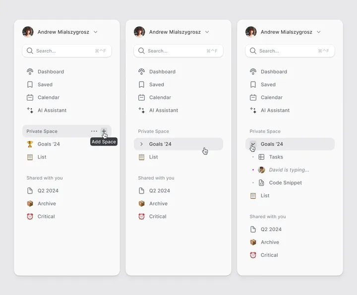
Sidebar Navigation Patterns — I'm excited to share another design pattern with you all!
This one includes nested menu elements and emphasizes clarity in the current state.
Enjoy and follow for more content.
Need assistance with your product?
Let's connect!
#design #dashboard #saas
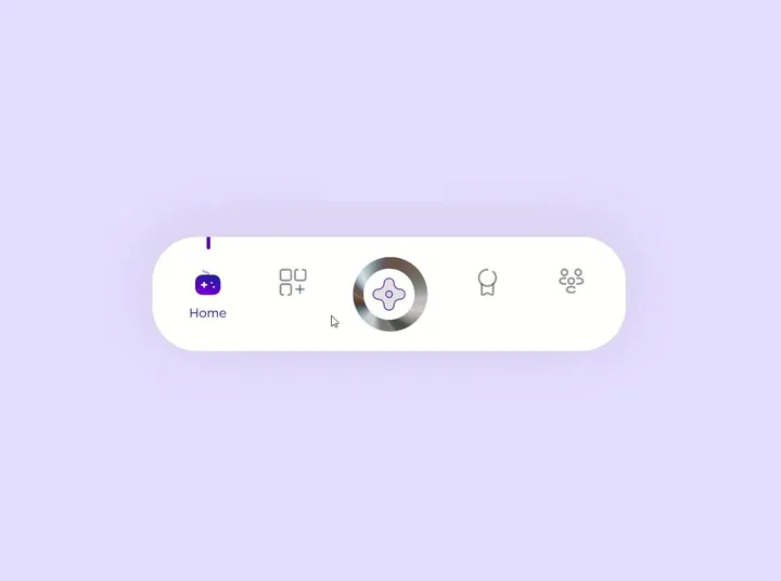
Proximity menu concept — The best click is no click. Before you say it, yes, I know this would make the area under the menu unusable. No it will not work for mobile. This is a desktop app that where that area is void of anything. This would be used as a secondary navigation, primary is a different, keyboard centric element. The goal is to not have navigation take up visual noise, so the content of the app can be focused on.
Still debating using this, but I think if done correctly it could work well.

