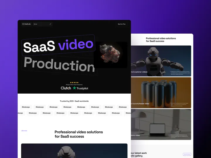
CineStudio SaaS Video Production Web Design — Hello Everyone!
CineStudio Agency Web Design is a comprehensive solution that meets the unique needs of SaaS video agencies, video production companies, new startups, solopreneurs, freelancers, and video agencies. With a focus on cutting-edge aesthetics, advanced functionality, and scalability, this template ensures your video services are showcased professionally while empowering your agency to operate seamlessly.
Key Features: ✣ Clean Design ✣ Fully Responsive ✣ 100% Customizable
✨ Update your visual experience with Grabui!
Explore More: grabui.com/product/cinestudio
#uiux #website #webtemplate
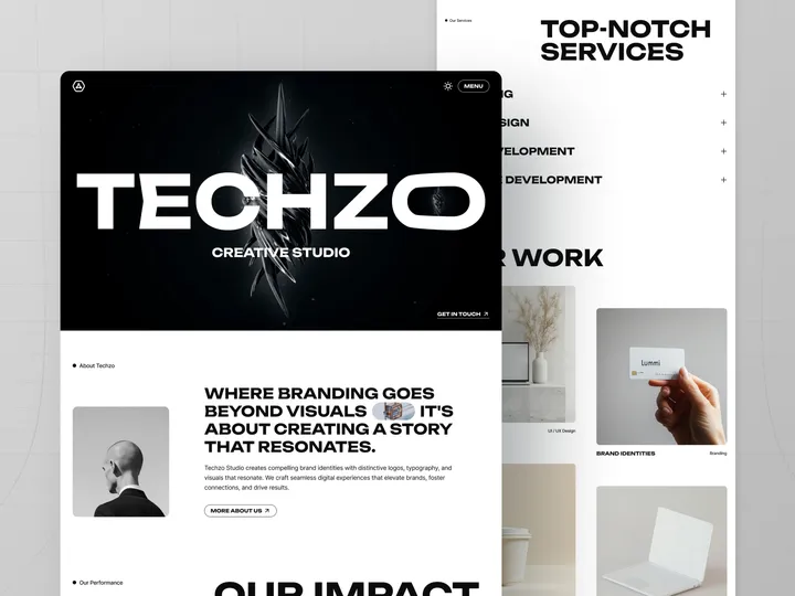
Techzo Digital Agency Web Design — 𝐇𝐞𝐥𝐥𝐨 𝐄𝐯𝐞𝐫𝐲𝐨𝐧𝐞!
Techzo is a web design solution that helps your IT agency stand out in a competitive market. Designed specifically for agencies specializing in digital solutions, Techzo enables you to showcase your branding, UI/UX design, web development, and no-code development expertise. With its sleek and user-friendly design, this template offers powerful features that make it easy to present your agency’s services and skills captivatingly, attracting potential clients.
Key Features: ✣ Clean Design
✣ Fully Responsive
✣ 100% Customizable
✣ Simple booking process
✣ SEO-optimized design
✨ Update your visual experience with Grabui!
Explore More: grabui.lemonsqueezy.com/checkout
#uiux #webdesign #wfc
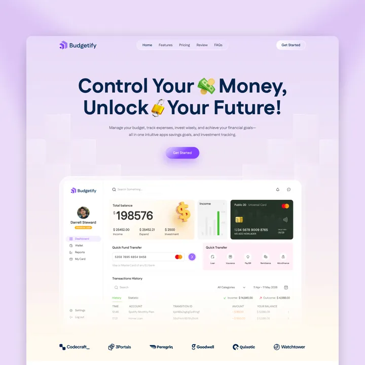
Launch Your Finance or SaaS Business in Minutes — Budgetify – an Officially Approved Framer Template!
Limited-Time Offer: Use code BUDGETIFY25 to get 25% OFF
Budgetify is a modern, high-converting Framer template designed for budgeting apps, fintech startups, and financial consulting services. With a clean layout, smooth animations, and interactive elements, it delivers a seamless user experience that builds credibility and drives conversions.
Key Features:
✔ No-Code Customization
✔ SEO-Optimized
✔ Conversion-Focused CTAs
✔ Smooth Animations & Interactivity
✔ Framer CMS Integration
✔ Fast Loading Speed
👉 framer.com/marketplace/templates/budgetify
#framer #fintech #saas
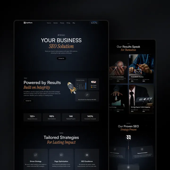
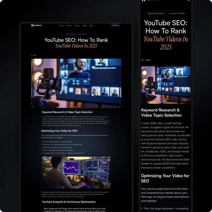
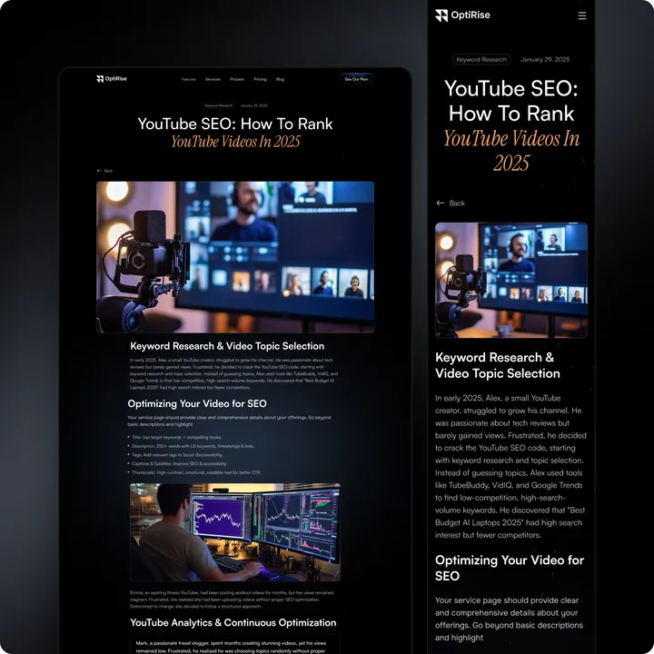
OptiRise – The Webflow Approved Design — Your SEO and marketing agency needs more than just a good-looking website — it needs one that drives results. OptiRise is a high-performance Webflow template built to help you scale with ease.
🔍 SEO-Optimized – Built-in best practices to boost your rankings faster
🎯 Lead-Focused Design – Proven layouts that convert visitors into clients
✨ Client-Ready Look – Professional, clean design to showcase your services and portfolio
🔗 Tool-Friendly – Seamlessly integrates with CRMs, analytics, and marketing tools
⚡ Quick Launch – Fully customizable with zero coding required
👉 Start growing today: shm.to/OptiRise-29-04-2025
#seoagency #webflowtemplate #leadgeneration
LaundrEase — Create a clean, modern online presence with LaundrEase!
Easily showcase your services, pricing, and booking options — all in one sleek, SEO-friendly template.
✅ Fully customizable
✅ Mobile-optimized
✅ Built to convert
Perfect for laundromats, dry cleaners, and pickup & delivery services.
👉 Live Preview: shm.to/laundrease18052025
#laundrymadeeasy #laundrease #framertemplate
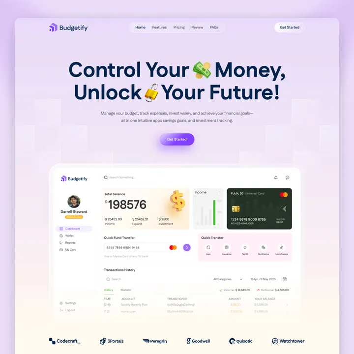
Budgetify is Now Live on Webflow! — A clean, high-performance website template built for finance startups, SaaS platforms, and tech businesses ready to grow.
Launch quickly, impress professionally, and drive conversions—without writing a single line of code.
🔑 Key Features
✔ Fully customizable with Webflow
✔ SEO-optimized for better visibility
✔ Conversion-focused CTA sections
✔ Smooth animations & interactive elements
✔ Webflow CMS for easy content updates
✔ Fast, responsive, and mobile-ready
👉 Explore Budgetify on Webflow: dub.sh/budge-WEB
#webflowtemplate #saaswebsite #fintechdesign
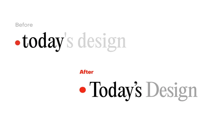
Today's Design logo — Great to see a new site enter the fray. To celebrate the inauguration of the site, I'll evaluate its logo.
I can see what @giel is attempting to do here with the logo, turn the "today" into a sort of implicit UI element in the form of a day indicator. I observe that he wants to center the circle with the x-height, in that the evenness of the height lends itself to the centered red indicator.
But day indicators of this sort, especially in this context would seem to call for title case or sentence case. Moreover, elsewhere in the UI, headings set in PP Editorial New are set in sentence case.
In this subtle revision, I've cleaned up the kerning, adopted title case, and used a matching ellipse rather than a standard circle, which comes off as somewhat generic. Most importantly, I've used a curly quote rather than the straight quote used which is an incorrect usage, and curly quotes look more elegant to boot.
Cheers to Giel on the launch.
Bento for Kaudas — Visual Brand concept created for Kaudas, a fresh new dog food company.
With its playful, layered, custom typography and clean design, the brand conveys the deliciousness and joy awaiting your furry best friend at every meal.
#visualidentity #bento #packaging
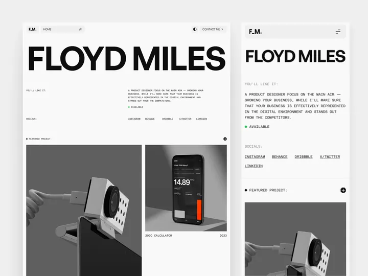
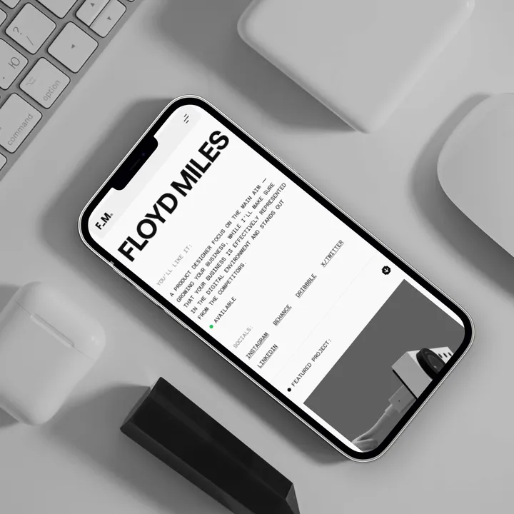
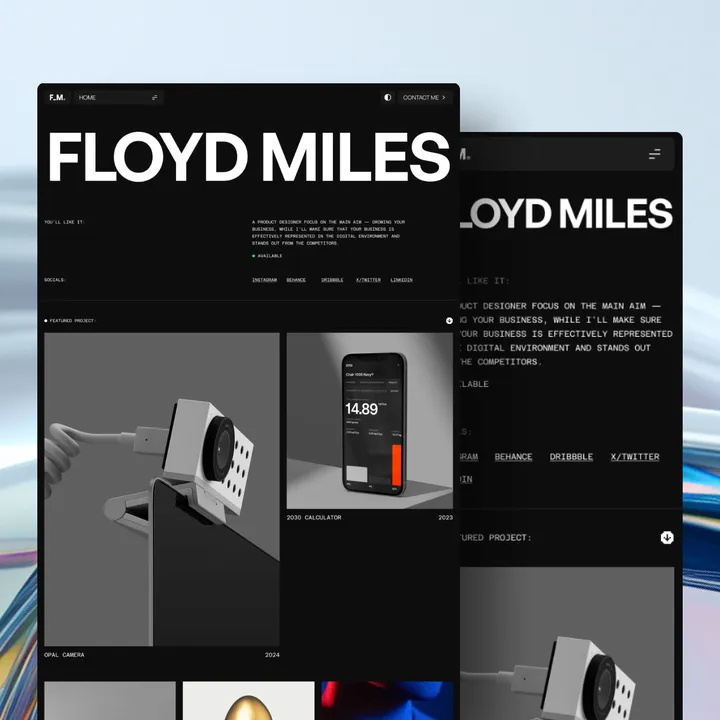
Floyd Miles Designer Portfolio Template Light — Discover the perfect blend of simplicity and sophistication with our 𝗙𝗹𝗼𝘆𝗱 𝗠𝗶𝗹𝗲𝘀 𝗣𝗼𝗿𝘁𝗳𝗼𝗹𝗶𝗼 𝗧𝗲𝗺𝗽𝗹𝗮𝘁𝗲. Tailored for designers who appreciate clean lines and a modern aesthetic, this template offers an elegant platform to showcase your work.
Whether you're a designer or a creative professional, this template provides a minimalist backdrop that highlights your portfolio without distraction.
#website #uiux #websitetemplate
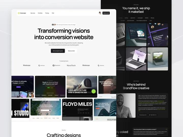
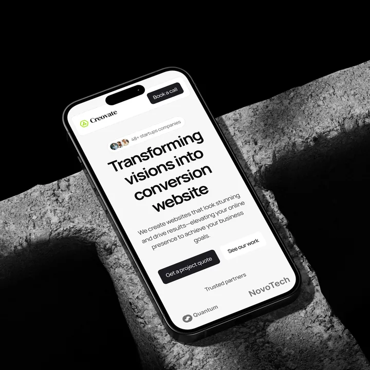
Creovate — Creative Agency Website Template — Hello Everyone!
Creovate is the ultimate template for forward-thinking design agencies, freelancers, and creative businesses. Perfect for building custom landing pages, full website templates, and dynamic portfolios, Creovate empowers you to craft visually stunning and high-performing websites with ease. Built with modern design principles and user experience in mind, Creovate offers the flexibility, functionality, and aesthetics needed to showcase your creativity and expertise. Whether you’re displaying client work, promoting your agency, or launching digital products, this template ensures your online presence stands out. With powerful customization tools, user-friendly features, and a sleek design, Creovate transforms ideas into impactful digital experiences.
Key Features:
✣ Clean Design
✣ Fully Responsive
✣ 100% Customizable
✨ Update your visual experience with Grabui!
Explore More: grabui.com/product/creovate
#uiux #website #websitetemplate
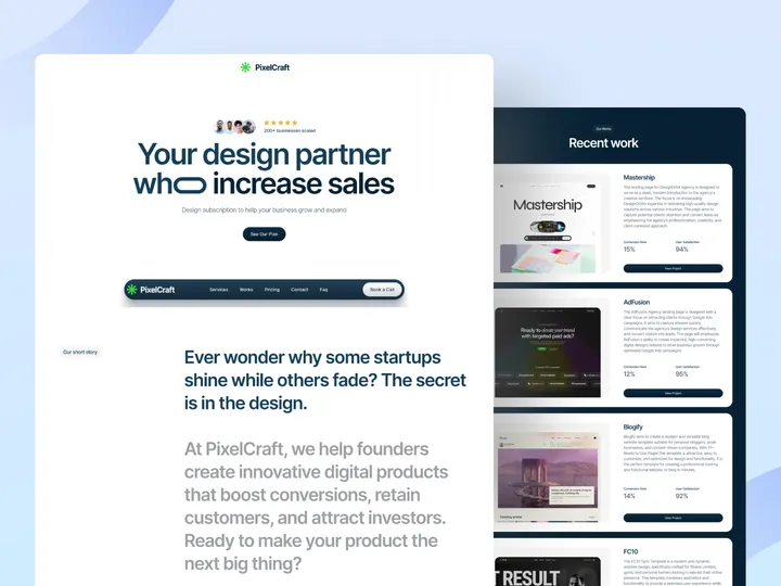
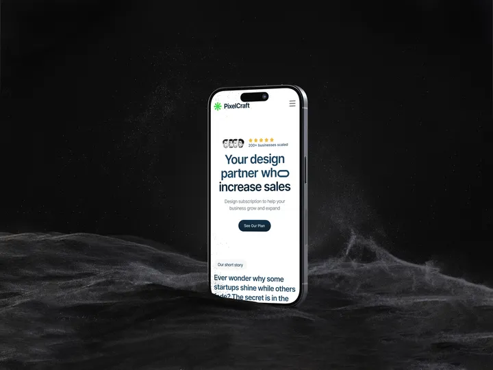
PixelCraft — Agency Landing Template — Hello Everyone!
PixelCraft Agency landing page Template offers a new design subscription service for businesses that need reliable, ongoing creative help. It highlights the benefits of PixelCraft’s approach—flexibility, affordability, and regular access to quality design. The page aims to provide an easy experience, showing how businesses can get unlimited design support without traditional agencies' high costs or delays. Clear calls to action prompt visitors to subscribe, making it simple to meet their design needs.
Key Features: ✣ Clean Design ✣ Fully Responsive ✣ 100% Customizable
✨ Update your visual experience with Grabui!
Explore More: grabui.com/product/pixelcraft
#uiux #website #websitetemplate
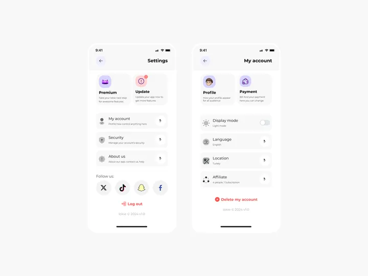
Settings Page for Mobile App - Lokie App — ◑ Design Elements:
Clean Layout: The screens maintain a clean and organized layout, ensuring clarity and ease of use.
Consistent Typography: The use of consistent fonts and font sizes enhances readability.
Iconography: Icons represent various settings and categories, aiding quick recognition.
Color Scheme: The light mode employs a soft color palette, reducing eye strain. #appdesign #figma #settings
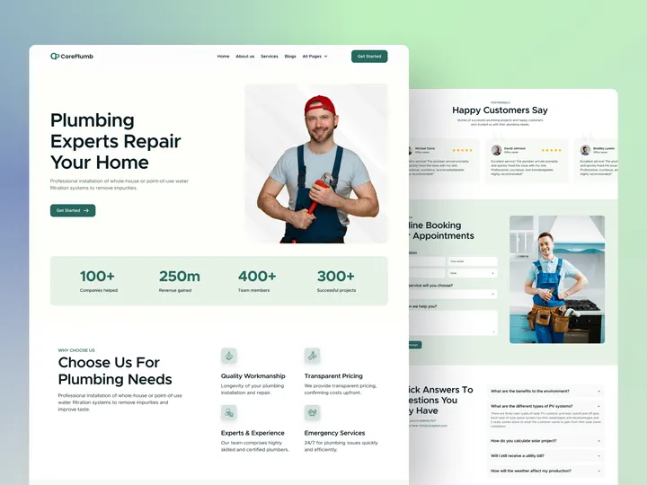
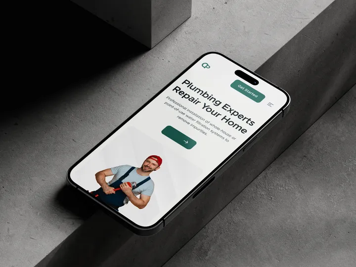
Coreplamb Plumbing Agency Website Template — Hello Everyone!
Coreplumb is designed to help plumbing companies easily build a strong online presence. Whether you're a local plumber or a large-scale service provider, this template is crafted to showcase your expertise and attract more clients.
Highlight your services, including plumbing inspections, backflow prevention, whole-home water filtration systems, and more. Coreplumb makes it simple to display your solutions—outdoor plumbing, gutter cleaning, plumbing supplies, and standard plumbing services—all in one sleek, professional design.
With this modern Webflow/Farmer template, position your business as the go-to expert for backflow prevention devices, reliable gutter cleaning, and comprehensive plumbing solutions.
✨ Update your visual experience with Grabui!
Explore More: grabui.com/product/core-plumb
#uiux #website #websitetemplate

