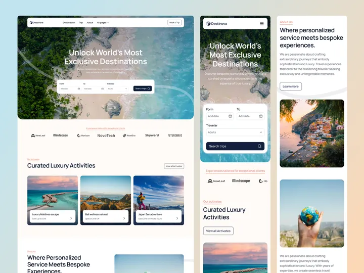
Destinova Travel Agency Web Design — Hello Everyone!
Destinova Travel Agency Web Design sets a new standard for travel agency websites by combining beautiful design with easy-to-use features. This creates a great user experience with stylish visuals, simple navigation, and interactive elements that inspire travel.
Destinova offers customized tours and travel packages that are perfect for luxury and corporate travel professionals. It works well for showcasing unique trips, destinations, and special offers. For these reasons, it’s the best choice for any online travel agency, providing an attractive web presence.
✨ Update your visual experience with Grabui!
Explore More: grabui.com/product/destinova
#uiux #travelwebsite #webdesign
Design Dissolve | Symbol Construction — The Keep Up Agency logo was developed with the aim of representing the strategic stages of the agency's services. The symbol is made up of three arrows that form a figure similar to a target, symbolizing the setting of goals and obtaining results. Each arrow represents a key element: strategies, tactics and objectives, culminating in a central target that illustrates the focus on results and success. The sans-serif typography chosen for the logo complements the symbol, ensuring a timeless and balanced appearance.
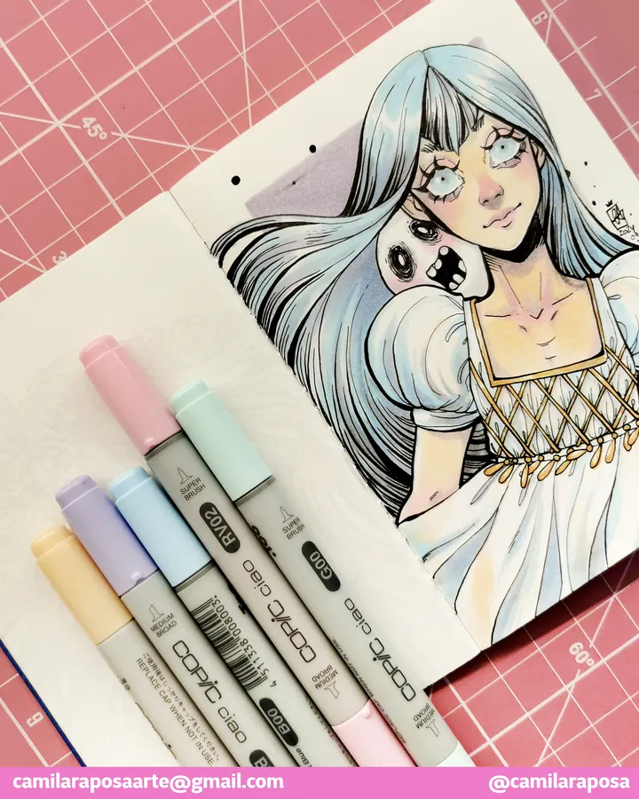
✨Delphina of the Dead✨ — A dream come true! Finally able to work with my Copic set. Copic was my childhood dream, always looking those mangaká using them on their official art.
Now is my turn!
Do you have any other OC in mind for me to test these on?
#copicmarkers
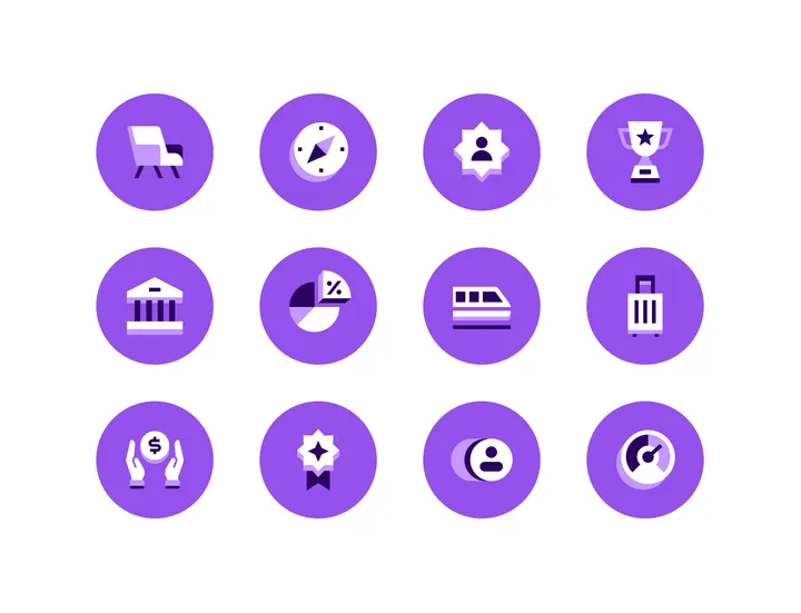
Rippling Badge Icons — Recent set of Badge Icons that I designed for awesome people over at Rippling.
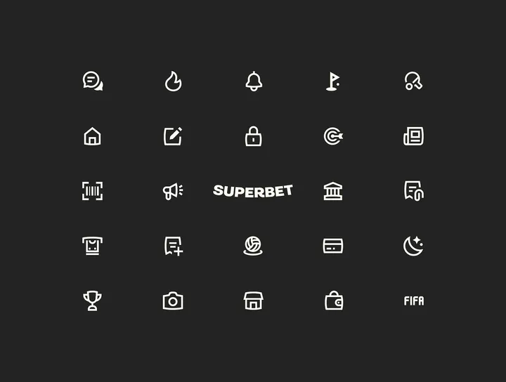
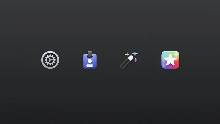
Settings Icons for Helm — For my latest app, Helm (helm-app.com), I decided to jump back on this older style. I might tweak the icons, but I'm happy with the style and direction.
Also, first post on here! Great job @giel, for bringing the design community back to the days when Dribbble was still fun :)
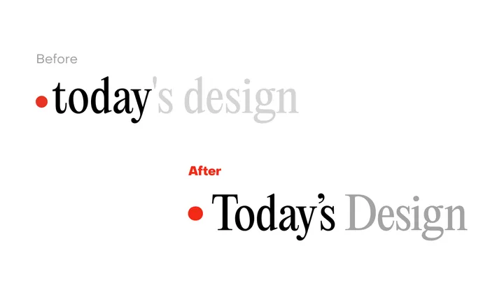
Today's Design logo — Great to see a new site enter the fray. To celebrate the inauguration of the site, I'll evaluate its logo.
I can see what @giel is attempting to do here with the logo, turn the "today" into a sort of implicit UI element in the form of a day indicator. I observe that he wants to center the circle with the x-height, in that the evenness of the height lends itself to the centered red indicator.
But day indicators of this sort, especially in this context would seem to call for title case or sentence case. Moreover, elsewhere in the UI, headings set in PP Editorial New are set in sentence case.
In this subtle revision, I've cleaned up the kerning, adopted title case, and used a matching ellipse rather than a standard circle, which comes off as somewhat generic. Most importantly, I've used a curly quote rather than the straight quote used which is an incorrect usage, and curly quotes look more elegant to boot.
Cheers to Giel on the launch.
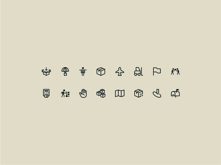
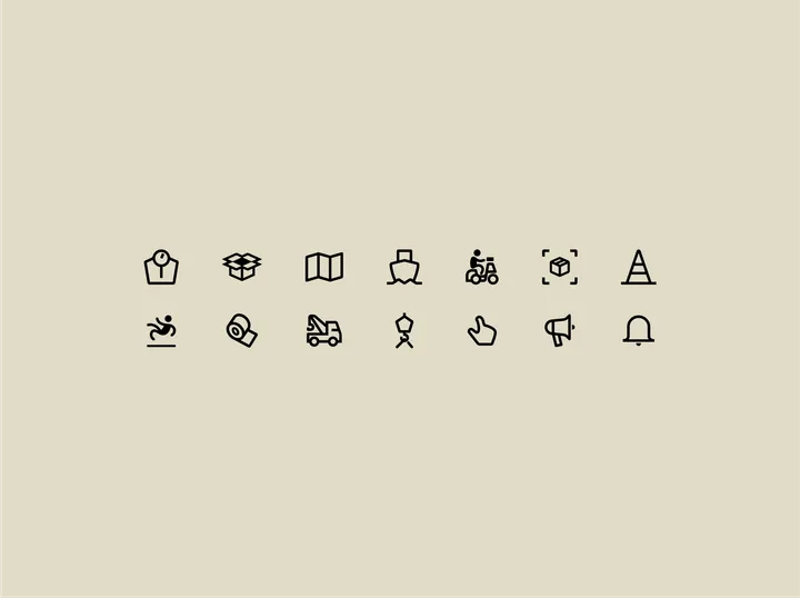
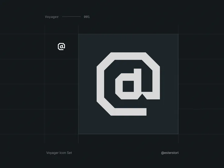
Voyager Icon Set — I needed icons for a project, but none that I could find scratched my itch. Some did, but the sets were incomplete at best.
So, I decided to try and start making my own! Has been quite a journey so far, I have been enjoying the minutia a lot more than I anticipated, even if it's frustrating at times.
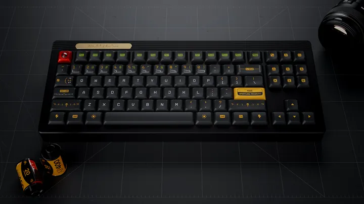
Working on kitting for a new keycap set — With Gestalt production finish I am working on my next keycap set, inspired by vintage photography and vintage photography lens hence the name Aperture Priority. This set was designed in Figma and I created a custom legends based on a monotype technical typeface. I also included familiar photography UI elements as novelty keycaps. #3d #mechanicalkeyboard
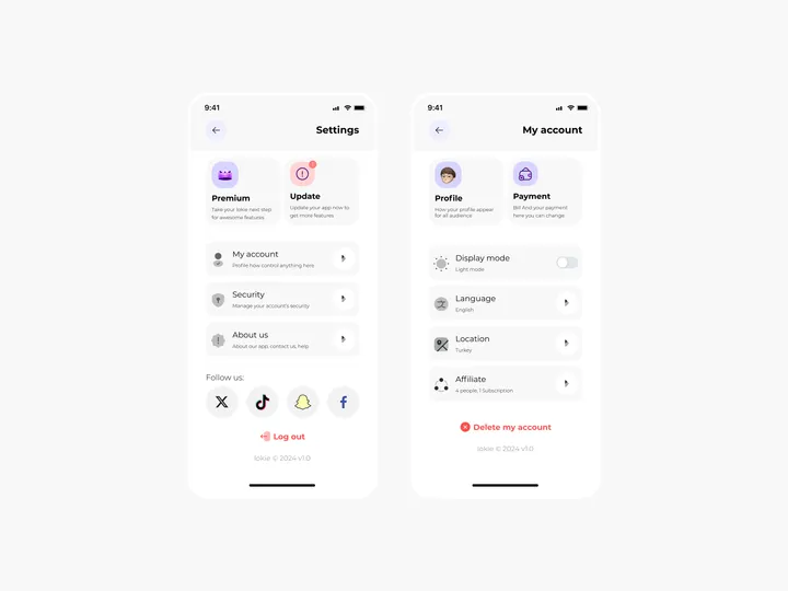
Settings Page for Mobile App - Lokie App — ◑ Design Elements:
Clean Layout: The screens maintain a clean and organized layout, ensuring clarity and ease of use.
Consistent Typography: The use of consistent fonts and font sizes enhances readability.
Iconography: Icons represent various settings and categories, aiding quick recognition.
Color Scheme: The light mode employs a soft color palette, reducing eye strain. #appdesign #figma #settings

