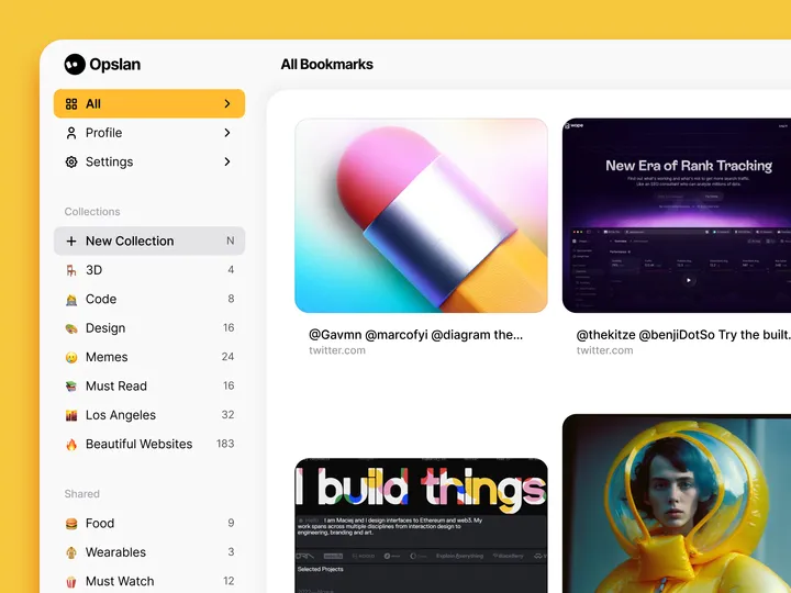
Opslan — Hi all 👋, I wanted to share Opslan, a bookmarking app I designed a while ago to help you easily save and rediscover websites that inspire you. It never saw the light, but I still feel it could be relevant. As a designer, I aimed to create a tool that combines a visually appealing interface with powerful search capabilities. With Opslan, you can archive your favorite sites and keep them well-organized for future reference, all without the clutter of traditional bookmarks. #web #website

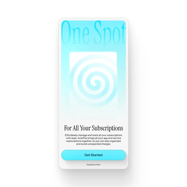
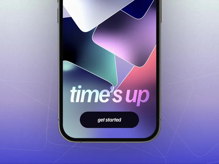
Hypnotic welcome screen for Time's Up game — Just peacefully moving cards for a gentle, calm animation ✨ #app #onboarding #animation

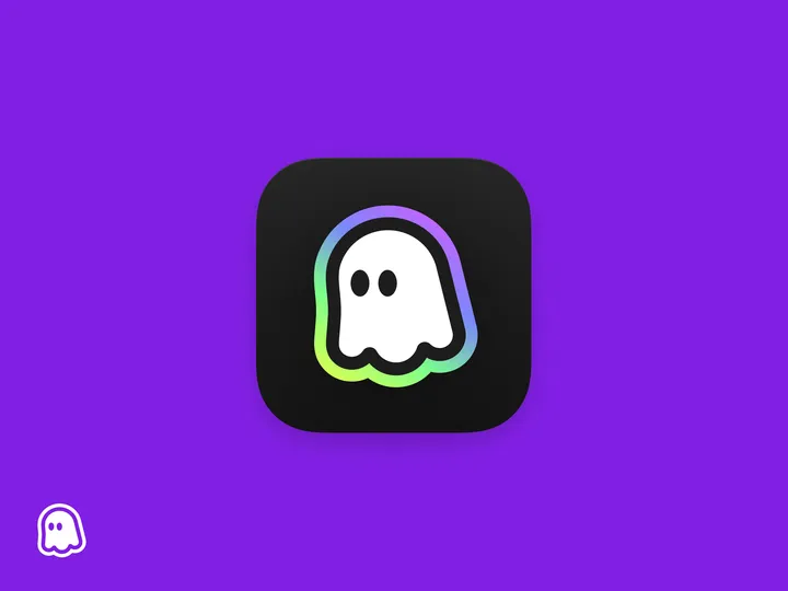
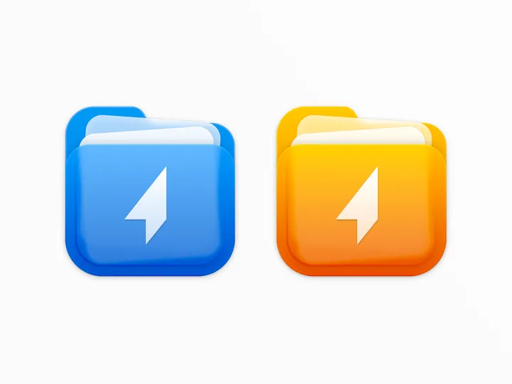
Shuttle icon — For the shuttle.zip project, I designed a two-color icon that combines the shapes of a folder and documents, while maintaining a square form to align with macOS app icon standards. #icon #macos

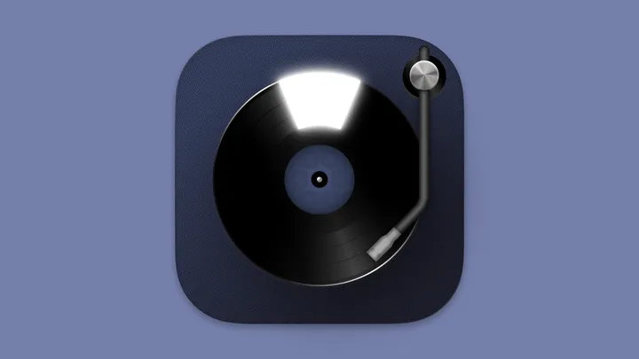
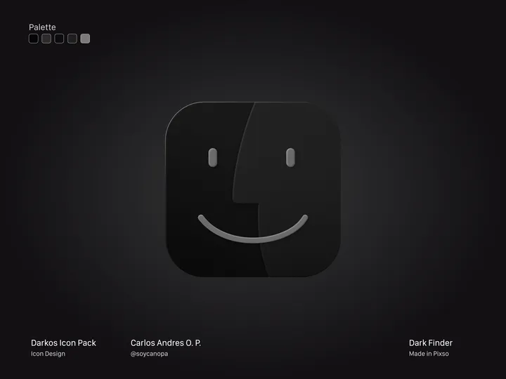
Finder Dark Version — Hey Hey Hey 👋, And this is how the first icon turned out, in this case, the Finder from my #icon pack in progress called DarkOS or DarkMaul; I still haven't decided on the name. It's a true dark version of many #apps icons in #macos Version 1.0 will have around 50 initial icons, but I plan to add more later.

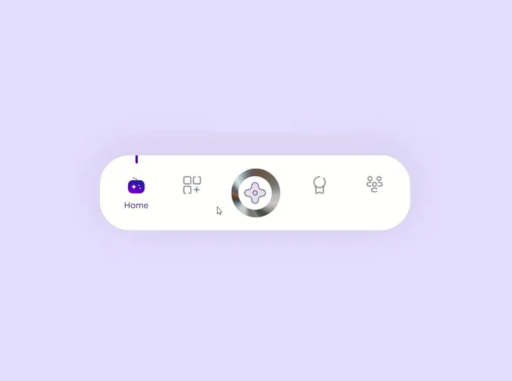
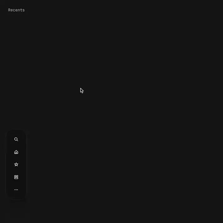
Proximity menu concept — The best click is no click. Before you say it, yes, I know this would make the area under the menu unusable. No it will not work for mobile. This is a desktop app that where that area is void of anything. This would be used as a secondary navigation, primary is a different, keyboard centric element. The goal is to not have navigation take up visual noise, so the content of the app can be focused on. Still debating using this, but I think if done correctly it could work well.

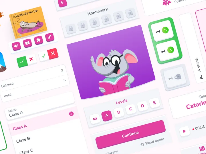
Design toolkit visual revamp — For a reading app that aims to develop reading habits and comprehension in children from kindergarten to elementary school utilizing technologies. #app #mobile #illustration

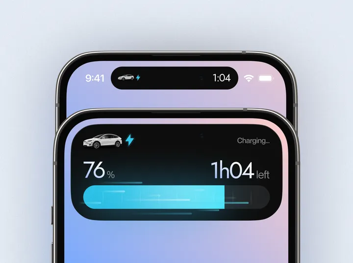
Dynamic Island exploration - Electric car app ⚡️ — I would love to have this kind of Dynamic Island while my car is charging 👀 #dynamicisland #app #design

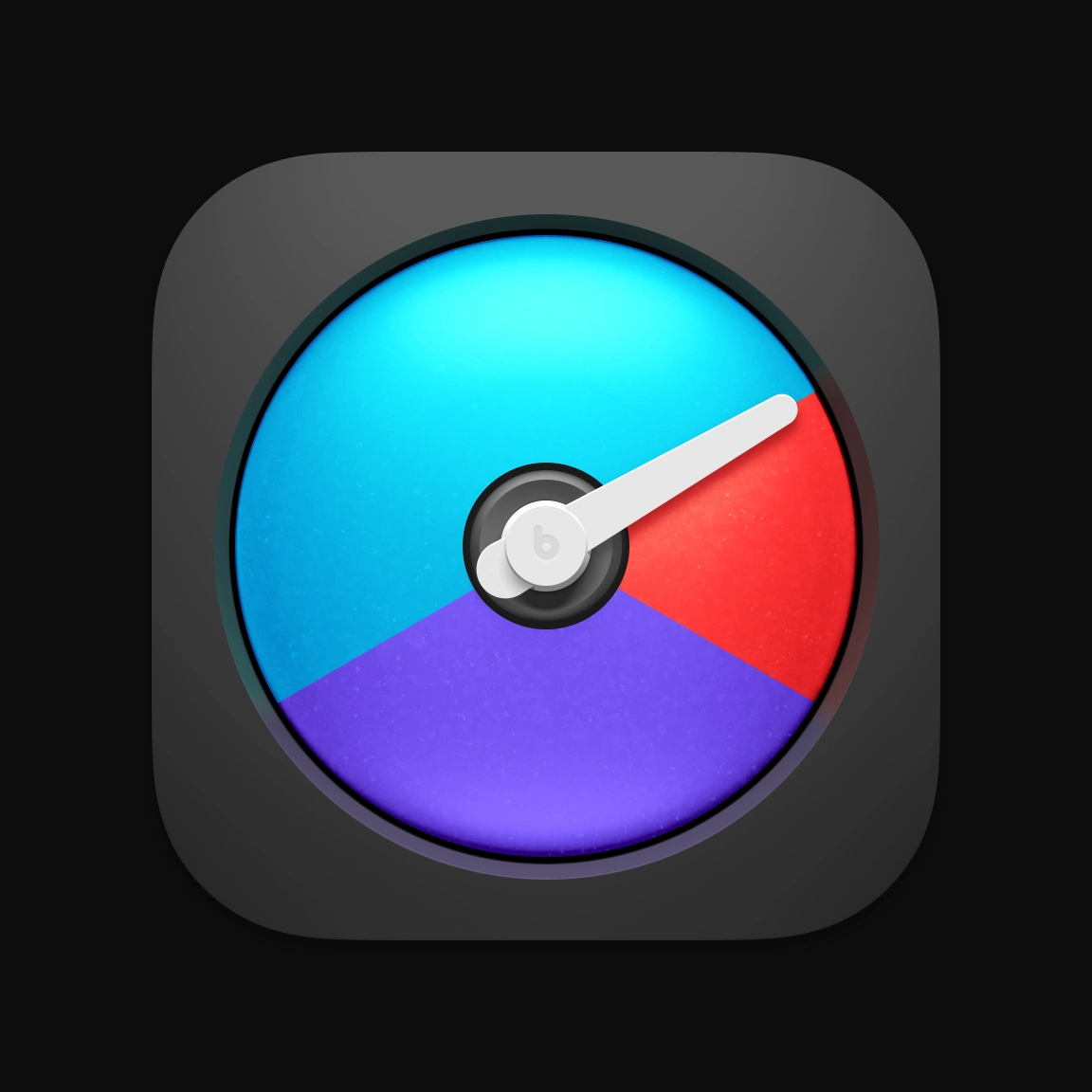
iStat Menus 7 app icon — We’re busy working on finishing the next major update for iStat Menus. The app icon is all done though. #icon #appicon #mac

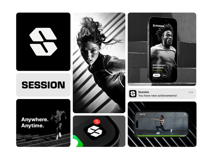
Session Brand Identity Bento — Session is an upcoming fitness app that will revolutionize how people exercise. The goal is to make your workouts more productive and effective with 20-30-minute sessions. All exercises are designed using body weight and basic equipment only. Based on your feedback, the app uses an AI system to create workout plans designed specifically for you. #logo #branding #appdesign

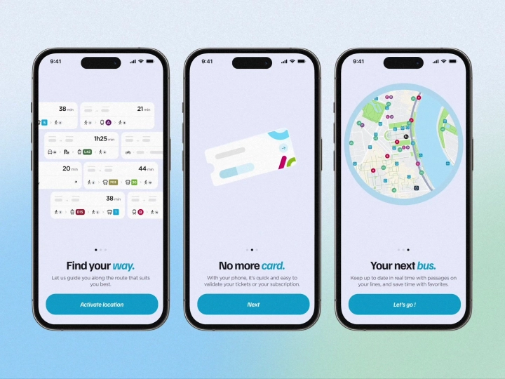
Onboarding animated screens — Onboarding animations for a navigation app, made with Rive ✨ #onboarding #animation #app

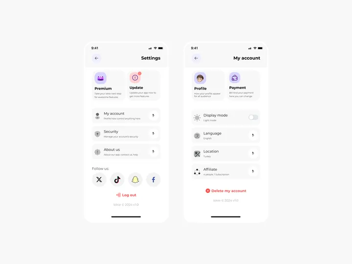
Settings Page for Mobile App - Lokie App — ◑ Design Elements: Clean Layout: The screens maintain a clean and organized layout, ensuring clarity and ease of use. Consistent Typography: The use of consistent fonts and font sizes enhances readability. Iconography: Icons represent various settings and categories, aiding quick recognition. Color Scheme: The light mode employs a soft color palette, reducing eye strain. #appdesign #figma #settings

