Rick Wong
Design Engineer in Amsterdam
Obsessed with progress. Staying unpredictable.
- rick.codes
- Amsterdam
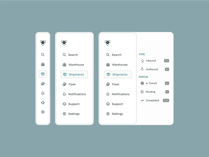
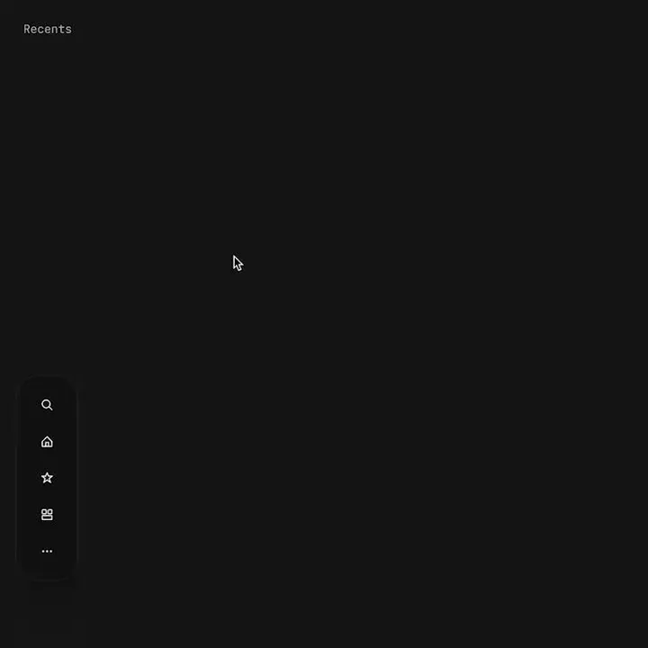
Proximity menu concept — The best click is no click. Before you say it, yes, I know this would make the area under the menu unusable. No it will not work for mobile. This is a desktop app that where that area is void of anything. This would be used as a secondary navigation, primary is a different, keyboard centric element. The goal is to not have navigation take up visual noise, so the content of the app can be focused on. Still debating using this, but I think if done correctly it could work well.

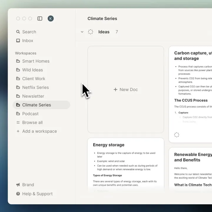
Get that sidebar justtt right — We just added re-arranging your sidebar in strut.so it's a small detail but builds on organizing your work the way you want.

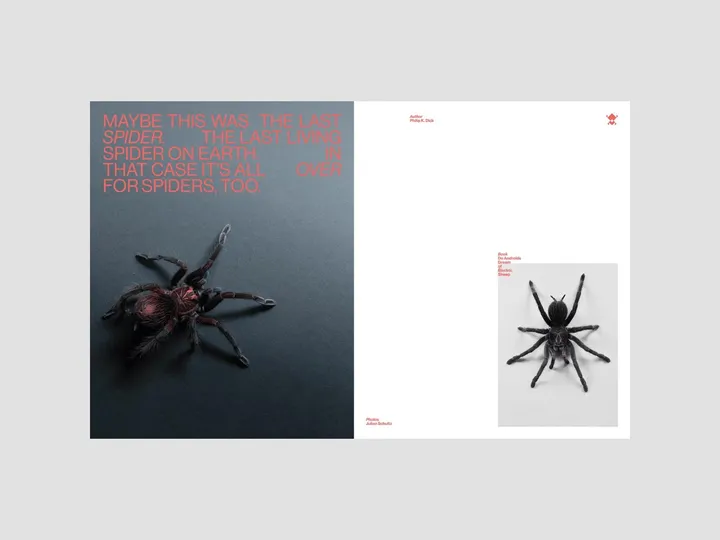
QUOTES#001 — Layout explorations through some famous QUOTES of popular sci-fi books that I have read and appreciated. ↳ Books: Do Androids Dream of Electric Sheep ↳ Author: Philip K. Dick ↳ ©Photos: Julian Schultz v/ unsplash

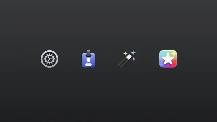
Settings Icons for Helm — For my latest app, Helm (helm-app.com), I decided to jump back on this older style. I might tweak the icons, but I'm happy with the style and direction. Also, first post on here! Great job @giel, for bringing the design community back to the days when Dribbble was still fun :)

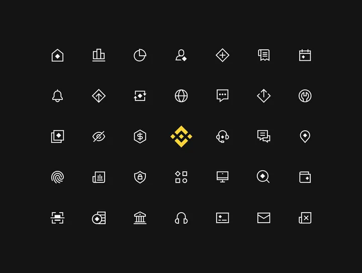
Binance — icon system that I designed for Binance See the case study here → dmitrilitvinov.com/p/UvFBALsB-binance-icons

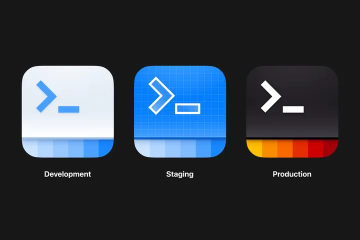
App icon — Icons for different environments for an internal iOS app used by hosts and crew. #appicon #illustration #appdesign

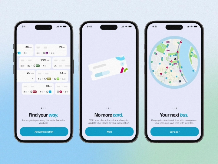
Onboarding animated screens — Onboarding animations for a navigation app, made with Rive ✨ #onboarding #animation #app

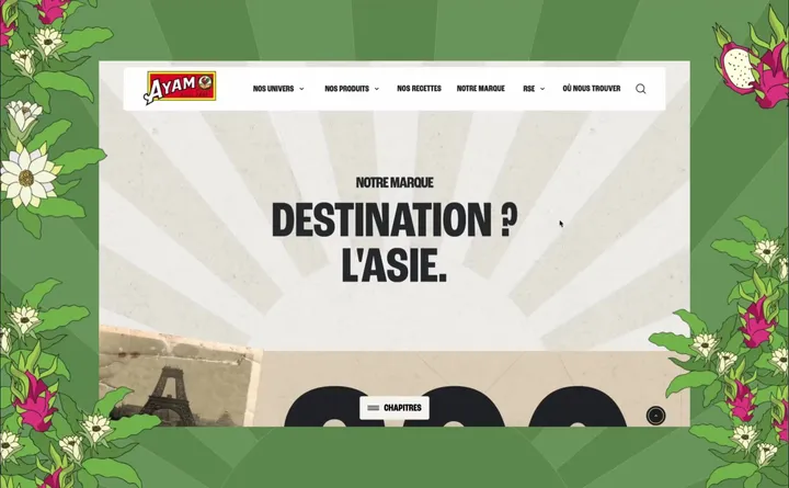
New Ayam™ — For several months, we have accompanied the Ayam™, a leader in Asian grocery, in the redesign of their french website. Our mission has been comprehensive, including the development of a new tone of voice and innovative artistic direction for the sector. #web #illustration #design

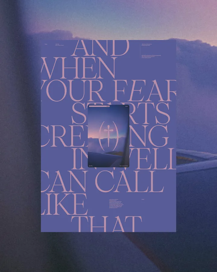
Halo Flip Poster — Poster, type & color exploration. Based on the lyrics from @vegynvegyn "Halo flip". Using @pangram.pangram Pangaia font. #poster #web #typography

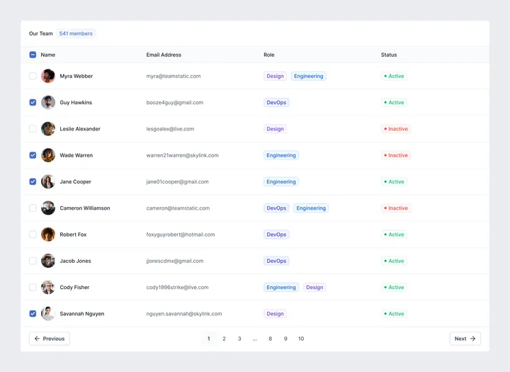
Simple Table UI — A dead-simple Table UI component made in #figma with components and variables. #webdesign #appdesign

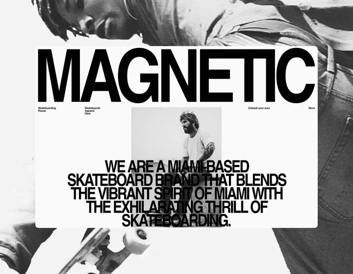
Magnetic — Skateboarding House — Layout and type explorations between projects. Magnetic is a fictional skateboard brand. #branding #web #exploration

