Funky, Bold lettering animation — Been designing a very, very bold typeface and animating it has been very satisfying

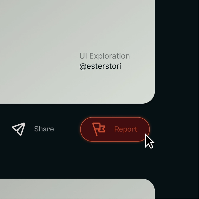
Report Button — Trying icons in actual UI work helps me understand if they do their job or not, much like here 👇

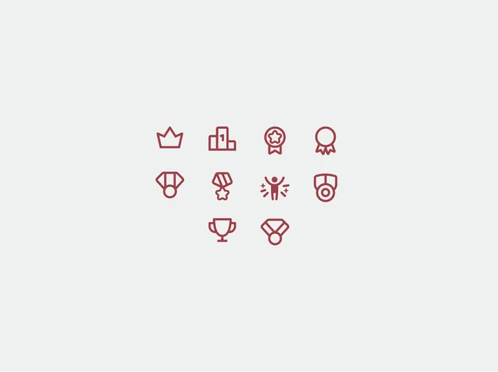
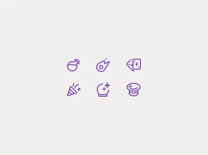
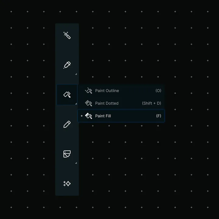
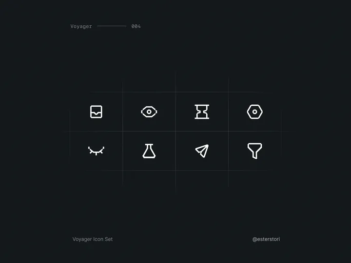
Assorted icons — Small varied assortment of my latest icons, to see if they all feel and look consistent

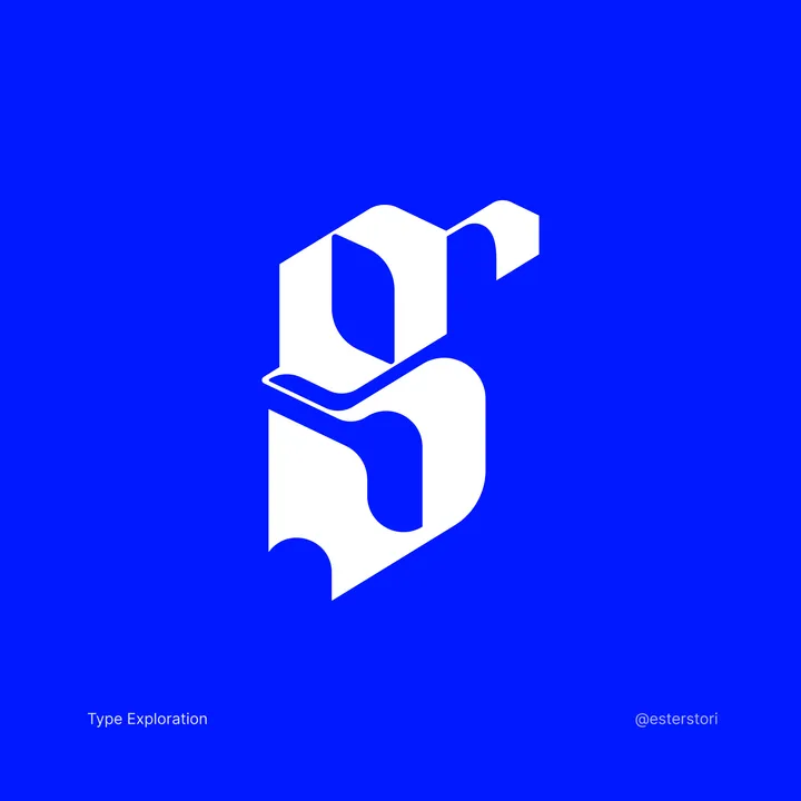
Letter G Typography exploration — First time in a while playing with type, it's always very challenging (and fun)

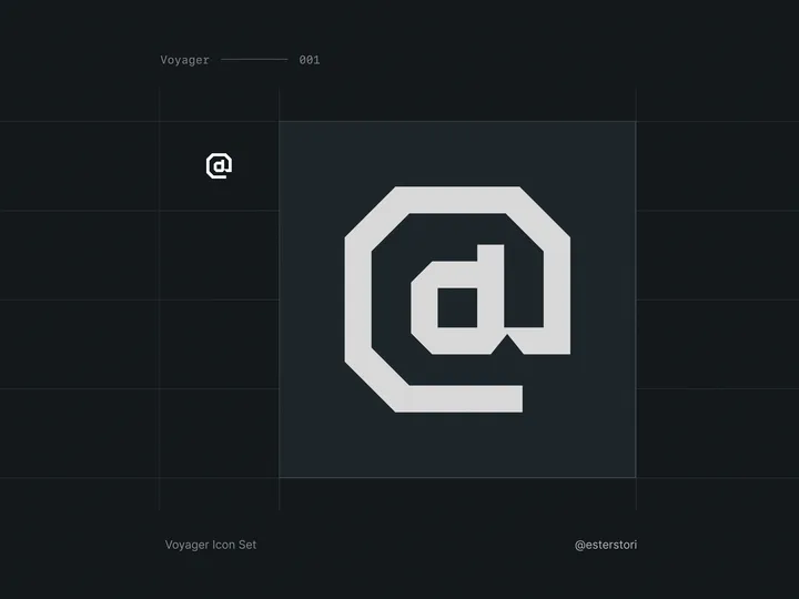
Voyager Icon Set — I needed icons for a project, but none that I could find scratched my itch. Some did, but the sets were incomplete at best. So, I decided to try and start making my own! Has been quite a journey so far, I have been enjoying the minutia a lot more than I anticipated, even if it's frustrating at times.

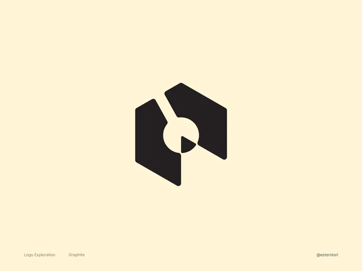
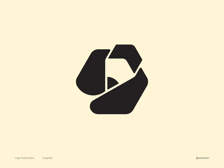
Graphite Logo Exploration #2 — An open-source and free design software made by very passionate volunteers. Similar to my first iteration, I decided on a slightly more abstract approach. I "carved" the pencil out of the hexagon. I think this makes for a really nice logomark/app icon! What do you all think?

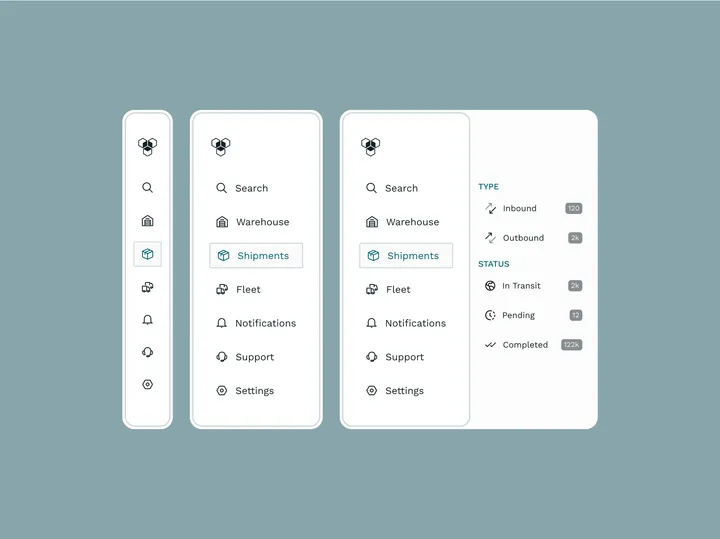
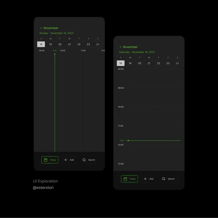
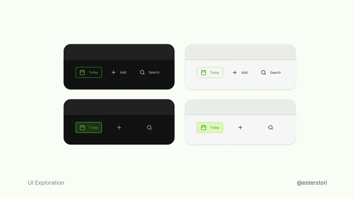
Calendar navbar variants — I have come to appreciate text a lot more, icons on their own can be unclear. Still worth iterating at times

Graphite Logo Exploration — An open-source and free design software made by very passionate volunteers. For this #logo , I wanted to nod to Graphite’s roots. The current logo features a pencil, which is a big favorite among the folks who contribute to the software. So, I made sure to keep that iconic pencil in my design by giving it a little twist. By playing with negative space, I not only kept the pencil but also introduced a node, which is a key part of Graphite’s features.

