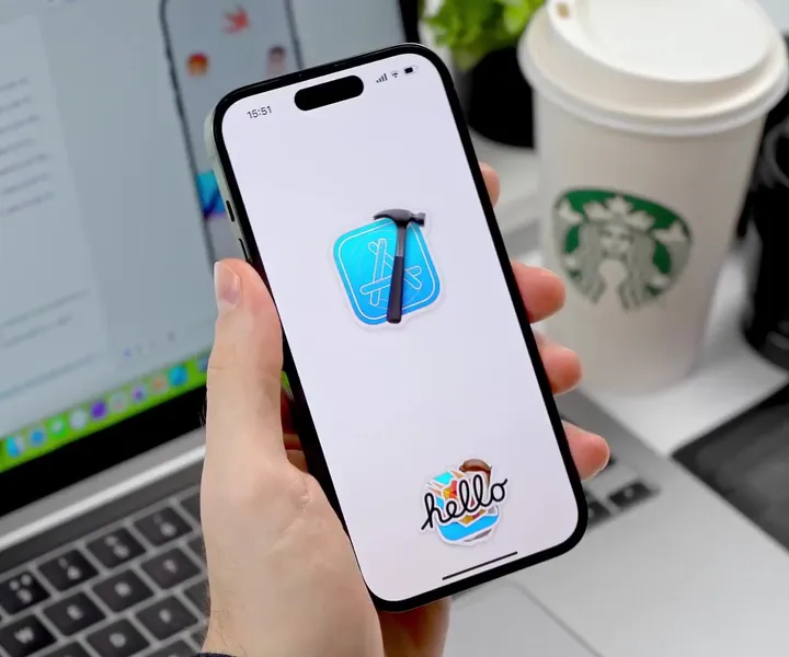
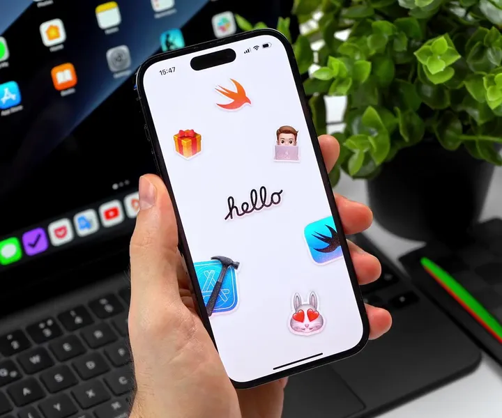
Sticker Wall – Creating holo effect in SwiftUI ✨ �— There were so many tiny things to consider when creating the holo effect, that I truly believe these details would have been impossible to prepare for in Sketch or Figma.
Details such as:
- using an additional dynamic white sparkle layer to create a compelling holo effect
- reacting to pitch/roll changes relative to various device positions (e.g. in hand, on table, etc.)
- resetting motion values when the device rests for more than 2 seconds with minimal motion
- keeping battery and performance in mind
- providing "dev/config" controls in context to tweak values just to feel right
Hope you'll find this post interesting! 🙌
#swiftui #concept #stickers
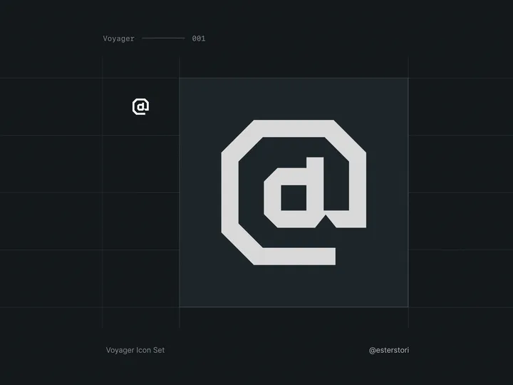
Voyager Icon Set — I needed icons for a project, but none that I could find scratched my itch. Some did, but the sets were incomplete at best.
So, I decided to try and start making my own! Has been quite a journey so far, I have been enjoying the minutia a lot more than I anticipated, even if it's frustrating at times.
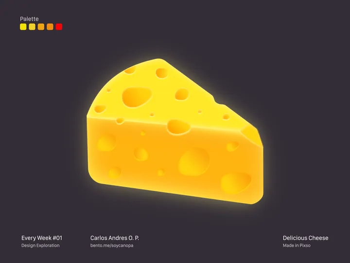
Delicious Cheese — Hey Hey Hey 👋, On weekends, it’s about doing illustration, this time it’s about a delicious cheese, the truth is that cheese is one of my weaknesses, in all its presentations.
This project was finished in Pixso, what do you think of the final result?
#pixso #illustration #uidesign
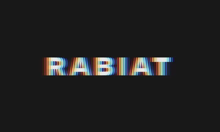
RABIAT — Made using Spline. Font is GT America Extended.
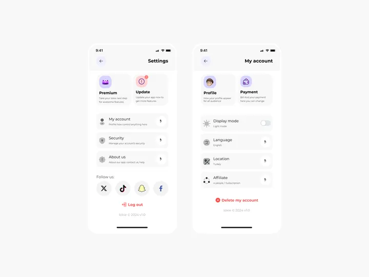
Settings Page for Mobile App - Lokie App — ◑ Design Elements:
Clean Layout: The screens maintain a clean and organized layout, ensuring clarity and ease of use.
Consistent Typography: The use of consistent fonts and font sizes enhances readability.
Iconography: Icons represent various settings and categories, aiding quick recognition.
Color Scheme: The light mode employs a soft color palette, reducing eye strain. #appdesign #figma #settings
Sticker Wall – Playing with SwiftUI 😍 — My first ever SwiftUI project trying to recreate Apple iMessage holo stickers ✨
Huge thank you for Philip Davis for his incredible course, Janum Trivedi and Alex Widua for the open source projects and Gavin Nelson for the inspiring prototypes! 🙌🔥
#swiftui #concept #stickers
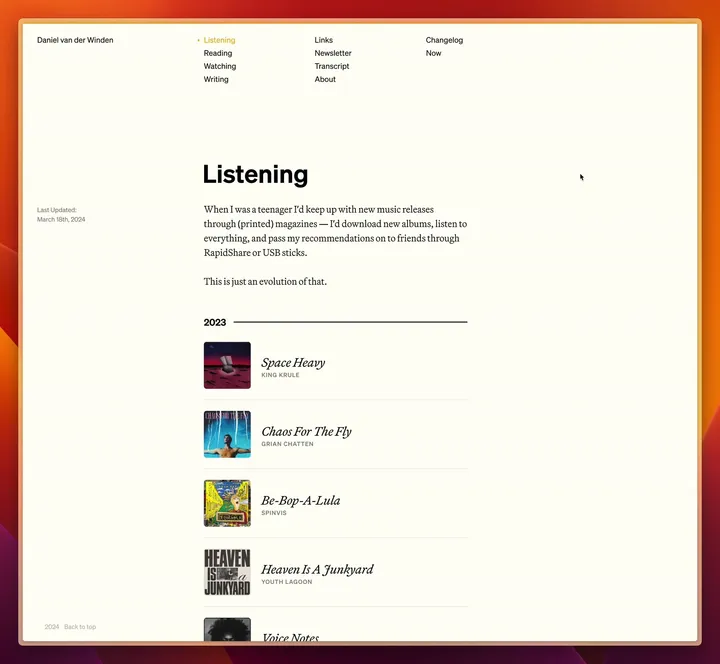
Personal website (v3) — Working on a new version of my personal website, on which I will make more space for my writing. Currently trialing Martina Plantijn and Söhne, two typefaces by Klim Type Foundry. Leaning towards keeping the former, but changing the latter.
It's going to be a while before this is out.
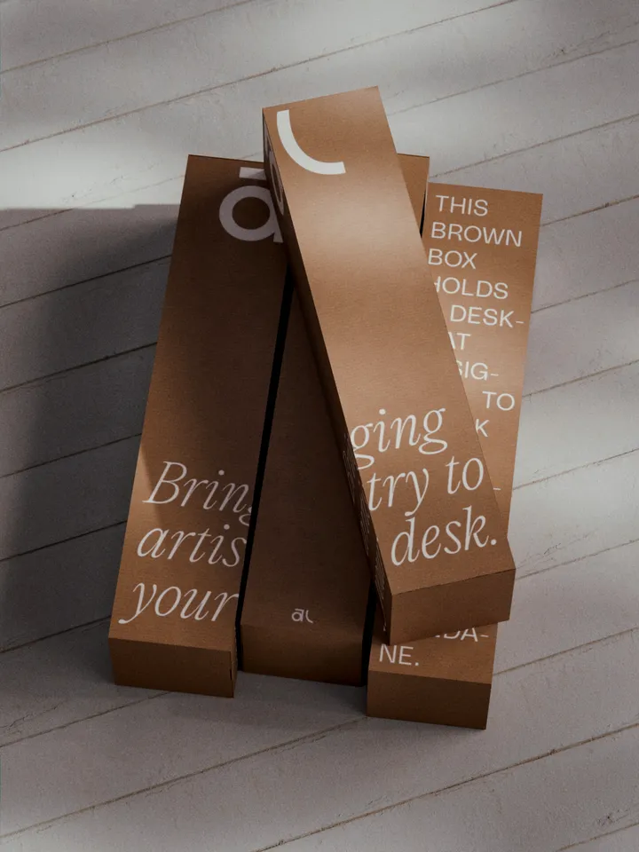
Akuko Labs Deskmat Packaging — Plain cardboard boxes are cheaper to produce, costing nearly half as much as fully printed boxes. I also find them more elegant, especially with white ink accents. Win-win. Designed in Figma, rendered in Blender.
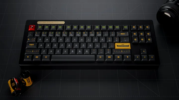
Working on kitting for a new keycap set — With Gestalt production finish I am working on my next keycap set, inspired by vintage photography and vintage photography lens hence the name Aperture Priority. This set was designed in Figma and I created a custom legends based on a monotype technical typeface. I also included familiar photography UI elements as novelty keycaps. #3d #mechanicalkeyboard
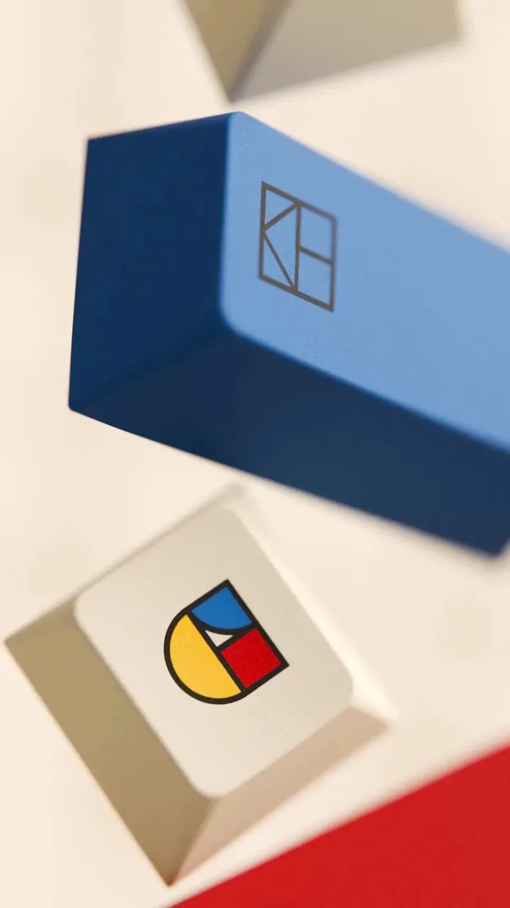
Bauhaus in motion… — I’m on a journey to up my 3D game so I came up with this scene, simulated the keycaps and rendered out this animation in Blender. A lot of art direction was involved to manipulate the simulation to ensure the G key would be consistently visible throughout the animation.
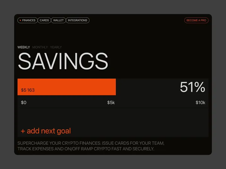
Brutal finance tracker — Check out our latest brainchild, the "Finance Tracker" app. This isn't your average budgeting tool—it's a design concept crafted in Figma and animated with Jitter, built to do more than just monitor your stash. It’s here to push your financial goals from dreams to reality with an interface so slick, it'll make your bank account look good.
#web #fintech #appdesign
SmashX logo — SmashX is a startup founded by an experienced team of market experts, software developers and designers. They develop white label mobile apps for various industries that help build brand engagement and facilitate the brand user in their daily work.
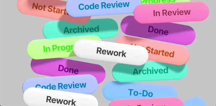
Dropping tags — I've been toying with the idea of creating an intro animation for an iOS project management app. The animation was rendered live using Spline3d.

