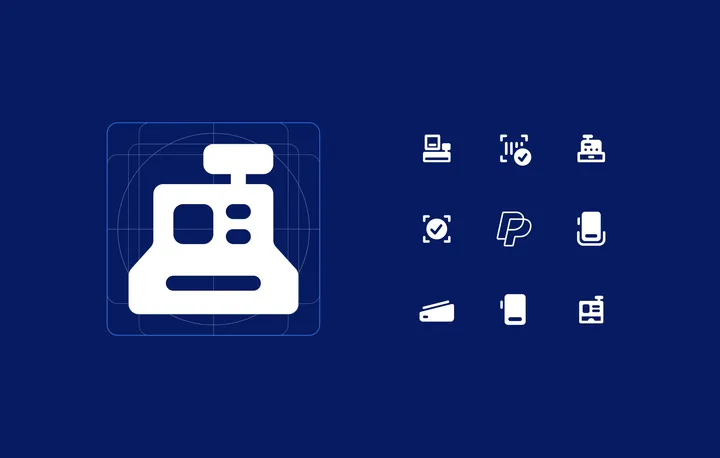
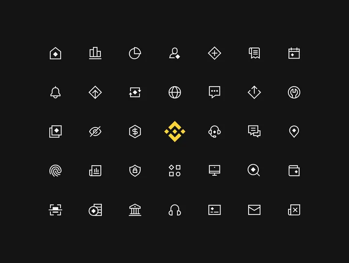
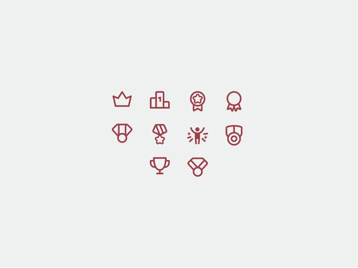
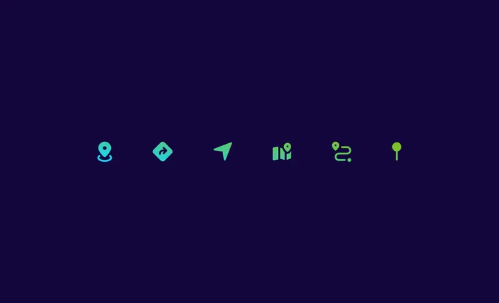
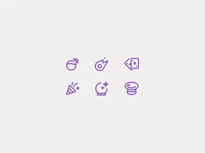
Binance — icon system that I designed for Binance See the case study here → dmitrilitvinov.com/p/UvFBALsB-binance-icons

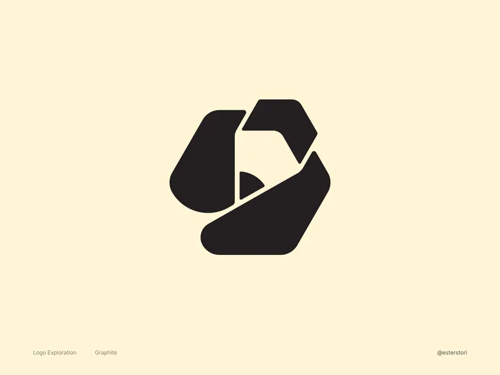
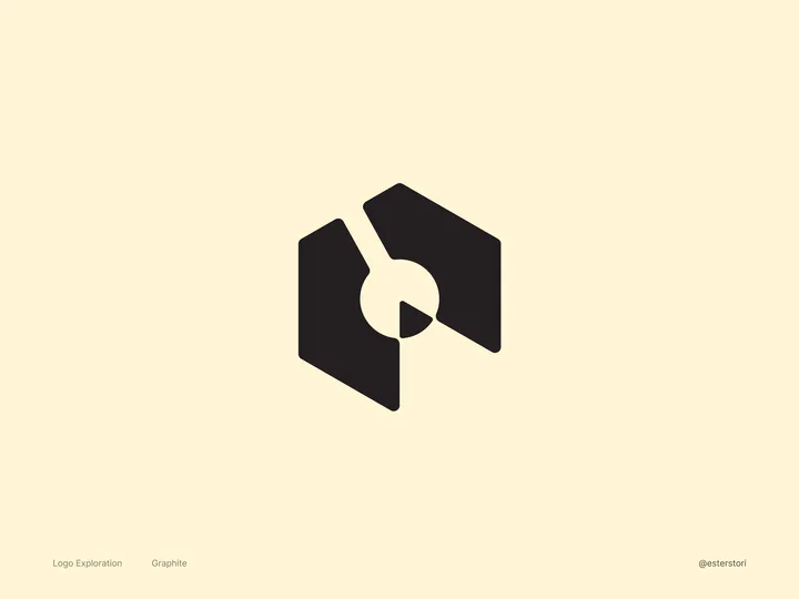
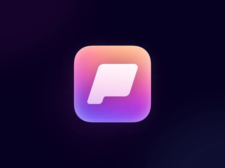
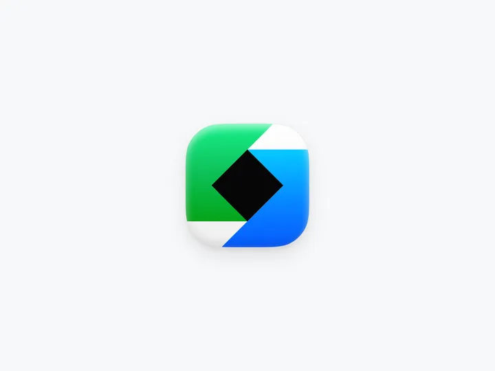
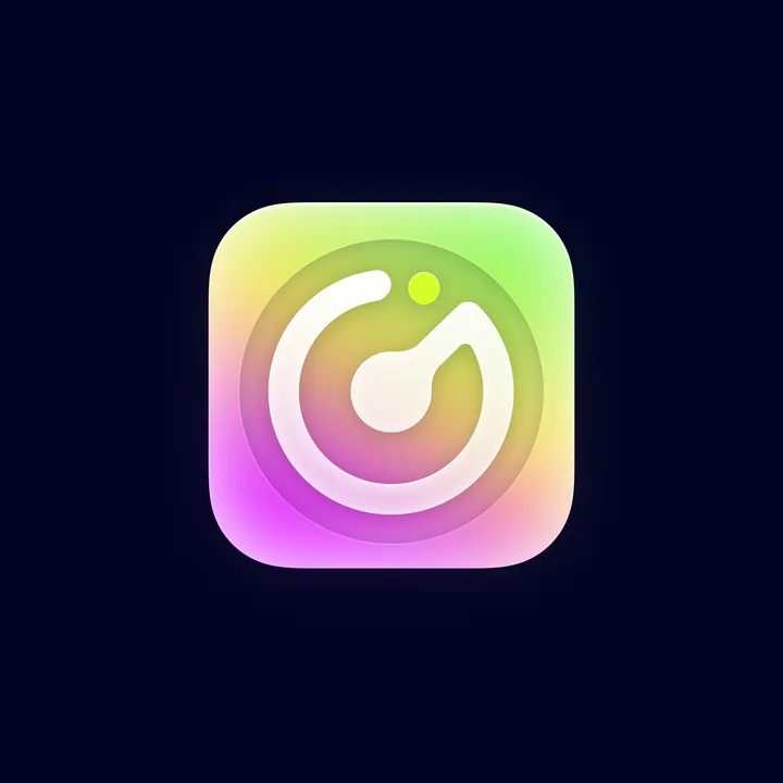
Graphite Logo Exploration #2 — An open-source and free design software made by very passionate volunteers. Similar to my first iteration, I decided on a slightly more abstract approach. I "carved" the pencil out of the hexagon. I think this makes for a really nice logomark/app icon! What do you all think?

Graphite Logo Exploration — An open-source and free design software made by very passionate volunteers. For this #logo , I wanted to nod to Graphite’s roots. The current logo features a pencil, which is a big favorite among the folks who contribute to the software. So, I made sure to keep that iconic pencil in my design by giving it a little twist. By playing with negative space, I not only kept the pencil but also introduced a node, which is a key part of Graphite’s features.

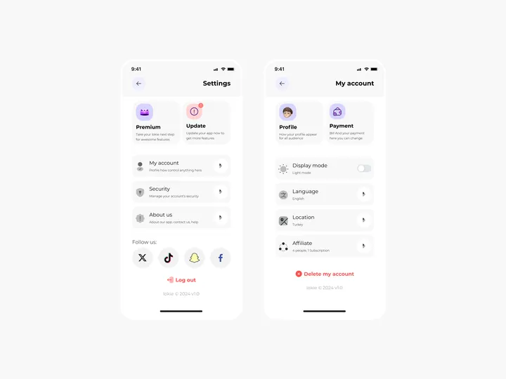
Settings Page for Mobile App - Lokie App — ◑ Design Elements: Clean Layout: The screens maintain a clean and organized layout, ensuring clarity and ease of use. Consistent Typography: The use of consistent fonts and font sizes enhances readability. Iconography: Icons represent various settings and categories, aiding quick recognition. Color Scheme: The light mode employs a soft color palette, reducing eye strain. #appdesign #figma #settings

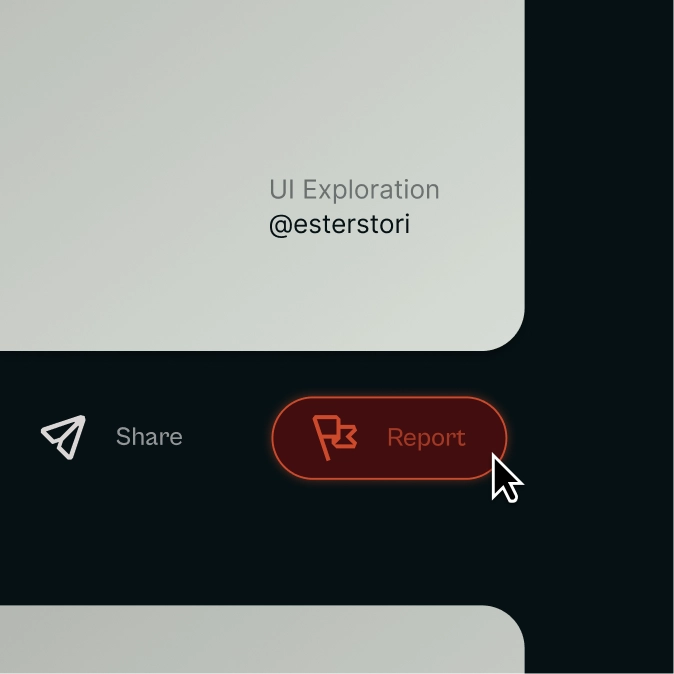
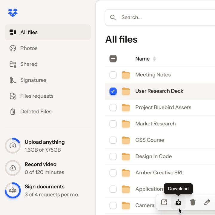
Report Button — Trying icons in actual UI work helps me understand if they do their job or not, much like here 👇

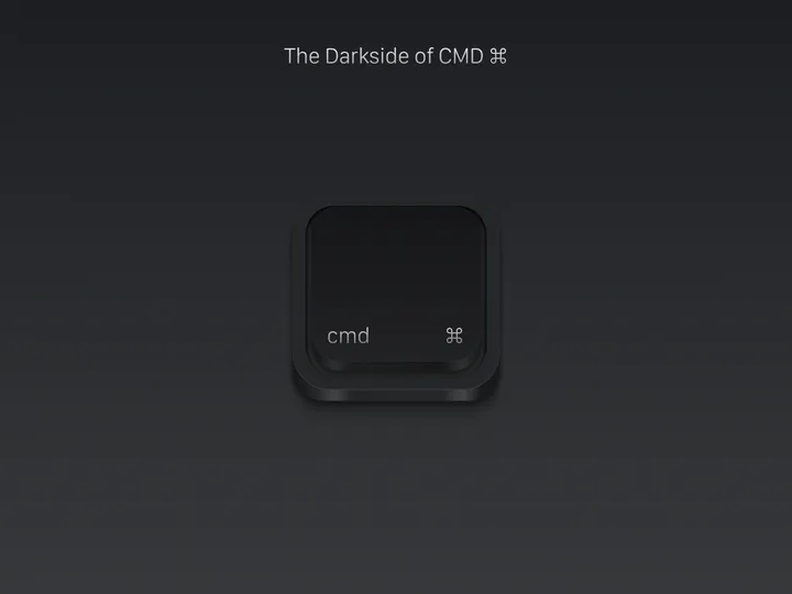
The Darkside of CMD ⌘ — Because light coexists harmoniously with darkness, neither can exist without the presence of its counterpart. This phenomenon becomes a fundamental component of universal equilibrium, integrating itself deeply into the very essence of existence. Here I share with you the Dark version of my Mac keyboard CMD icon, completely made in Figma.

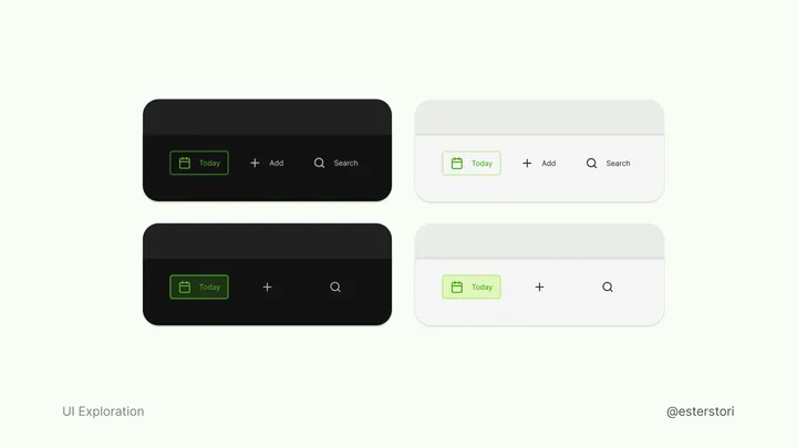
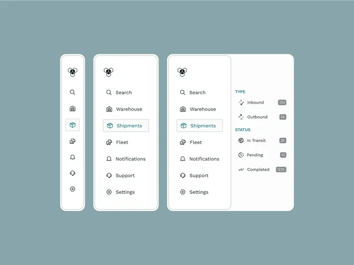
Calendar navbar variants — I have come to appreciate text a lot more, icons on their own can be unclear. Still worth iterating at times


















![Menu [Dark]](https://media.todays.design/15c5b50b0c2f38ac5d5011d39d0b9a723294f44c14088f770b5d1074739d2cbb-md.webp)

