Nathan Manceaux-Panot
Paris
- cykele.ro
- Paris
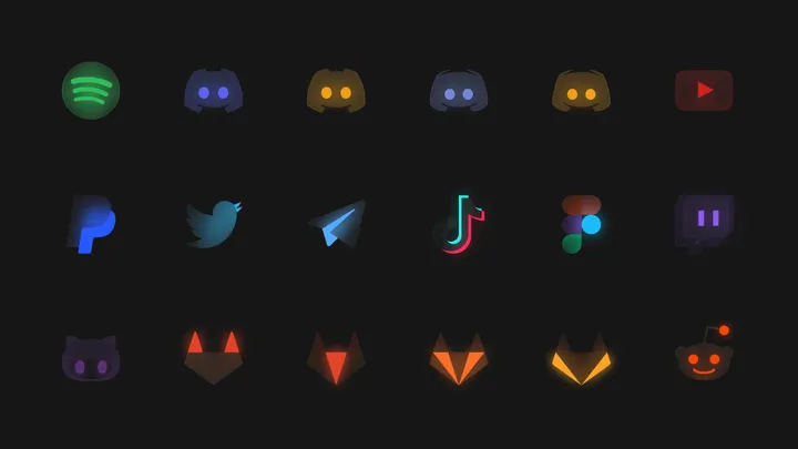
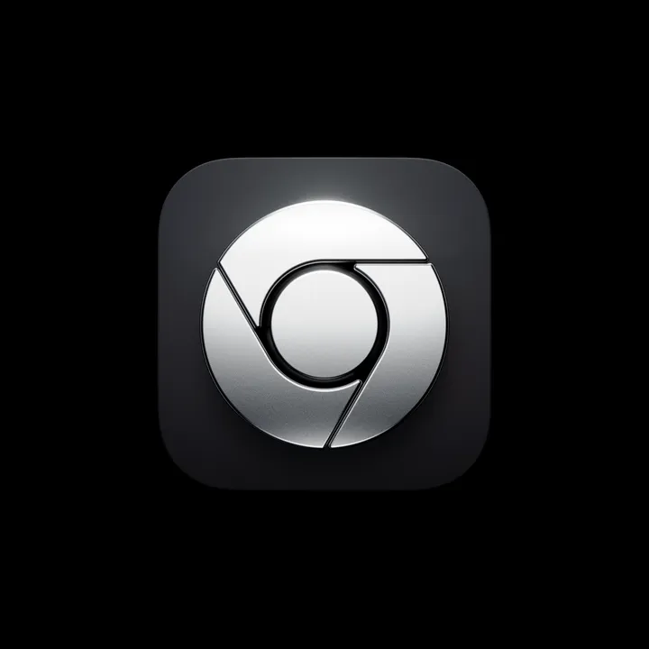
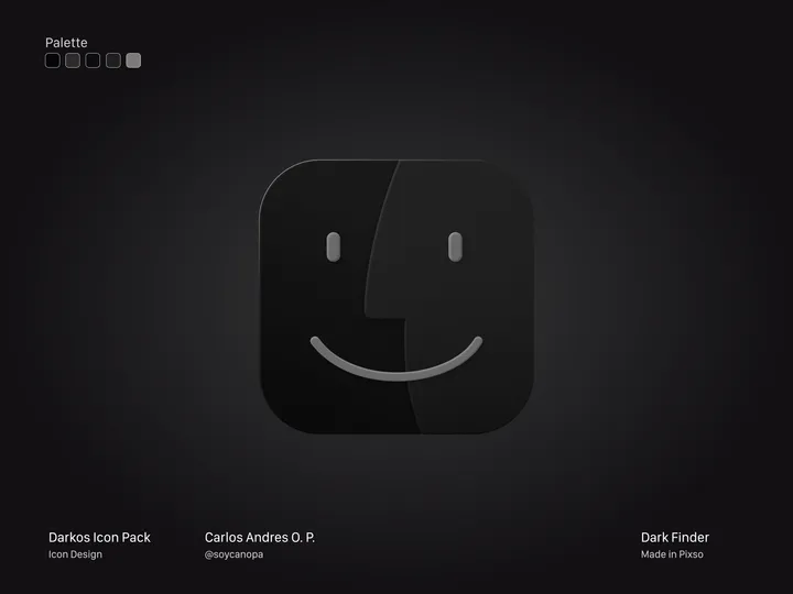
Finder Dark Version — Hey Hey Hey 👋, And this is how the first icon turned out, in this case, the Finder from my #icon pack in progress called DarkOS or DarkMaul; I still haven't decided on the name. It's a true dark version of many #apps icons in #macos Version 1.0 will have around 50 initial icons, but I plan to add more later.

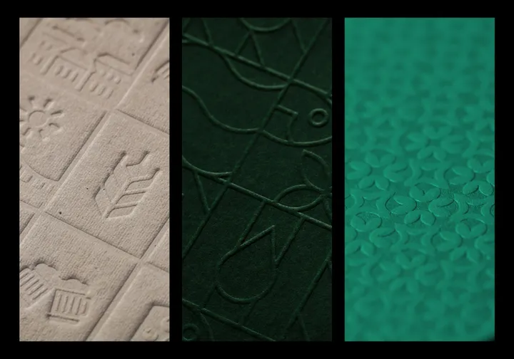
Macro Shots from 3 printed patterns I designed. — I live for these macro shots.. Love well designed patterns, they just add so much to a visual identity. #branding #pattern

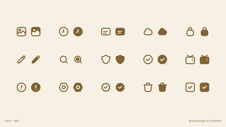
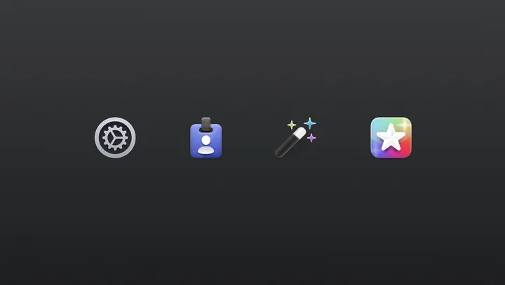
Settings Icons for Helm — For my latest app, Helm (helm-app.com), I decided to jump back on this older style. I might tweak the icons, but I'm happy with the style and direction. Also, first post on here! Great job @giel, for bringing the design community back to the days when Dribbble was still fun :)

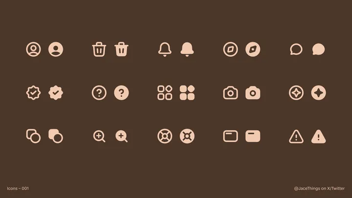
First Effort at Icons! — My first time making icons! Please give feedback if you have any! Wondering if I should make more.

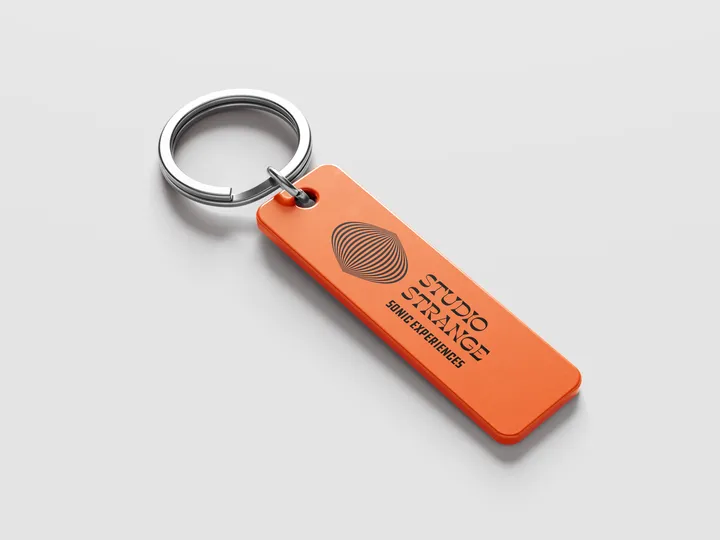
Studio Strange Keychain — It's one of the fun bits of branding for Studio Strange. A record label and electronic instrument rental company. #branding #design #typography

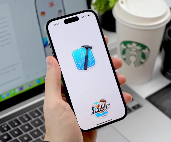
Sticker Wall – Creating holo effect in SwiftUI ✨ — There were so many tiny things to consider when creating the holo effect, that I truly believe these details would have been impossible to prepare for in Sketch or Figma. Details such as: - using an additional dynamic white sparkle layer to create a compelling holo effect - reacting to pitch/roll changes relative to various device positions (e.g. in hand, on table, etc.) - resetting motion values when the device rests for more than 2 seconds with minimal motion - keeping battery and performance in mind - providing "dev/config" controls in context to tweak values just to feel right Hope you'll find this post interesting! 🙌 #swiftui #concept #stickers

Custom Icons for StampMyVisa — I made some custom icons for the onboarding screens for stampmyvisa.

