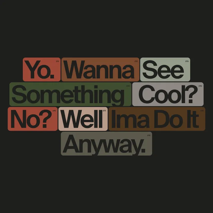
Something cool — Fun stuff with colors and layouts. Yes I like cards. #artdirection #concepts #inspiration

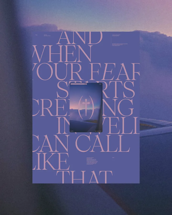
Halo Flip Poster — Poster, type & color exploration. Based on the lyrics from @vegynvegyn "Halo flip". Using @pangram.pangram Pangaia font. #poster #web #typography

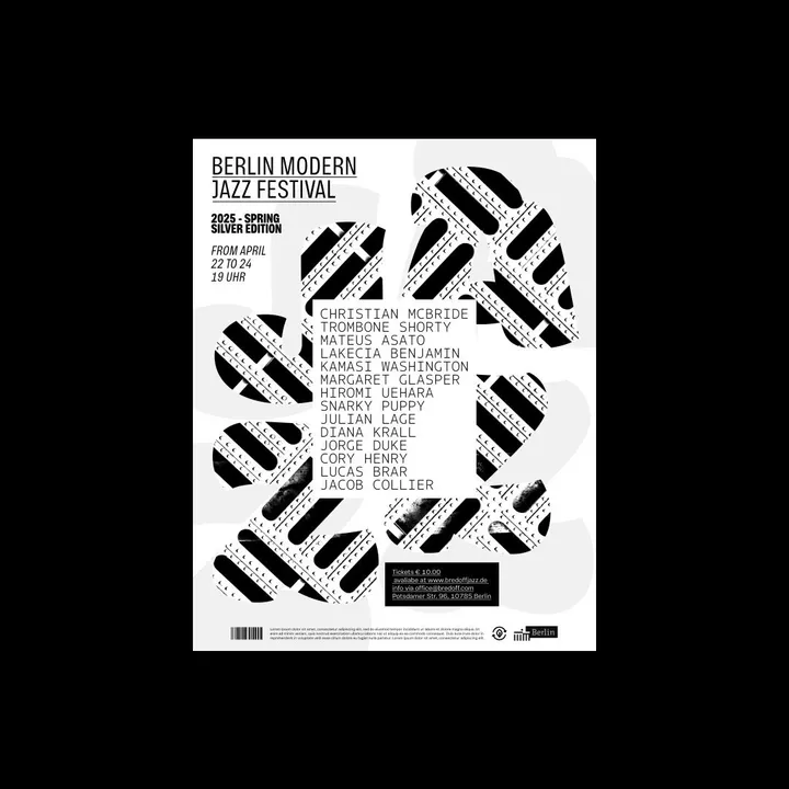
Experimental posters for a Jazz Festival — Study where I set out to create a poster for a jazz event in Berlin, experimenting with various colors featuring exotic contrasts and typographic combinations. #type #print #music

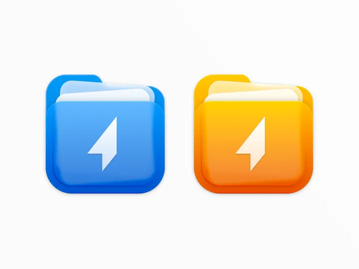
Shuttle icon — For the shuttle.zip project, I designed a two-color icon that combines the shapes of a folder and documents, while maintaining a square form to align with macOS app icon standards. #icon #macos

Prop - Showreel — This reel features vibrant colors and geometric designs, emphasizing Prop's values of innovation, integrity, collaboration, and impact. #showreel #animation #motiondesign


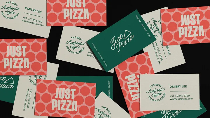
Just Pizza — A fun yet classic visual identity for a pizzeria located in Australia. #visualidentity #logo #colors

Motion Brand Logo Animation — Brand animation for a motion design course, where I explored dynamic shapes and a vibrant color palette to bring the course's visual identity to life. The result is an animation full of personality that captures the brand's creative essence. 🌟🎨 #motiondesign #logoanimation #animation


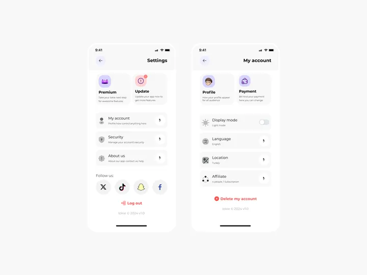
Settings Page for Mobile App - Lokie App — ◑ Design Elements: Clean Layout: The screens maintain a clean and organized layout, ensuring clarity and ease of use. Consistent Typography: The use of consistent fonts and font sizes enhances readability. Iconography: Icons represent various settings and categories, aiding quick recognition. Color Scheme: The light mode employs a soft color palette, reducing eye strain. #appdesign #figma #settings

