Willian Matiola
Experience Designer in Germany
Designer & Photographer from Brazil, currently living in Germany. Designing healthcare products at Cactus. 🌵
- componentes.design
- Germany
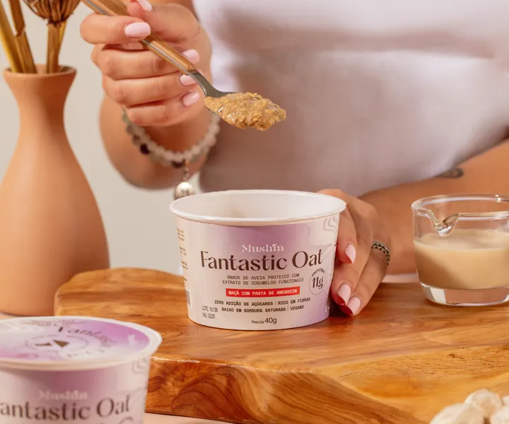
Fantastic Oat Packaging — Fantastic Oat is an instant oat porridge, gluten-free, lactose-free, sugar-free and full of flavor, from Mushin, which incorporates functional mushroom extract in its formulations. Complete Project → www.behance.net/gallery/203297345/Fantastic-Oat #packaging #packing #graphicdesign

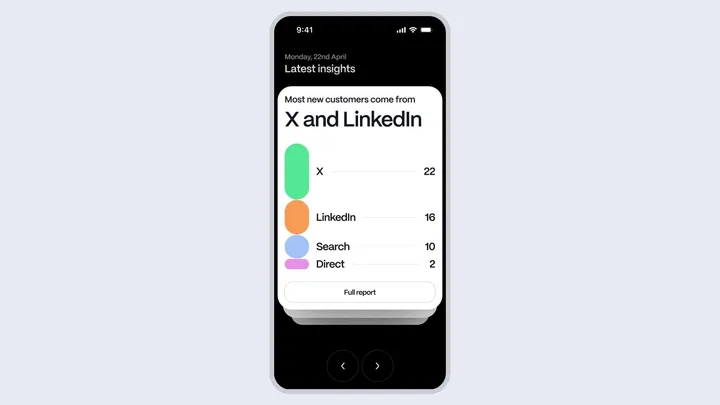
Blink* Branding — The full Blink* Brand and UI project will be posted on Behance next week. #branding #card #foil

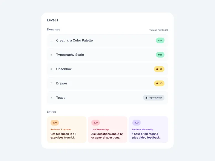
Lessons List — This is how the lessons are displayed. Some of them are free, others paid. Students can also purchase some extras. You can check live here: componentes.design If you like my work, consider following me on Twitter twitter.com/willianmatiola 😊

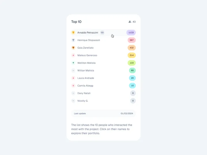
Leaderboard UI — Leaderboard for a personal project where I teach design lessons on how to design UI components on Figma. The more exclusive lessons or extras the student buys, the more points he gets. If you like my work, consider following me on Twitter twitter.com/willianmatiola 😊 #leaderboard #table #list

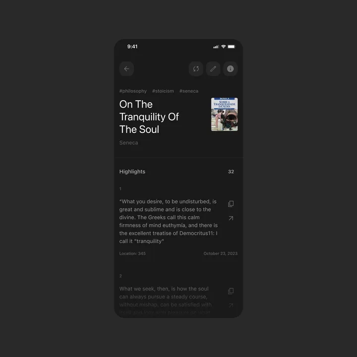
Detail Page for Kindle Highlights — This is a concept design for the Kindle Highlights app idea I posted before. When you enter a book, you see all your notes and can share or copy them to your clipboard. #appdesign #list #quotes

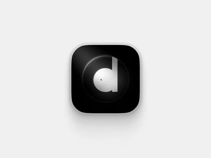
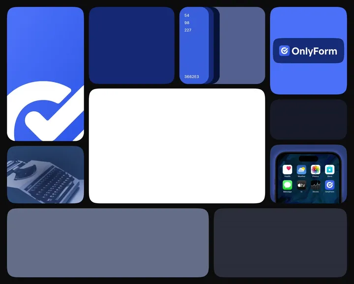
Animated Branding Bento — A branding exploration for an online form product, animated in @jittervideo

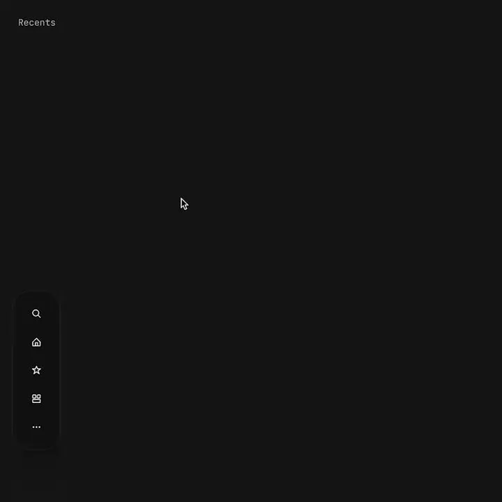
Proximity menu concept — The best click is no click. Before you say it, yes, I know this would make the area under the menu unusable. No it will not work for mobile. This is a desktop app that where that area is void of anything. This would be used as a secondary navigation, primary is a different, keyboard centric element. The goal is to not have navigation take up visual noise, so the content of the app can be focused on. Still debating using this, but I think if done correctly it could work well.

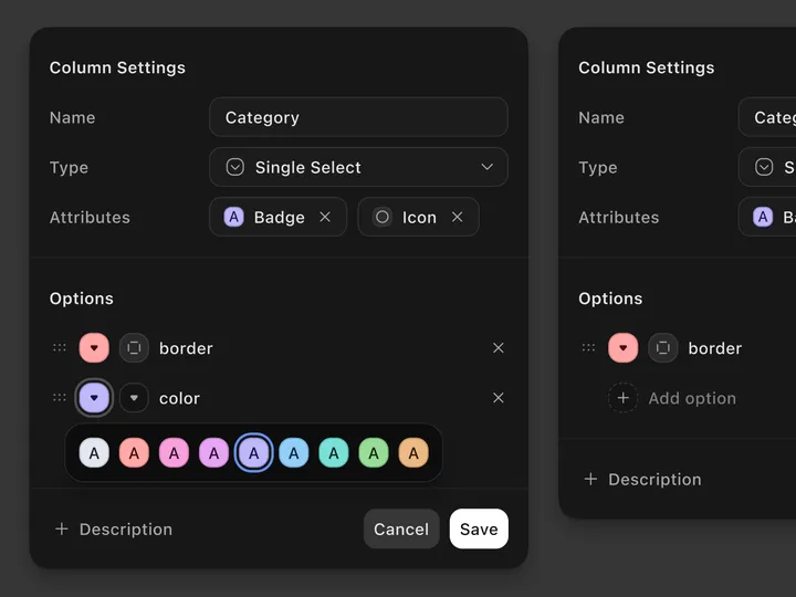
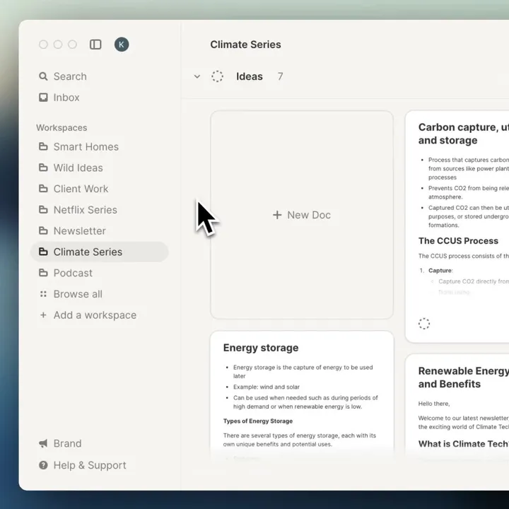
Get that sidebar justtt right — We just added re-arranging your sidebar in strut.so it's a small detail but builds on organizing your work the way you want.

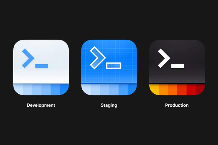
App icon — Icons for different environments for an internal iOS app used by hosts and crew. #appicon #illustration #appdesign

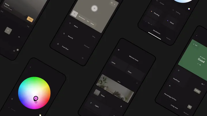
Febriq - A native Home Assistant app — Febriq is a intuitive app for Home Assistant. Easily control all connected devices in your home. If you have Home Assistant you can try the app here: iOS link: testflight.apple.com/join/K5bloOXm Android link: play.google.com/store/apps/details?id=app.febriq #smarthome

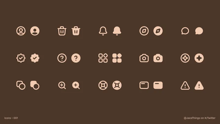
First Effort at Icons! — My first time making icons! Please give feedback if you have any! Wondering if I should make more.

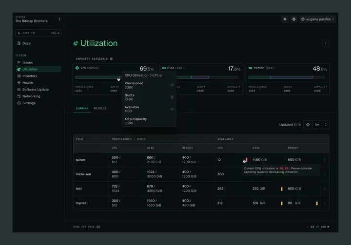
Capacity and Utilization summary — Hey everyone! I'm really excited to join this community! I've been hard at work lately on delivering a great user experience at oxide.computer. Finally getting a chance to share a sneak peek at the revamped Capacity and Utilization pages I've been working on. There are more exciting updates coming soon, so stay tuned! #product #darktheme #saas

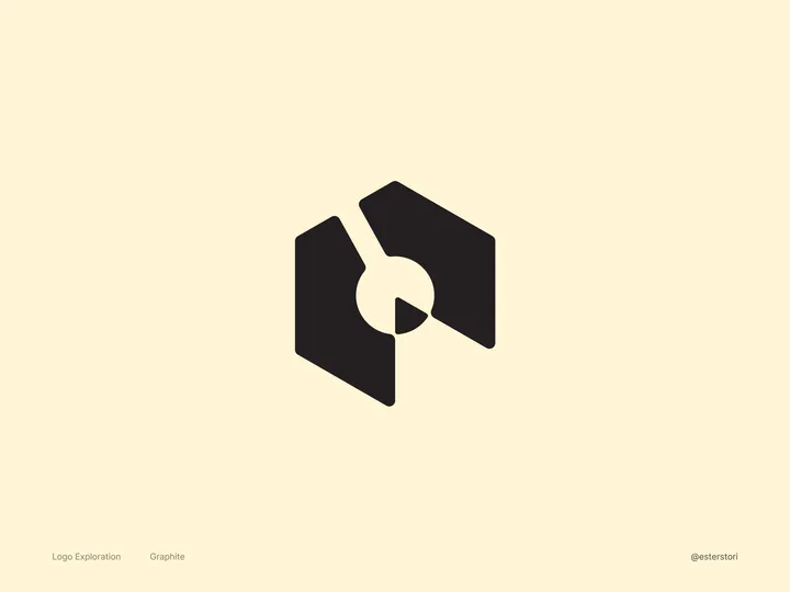
Graphite Logo Exploration — An open-source and free design software made by very passionate volunteers. For this #logo , I wanted to nod to Graphite’s roots. The current logo features a pencil, which is a big favorite among the folks who contribute to the software. So, I made sure to keep that iconic pencil in my design by giving it a little twist. By playing with negative space, I not only kept the pencil but also introduced a node, which is a key part of Graphite’s features.

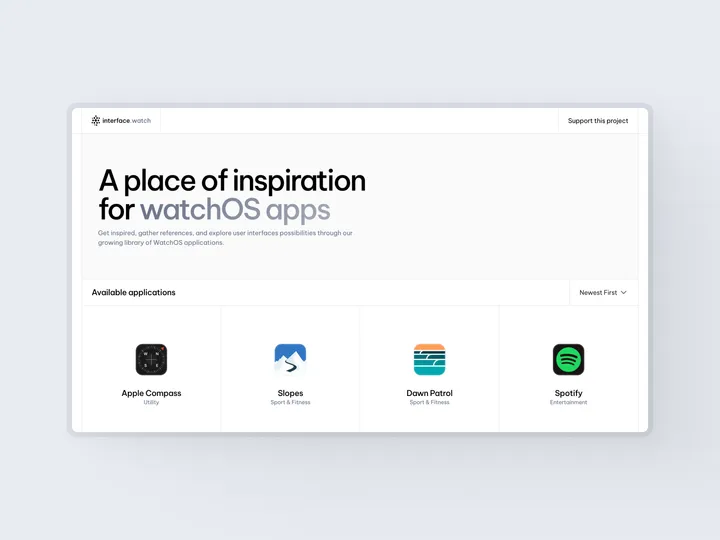
interface.watch — interface.watch is a platform dedicated to providing UI inspiration for watchOS applications. You can find it here: www.interface.watch #watchos #applewatch

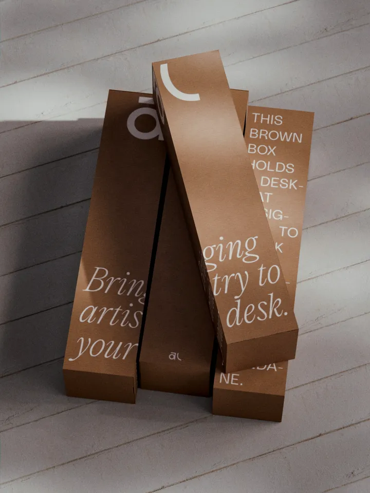
Akuko Labs Deskmat Packaging — Plain cardboard boxes are cheaper to produce, costing nearly half as much as fully printed boxes. I also find them more elegant, especially with white ink accents. Win-win. Designed in Figma, rendered in Blender.

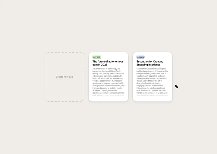
Drag-and-drop interaction for document archival — Quick mockup I made in Figma to get the idea out of my head. No project in mind. Just for fun. :)

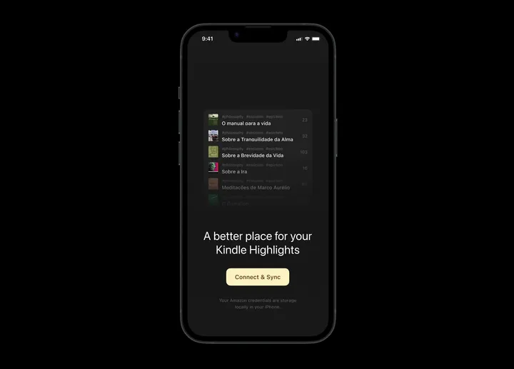
Kindle Highlights — Connect & Sync — This is an open page inviting users to connect their Kindle accounts to start the highlights synchronization. #appdesign #darktheme #onboarding

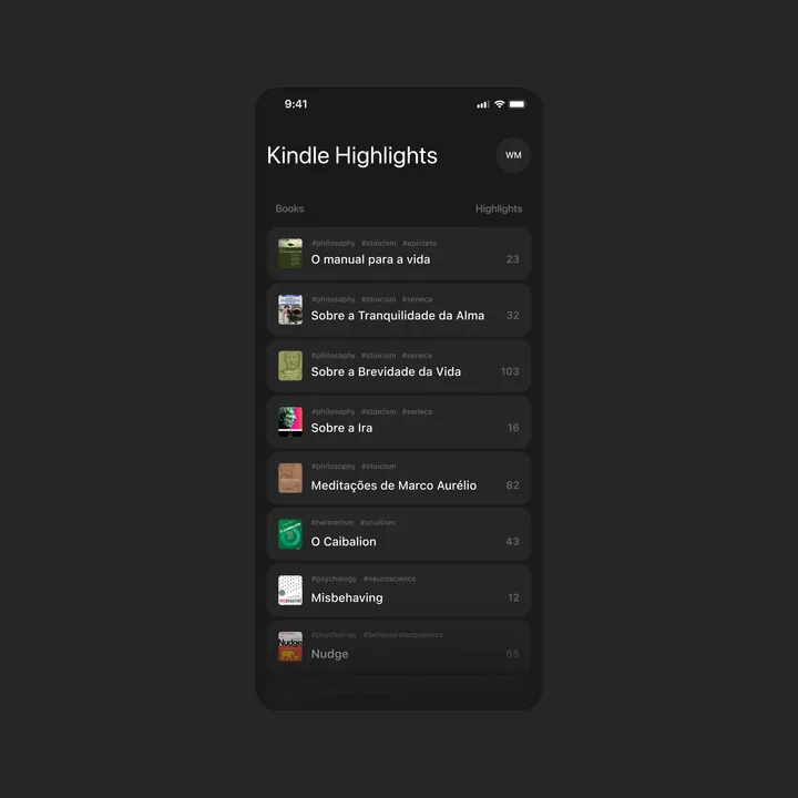
Kindle Highlights Concept — I wish I had a way to sync all my highlights in just one place that allows me to copy or share easily. So, I made this first concept that categorizes my highlights in order. #appdesign #uidesign #darktheme

