Sticker Wall – Creating holo effect in SwiftUI ✨ — There were so many tiny things to consider when creating the holo effect, that I truly believe these details would have been impossible to prepare for in Sketch or Figma.
Details such as:
- using an additional dynamic white sparkle layer to create a compelling holo effect
- reacting to pitch/roll changes relative to various device positions (e.g. in hand, on table, etc.)
- resetting motion values when the device rests for more than 2 seconds with minimal motion
- keeping battery and performance in mind
- providing "dev/config" controls in context to tweak values just to feel right
Hope you'll find this post interesting! 🙌
#swiftui #concept #stickers
Delicious Cheese — Hey Hey Hey 👋, On weekends, it’s about doing illustration, this time it’s about a delicious cheese, the truth is that cheese is one of my weaknesses, in all its presentations.
This project was finished in Pixso, what do you think of the final result?
#pixso #illustration #uidesign
Shop iOS — preview of a recent iOS project for a shop app.
Voyager Icon Set — I needed icons for a project, but none that I could find scratched my itch. Some did, but the sets were incomplete at best.
So, I decided to try and start making my own! Has been quite a journey so far, I have been enjoying the minutia a lot more than I anticipated, even if it's frustrating at times.
Apollo.io Icons — new icon system that I designed for the awesome people at Apollo.io
Graphite Logo Exploration #2 — An open-source and free design software made by very passionate volunteers.
Similar to my first iteration, I decided on a slightly more abstract approach. I "carved" the pencil out of the hexagon. I think this makes for a really nice logomark/app icon! What do you all think?
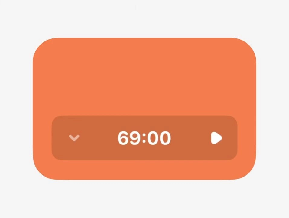
Using eyebrows for Pricing Options 👀 — I've fallen in love with eyebrows (yes, they're called eyebrows), being in every play they can be, using them here to identify Basic vs Premium
Settings Page for Mobile App - Lokie App — ◑ Design Elements:
Clean Layout: The screens maintain a clean and organized layout, ensuring clarity and ease of use.
Consistent Typography: The use of consistent fonts and font sizes enhances readability.
Iconography: Icons represent various settings and categories, aiding quick recognition.
Color Scheme: The light mode employs a soft color palette, reducing eye strain. #appdesign #figma #settings
2024 Portfolio Website — As a 90s kid, pixel games have always held a special place in my heart. Marking my first year as a product designer, I’ve decided to infuse my portfolio website with a pixel theme!
Check it out here: bygideon.com
Calendar navbar variants — I have come to appreciate text a lot more, icons on their own can be unclear.
Still worth iterating at times
RABIAT — Made using Spline. Font is GT America Extended.
Eindsprint — Exam training detailpage — It's time for the final exams again! For some, it's a breeze, for others, a massive challenge. With Eindsprint, you can confidently approach your final exams. Eindsprint assists students in passing their final exams by offering exam training.
I helped Eindsprint optimize the search and booking process for exam training. In doing so, I worked on improving the training detail page and overhauled the ordering process.
Eindsprint provides exercises and trainings to equip you for success in your final exams. Eindsprint already helped more than 10.000 students!
Rippling Badge Icons — Recent set of Badge Icons that I designed for awesome people over at Rippling.
Sticker Wall – Playing with SwiftUI 😍 — My first ever SwiftUI project trying to recreate Apple iMessage holo stickers ✨
Huge thank you for Philip Davis for his incredible course, Janum Trivedi and Alex Widua for the open source projects and Gavin Nelson for the inspiring prototypes! 🙌🔥
#swiftui #concept #stickers