Karim Saif
Product Designer ⁕ in Egypt
Visual Designer ⁕ Product Designer ⁕I fell in love with technology ⁕ Framer ⁕ Figma ⁕ Spline ⁕ Rive ⁕ Notion ⁕ Software Engineer ⁕ UI Designer ⁕ Prompt Engineer
- bento.me/karimsaif
- Egypt
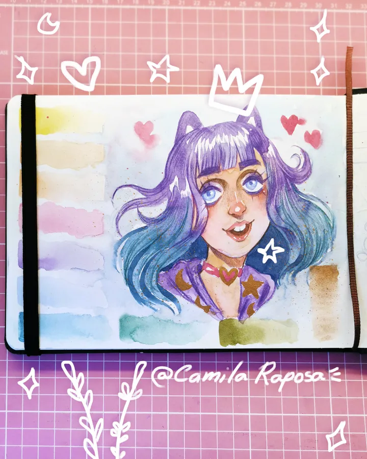
Liz Fennek - Pastel Watercolor — Good afternoon, grape bunch!🍇 What a busy week! 🥵 But I'm happy I managed to adjust my schedule and so I can edit, post and record things more often. Because of my ADHD, organizing and finishing tasks is always challenging and tiring. That's why I'm always testing new things to be more productive and organized. ⏰ ️ 🖼️The art of the moment is our dear Lis Fennek, my decora girl, apprentice of our beloved Fox Angelov. She was made with pastel watercolors from @pestilentoart, outlines in Super Soft from @faber_castell_br on a Watercolor Book from @hahnemuehle_brasil Perfect combo!!!💪😼 I'm getting organized to post more and be more present.🤘 That's it, stay well out there and see you later! 🦊

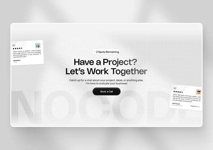
CTA Section Design — Recently I designed this Modern and Minimal CTA Section for Nocodetalks website's, Checkout the Full website here - nocodetalks.co #website #framer #figma

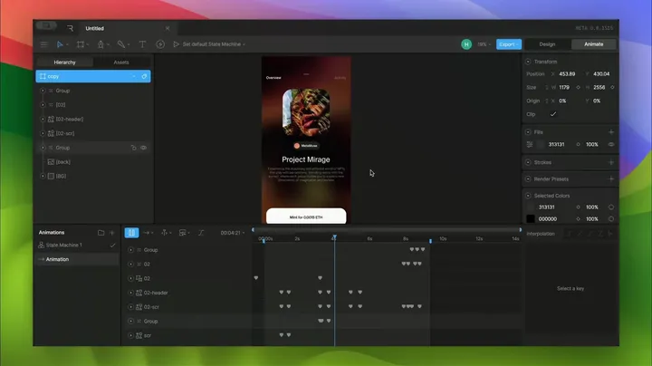
Figma + Rive: sharing my workflow for animations — Check out my article, where I discuss the tools and methods I use for interface animations, including Rive. We’ll also review an older project to highlight what to avoid and what works better. ↓↓↓ medium.com/user-experience-design-1/how-i-create-animation-for-interfaces-7183b3b6482f

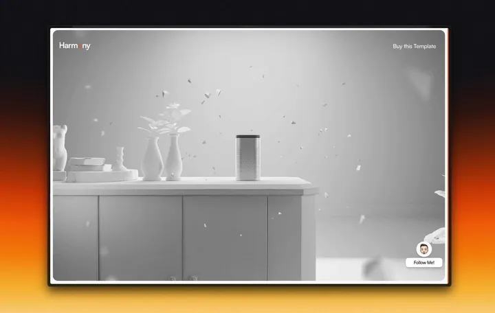
404 Page - HarmonyPod Framer Template — Seems like something is broken. #web #product #motiondesign

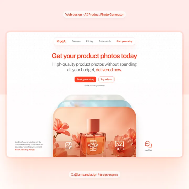
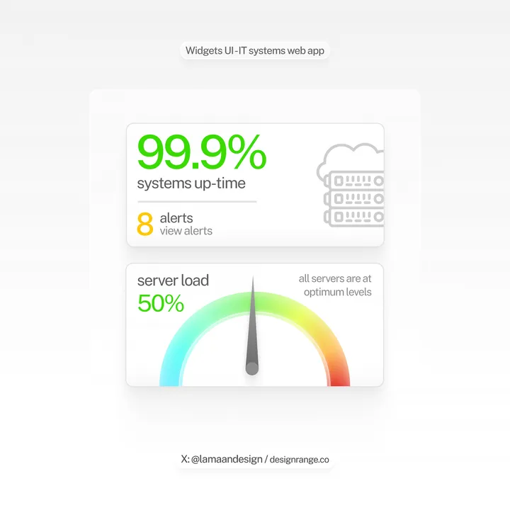
Widgets UI for an IT systems web application — Everything except the grey cloud server icon was created in Figma. Looking forward to completing this dashboard home and showing it together. - Need a high-impact design? Available for web design, UI, and visual designs. DM or email at lamaan@designrange.co

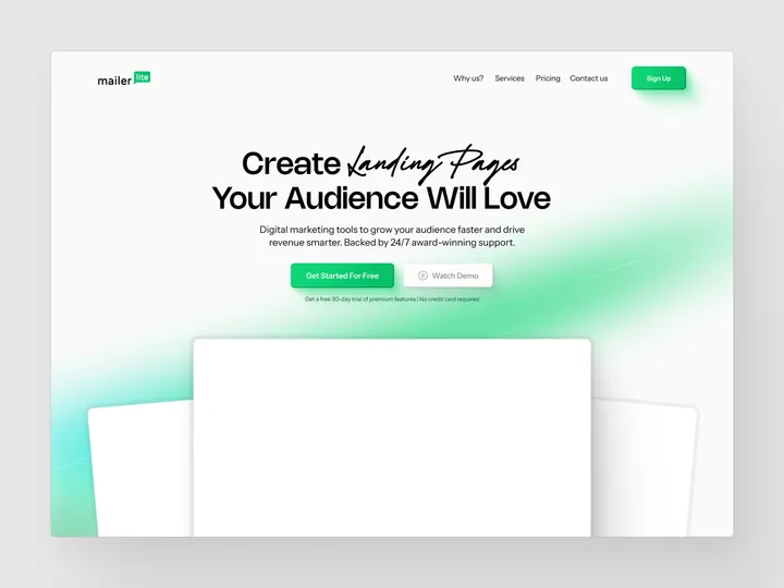
Landing Page Redesign - MailerLite — Redesigned MailerLite Website just some design exploration #web #design #landing

