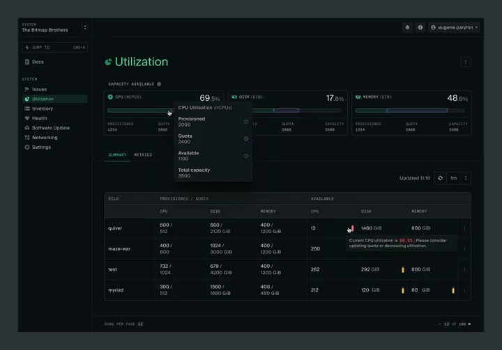
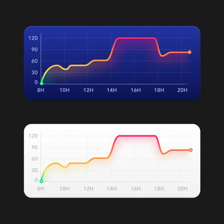
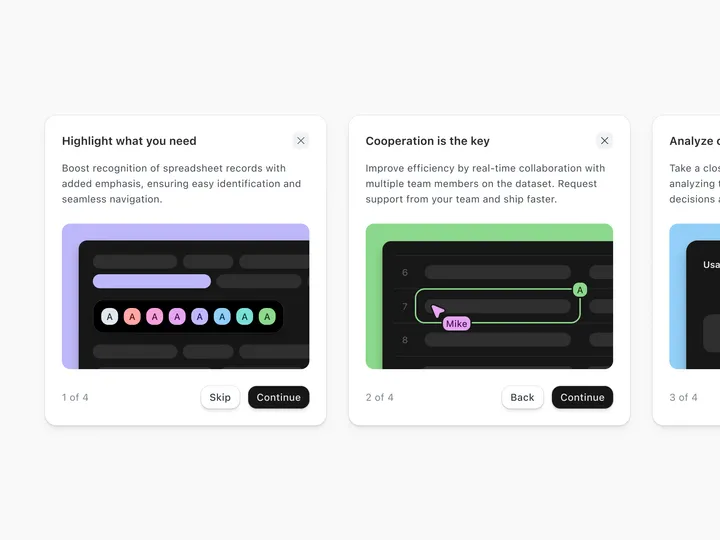
Capacity and Utilization summary — Hey everyone! I'm really excited to join this community!
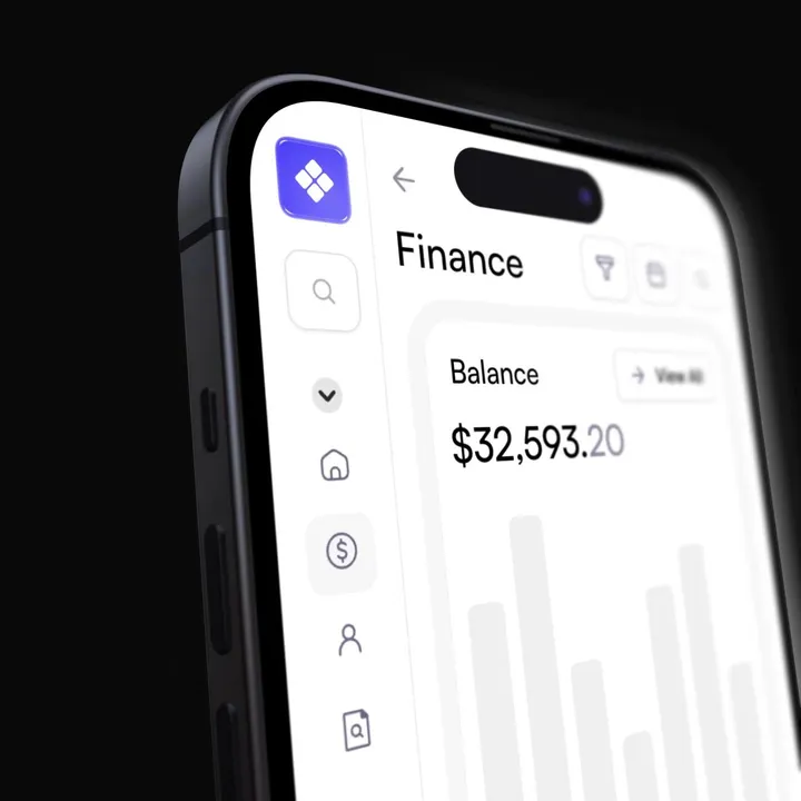
I've been hard at work lately on delivering a great user experience at oxide.computer. Finally getting a chance to share a sneak peek at the revamped Capacity and Utilization pages I've been working on.
There are more exciting updates coming soon, so stay tuned!
#product #darktheme #saas
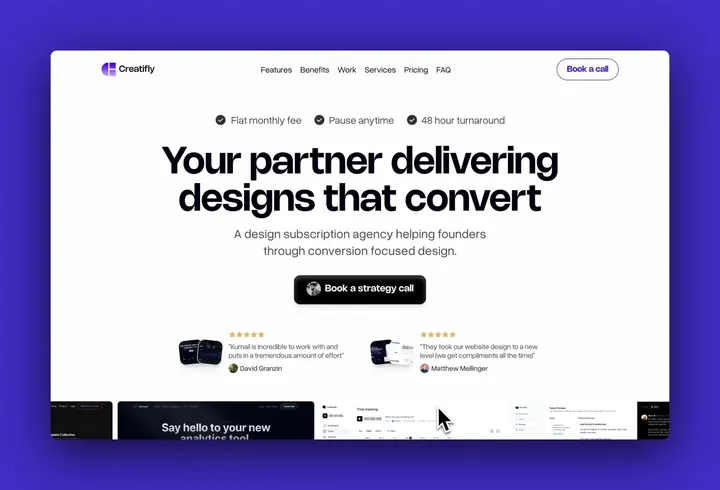
Flux Runner — Hero section design for Flux Runner early access landing page.
#web3
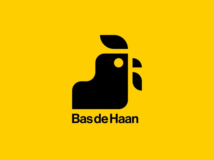
Bas de haan logo — Made a rooster for my friend Bas. His last name means rooster in dutch. The monogram is created on a grid, since he is a furniture maker and specialises in perfect corner-connections and details in his work.
Newton lessen Logo — My first submit for today's design, not really from today but a visual identity project I did last year.
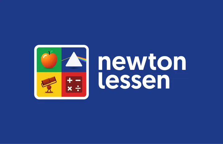
‘Newton lessen’ provides Science & Technology lessons and teaching materials for to primary schools in the Netherlands. I got asked to design the visual identity and make various branding materials.
The brand's name, 'Newton Lessen,' pays tribute to Sir Isaac Newton, a famous scientist, astronomer and mathematician renowned for his many and important discoveries. Since Newton's work is vast and varied, I came up with the idea that Newton can’t be captured into a single symbol. Therefore I designed a dynamic and playful logo made up of four symbols, each representing something Newton discovered. F.e. an apple that symbolises the Laws of Gravity, a prism for his thoughts about the refraction of light, mathematical symbols representing calculus and the famous Newtonian telescope.
#branding #science #logo
UPD consultancy Logo — UPD's logo intertwines its name with the infinity symbol, reflecting its dedication to constant improvement as consultants.
Linksvoor logo exploration — Exploring logo concepts for Studio Linksvoor, a Dutch event agency. 'Linksvoor' translates to 'front left'.
Gold Medal — Hey Hey Hey 👋, Visual exploration of the construction of a medal for the first place or for the one who got the highest score in a video game, part of one of the rewards, for passing that section in extremely difficult.
Visual exploration made entirely in Pixso, although the star was already made in Sketch.
What do you think? I think I can improve some more things but we are on the right track.
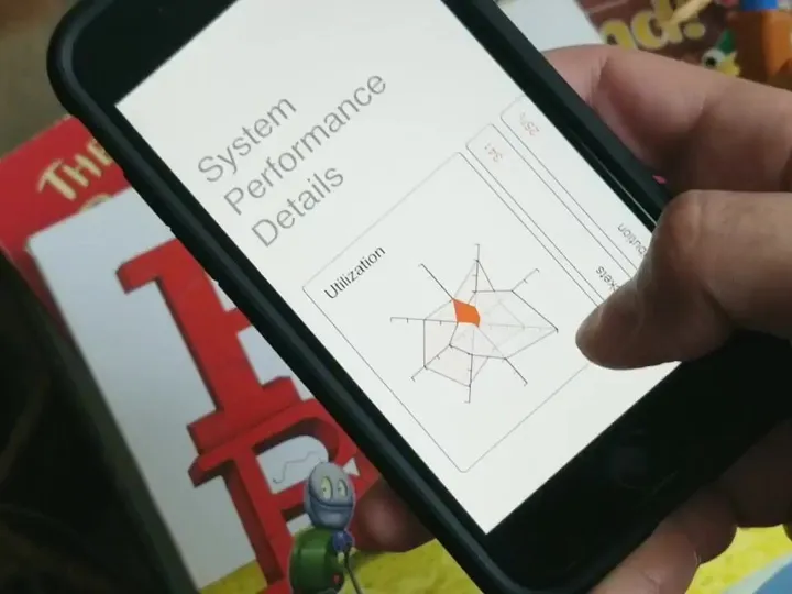
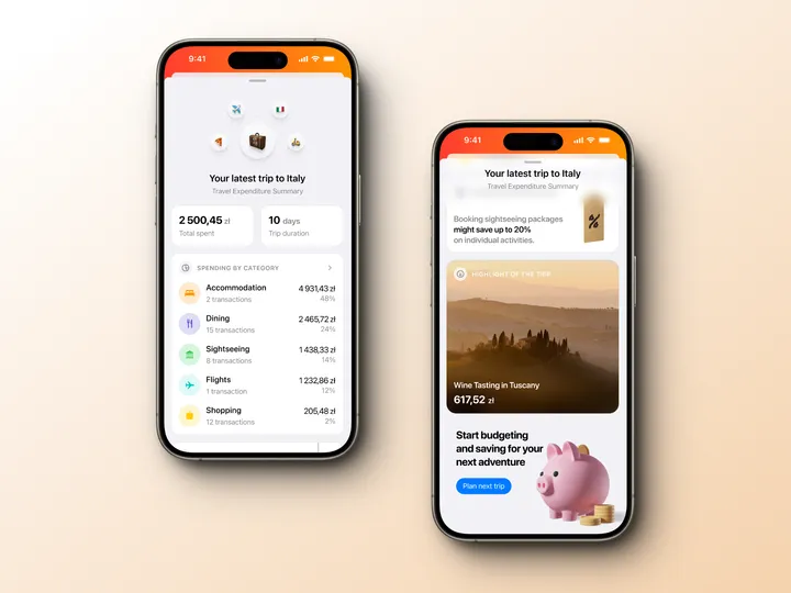
Swipe to view data — Exploration of cards on mobile with the ability to view more data and charts on swipe.
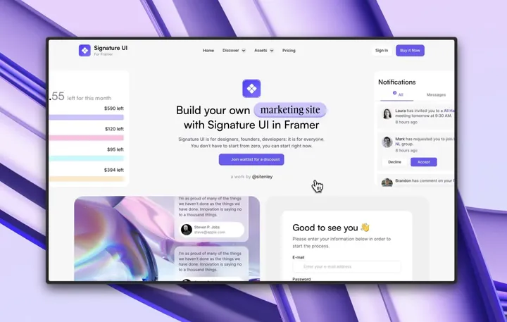
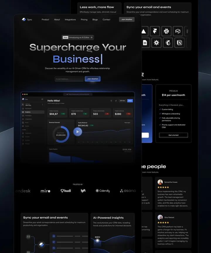
Sync SaaS CRM Framer Template — What better way to begin my Today's Design journey. Hereby I'm sharing our latest #framer template. If you'd like to check it out, you can visit the following link: www.framer.com/templates/synccrm 🔗
Please let me know what you think about it! Your feedback is appreciated! 😁
And if you'd like to purchase the template you can use code SYNC25 for a 25% discount code. 🪄
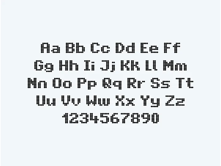
Intransit — The recreation of a typeface commonly used in Amsterdam's public transport system. The grid inspired by the LED screens used for displaying messages, intrigued me.

