Design Dissolve | Symbol Construction — The Keep Up Agency logo was developed with the aim of representing the strategic stages of the agency's services. The symbol is made up of three arrows that form a figure similar to a target, symbolizing the setting of goals and obtaining results. Each arrow represents a key element: strategies, tactics and objectives, culminating in a central target that illustrates the focus on results and success. The sans-serif typography chosen for the logo complements the symbol, ensuring a timeless and balanced appearance.
AI1 App Design — All the AIs in one place, responding to you simultaneously, and you choose the best answer and move on.
Framer Template Chest — I designed and animated this only using Framer, a treasure chest to keep my Framer templates.
Base Token Store Front Page UI — Demonstrating a powerful idea that you can purchase a token or an NFT as easily as in any other e-commerce site
This is an exploratory concept design which got a dev inspired and got developed and available at www.basetokenstore.com
Fabio Nasci - Personal Branding — My symbol is the letter "F", developed in a rectangle √ 2.
It conveys transformation, dynamism, elegance and simplicity. From the outset I planned to use classic design shapes, such as rectangles and ellipses.
Ruimtevolk dynamic logo — The dynamic Ruimtevolk logo, composed of letters in 1:1 squares, perfectly reflects the expertise and versatility seen in their urban development projects. Its modular design ensures easy and dynamic adaptation across various assets.
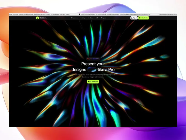
Grainient — Grainient collection Page
Grainient offers top-tier gradient and abstract AI-generated backgrounds tailored for designers, solopreneurs, and creative startups.
#gradients #grainient #graidients