Zsolt Stelkovics
Amsterdam
- Amsterdam
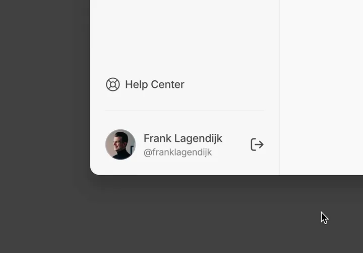
Sign-out: making it fun & creating a lasting — Little experiment on a sign-out interaction ✨ Of course you want people actively engaged in your app. You also want to improve the onboarding to reduce your 'time to value'. But what about making it a little more fun when people want a break from your thing? These impressions count as well. Just like that cheap-ass but pretty good hotdog you get at IKEA as a last impression before you leave. That's not by accident – it’s psychology. It's called the 'peak-end rule'. -- If you’d like to inspect or use it, add a comment on my X post and follow me, so I can DM you the remix link x.com/franklagendijk/status/1818608522218672136

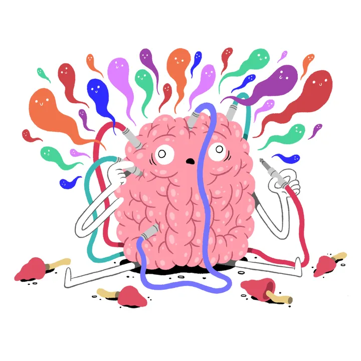
Connections — For a newspaper piece on how certain drugs can make new (positive) connections in our brains. #editorial #illustration

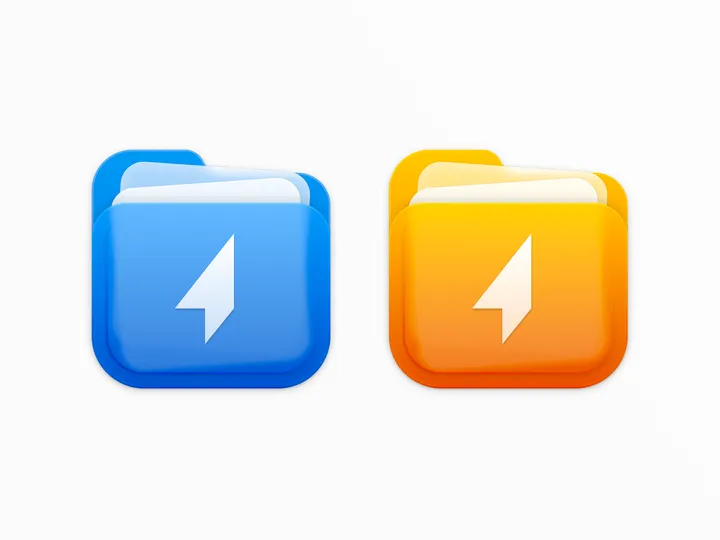
Shuttle icon — For the shuttle.zip project, I designed a two-color icon that combines the shapes of a folder and documents, while maintaining a square form to align with macOS app icon standards. #icon #macos

Immersy Logo Animation — It’s not just any reveal; we added a playful spring effect to bring the logo to life, perfectly mirroring the school's energetic approach to teaching. 🎓✨ #logoanimation #motiondesign #typography


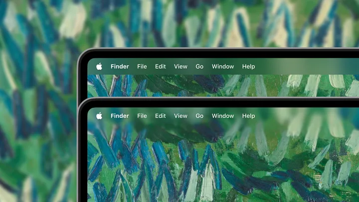
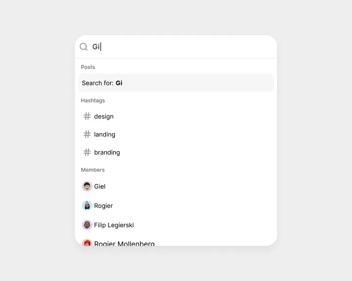
Instant search — Wherever you are on the platform, just hit CMD+K on your keyboard—go ahead, try it now! The search box will appear instantly. Start typing, and it will quickly filter through hashtags and members. If you’re looking for posts, simply hit enter to see an overview feed with all the relevant posts. #search #updates #cmdk Powered by the fast and composable unstyled command menu from @paco – visit cmdk.paco.me

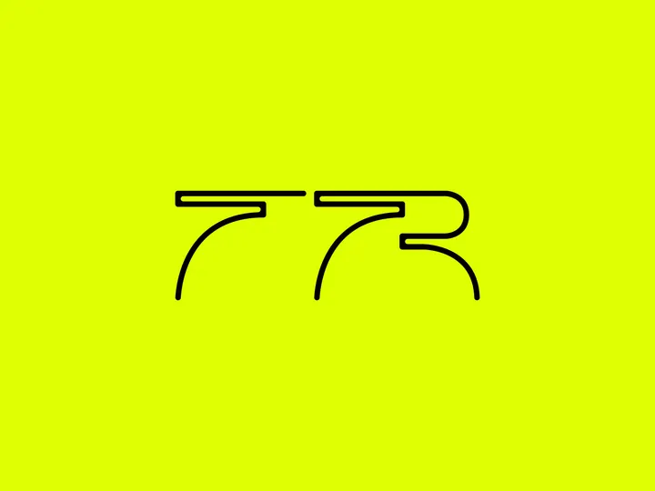
TR - Lettering sketch — I find it helpful to put every idea on paper, even if I have doubts about the design while doing so. Completing the process often results in an interesting design. For now, it's parked, but I keep looking back at it. I'm curious to see if I will eventually present this to the client.

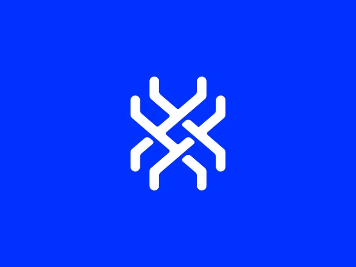
X - Monogram — This is an unused monogram for a project I was working on. Although I find the shape intriguing, the client and I decided that it is too complex for small sizes, which is how the logo will primarily be used. Despite this, I still believe it has something interesting in there worth exploring.

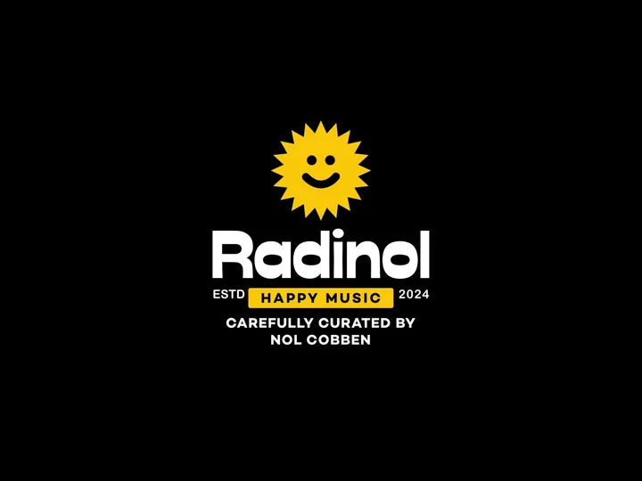
Radinol concept sketch — I've always aspired to have my own radio show, and this was a fun, quick exploration of what that could look like visually. While I'm not sure if this is the final design, I liked it enough to share.

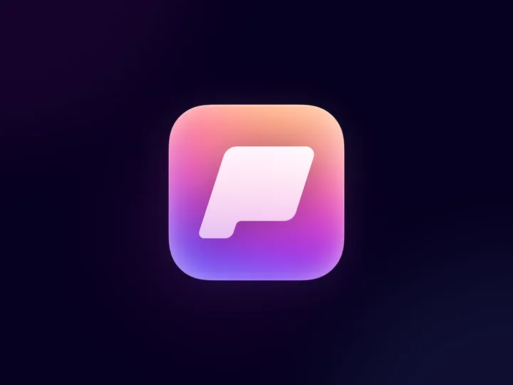
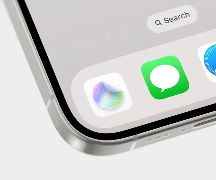
New StickerWall app icon created in Sketch ✨ — It's been so long since I've practiced creating app icons 💎 The new app icon is part of the entire StickerWall package available on Lemon Squeezy 👇 danielkorpai.lemonsqueezy.com/buy/392b7659-e9cb-4995-a84a-24965585b701 #mobile #iphone #appicon

Showreel 2023 — Last year's showreel. Trying to expand the portfolio a lot this year! #showreel #animation #motiondesign


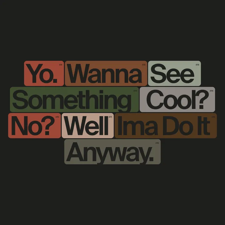
Something cool — Fun stuff with colors and layouts. Yes I like cards. #artdirection #concepts #inspiration

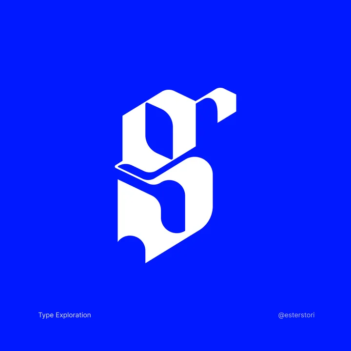
Letter G Typography exploration — First time in a while playing with type, it's always very challenging (and fun)

