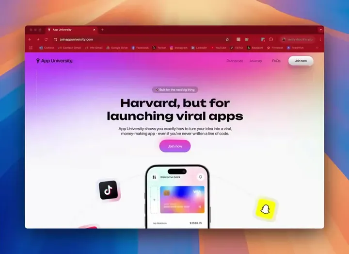
App University Website Design & Development — Designed this amazing modern Landing page for App University Made in @framer

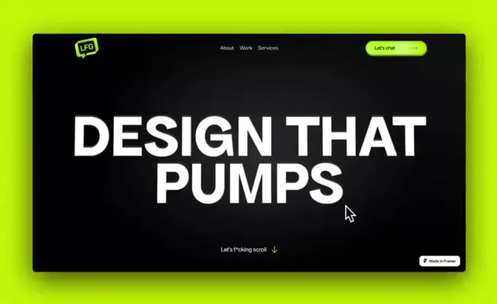
LGF Website Design & Development — Designed this amazing and highly animated website in framer for lfg.design

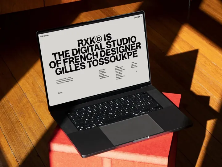
RXK Studio Portfolio — New portfolio made with talented developer, Michael Garcia. Enjoy live website here: ↳ rxkstudio.com #design #portfolio #typography

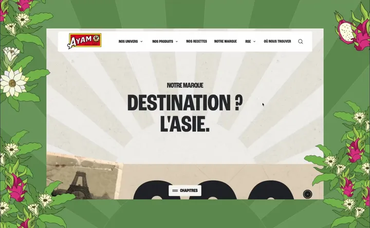
New Ayam™ — For several months, we have accompanied the Ayam™, a leader in Asian grocery, in the redesign of their french website. Our mission has been comprehensive, including the development of a new tone of voice and innovative artistic direction for the sector. #web #illustration #design

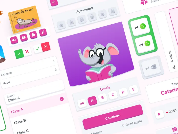
Design toolkit visual revamp — For a reading app that aims to develop reading habits and comprehension in children from kindergarten to elementary school utilizing technologies. #app #mobile #illustration

bauplan logo and landing page — Bauplan is a small startup trying to simplify data infrastructure management. The team asked me to refresh their logo and website. We envisioned a playful Bauhaus look with modern elements. I designed the page in Figma and developed it in Framer.


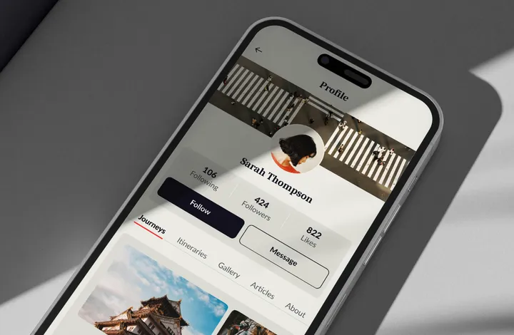
Journi - app design — Journi is a UI/UX design project I developed, where I created a dedicated space on the profile to organize and share each trip in a well-segmented and streamlined way, allowing users to relive and share their adventures uniquely. www.behance.net/gallery/175447827/Journi-UIUX-Design #ui #figma #appdesign

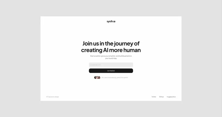
Synth - AI SaaS Design Brandkit (Light) — This kit is designed for startups or individuals looking to launch or refresh their brand with a sleek, professional minimal look. This all-in-one kit includes everything you need to establish your brand's presence. Preview full kit: www.capslock.design/brand-kits/synth-light _________________________ What's Inside: Website designed in Figma Developed in Framer Pitch Deck Client Onboarding Doc Letter Head Business Card Social Media Covers Brand Guide _________________________ Kit Features: Light Theme Minimal Design 100% Customizable Just Change Content Professionally Designed _________________________ If you need any help along the way, just reach out to me at: hey@capslock.design

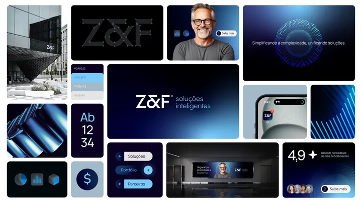
Bento for Z&F — Visual identity developed for a telecommunications company focused on technology and innovation. #bento #type #logo

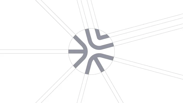
Design Dissolve | Symbol Construction — The Keep Up Agency logo was developed with the aim of representing the strategic stages of the agency's services. The symbol is made up of three arrows that form a figure similar to a target, symbolizing the setting of goals and obtaining results. Each arrow represents a key element: strategies, tactics and objectives, culminating in a central target that illustrates the focus on results and success. The sans-serif typography chosen for the logo complements the symbol, ensuring a timeless and balanced appearance.

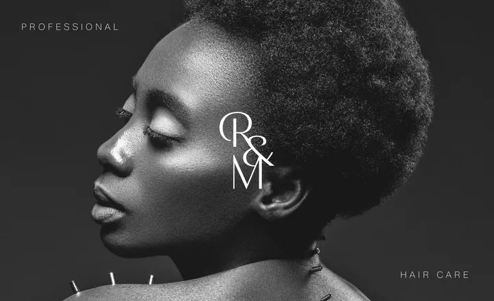
R&M Monogram — Monogram developed for a professional studio specializing in hair care. #type #logo #visualidentity

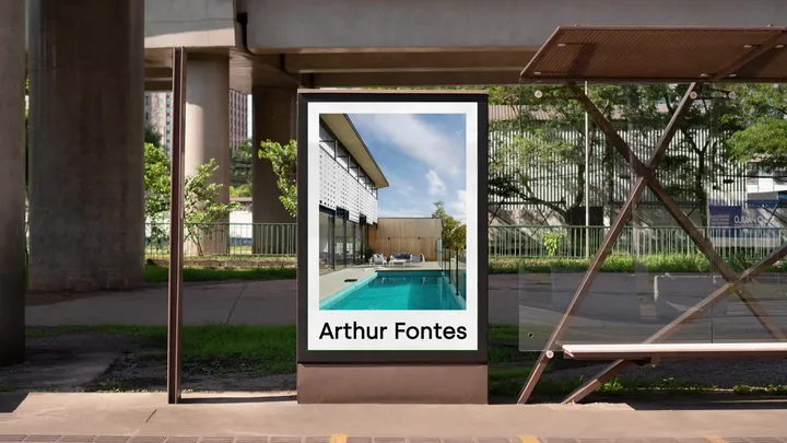
Arthur Fontes Visual Identity — Arthur Fontes, a real estate broker known for working with high-end properties in condominiums in the capital of Sergipe, was seeking a visual identity that would reflect both the exclusivity of the developments he represents and his unique personality in the market. #visualidentity #type

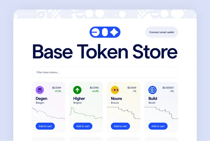
Base Token Store Front Page UI — Demonstrating a powerful idea that you can purchase a token or an NFT as easily as in any other e-commerce site This is an exploratory concept design which got a dev inspired and got developed and available at www.basetokenstore.com

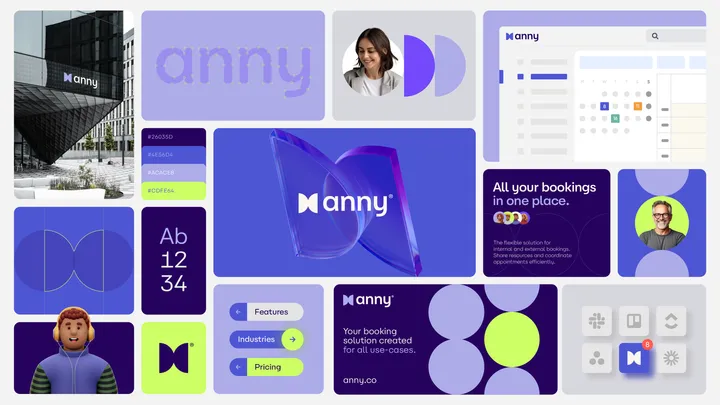
Bento for Anny — Visual identity developed for a modern and flexible collaborative platform. #bento #visualidentity #logodesign

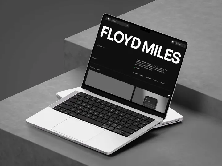
Portfolio Framer template for Product Designer — We develop F_M. Framer template for Product Designers to quickly launch their websites and showcase their expertise and projects, establishing trust with hiring managers and potential clients. #portfolio #webdesign #framer

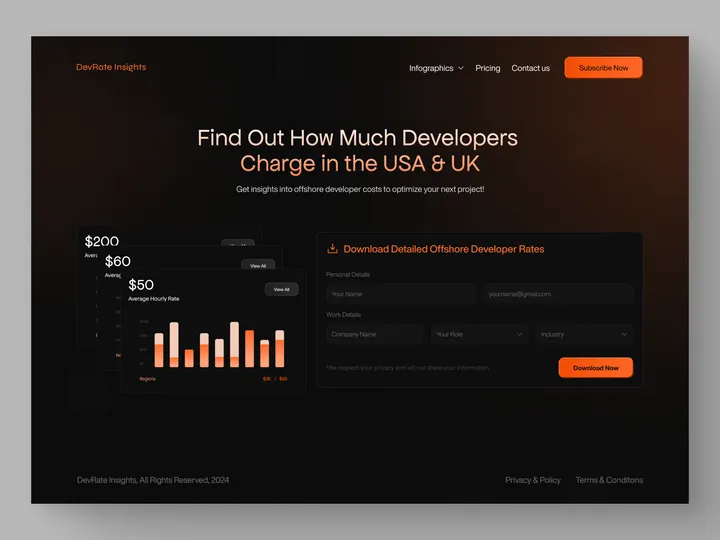
DevRate Insights - Website Design — I designed a modern, orange-themed website for DevRate Insights, featuring forms for data submission and an infographic on developer rates. #webdesign #website #web

