Studio Strange Keychain — It's one of the fun bits of branding for Studio Strange. A record label and electronic instrument rental company. #branding #design #typography


Funky, Bold lettering animation — Been designing a very, very bold typeface and animating it has been very satisfying


First Framer Template: Cally for SaaS startups — Dropping my first Framer template for SaaS startups today and added a teaser to celebrate! ✨ Find me on X x.com/franklagendijk to learn more 😎


Skyview Lamp Website — I worked on this project a few years ago with some other talented designers #web #3d #motion


Widgets — Some widgets for the upcoming redesign of duuude.studio Designed in Figma, animated in Framer #framer #figma #components


Plant Care & Tracking Dashboard — Take care of your plants, and track care schedules and reminders, Also, follow the tractors' location, agricultural records, inventory, and reports about your farm. Logo by: Wahyu Rizfi #web #dashboard #farm


(TERRACOTTA) Macbook Pro - Animated mockup — The Terracotta Collection contains four animated video mockups adding up to a total of 26 seconds of footage. » After Effects CC » Drag & drop workflow » Adjustable reflections » iPhone 14 Pro x 2 » MacBook Pro x 2 » Showreel ready file ↳ bakedgraphics.com


(fake) event card — hover by letter interaction with variable font #microinteractions #web #framermotion


Aplicativo do Aluno — The Student App is an application from the University of Sorocaba that allows students to access class schedules, check attendance records, view semester grades, see completed courses, access financial information, and perform various other functions.


Utah Creative - Hero section of landing page — Some web work I was doing for a buddy's creative business concept. #web #landingpage #webdesign


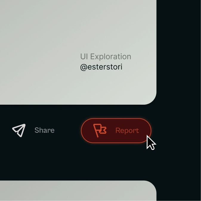
Report Button — Trying icons in actual UI work helps me understand if they do their job or not, much like here 👇