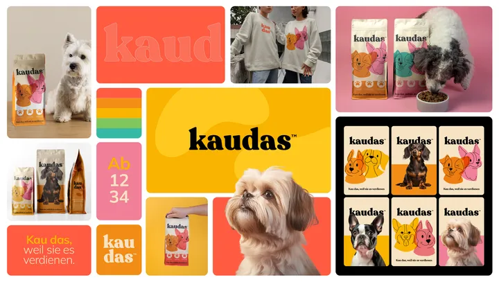
Bento for Kaudas — Visual Brand concept created for Kaudas, a fresh new dog food company.
With its playful, layered, custom typography and clean design, the brand conveys the deliciousness and joy awaiting your furry best friend at every meal.
#visualidentity #bento #packaging
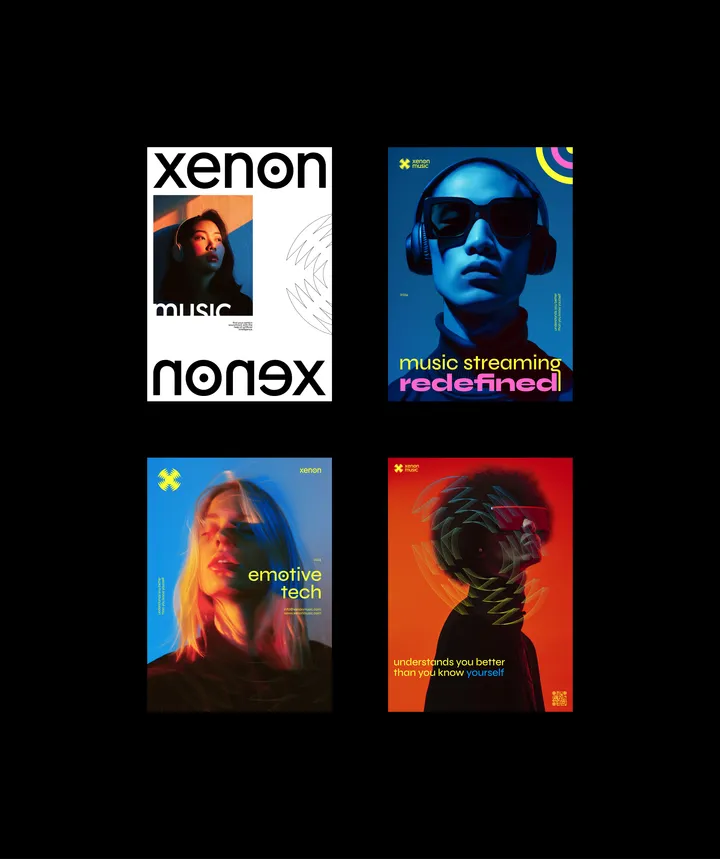
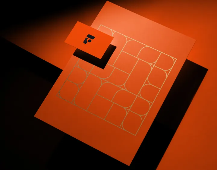
Logo based Pattern — I love designing patterns based on Logos. And often a sleek motion can help introduce the concept. This one was for a creative archviz studio called Studio F.
#motion #brand #logo
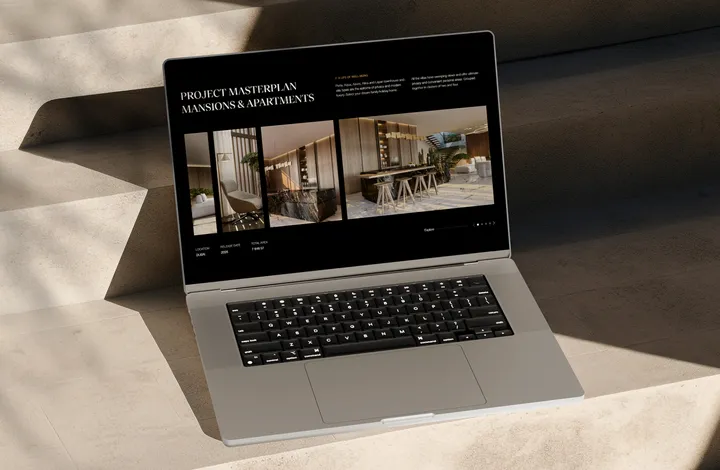
Ocean Break Website — Ocean Break - Danah Bay is a community, lifestyle, and the gateway to diverse experiences whether you’re staying at the hotel or your home at Danah Bay. It’s 90,000 square metres of enriching opportunities for Ras Al Khaimah, investors and tourism.
#web #ui #design
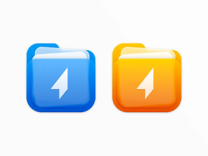
Shuttle icon — For the shuttle.zip project, I designed a two-color icon that combines the shapes of a folder and documents, while maintaining a square form to align with macOS app icon standards. #icon #macos
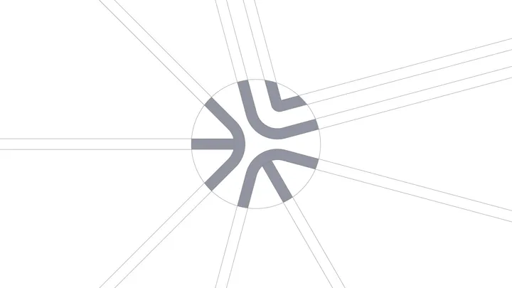
Design Dissolve | Symbol Construction — The Keep Up Agency logo was developed with the aim of representing the strategic stages of the agency's services. The symbol is made up of three arrows that form a figure similar to a target, symbolizing the setting of goals and obtaining results. Each arrow represents a key element: strategies, tactics and objectives, culminating in a central target that illustrates the focus on results and success. The sans-serif typography chosen for the logo complements the symbol, ensuring a timeless and balanced appearance.
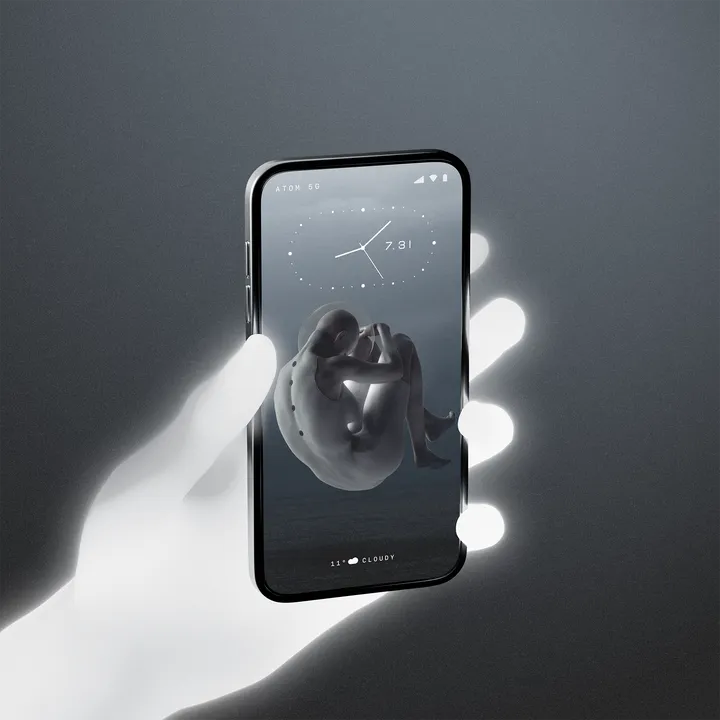
VOID - Mockup / UI / Wallpaper — This one i have done everything just for fun. Created the mockup in 3D using Blender, Minimal UI created in Figma, and the wallpaper artwork using Photoshop, and put all together in Photoshop. (Maybe i will animate this one too).
#mobile #app #design
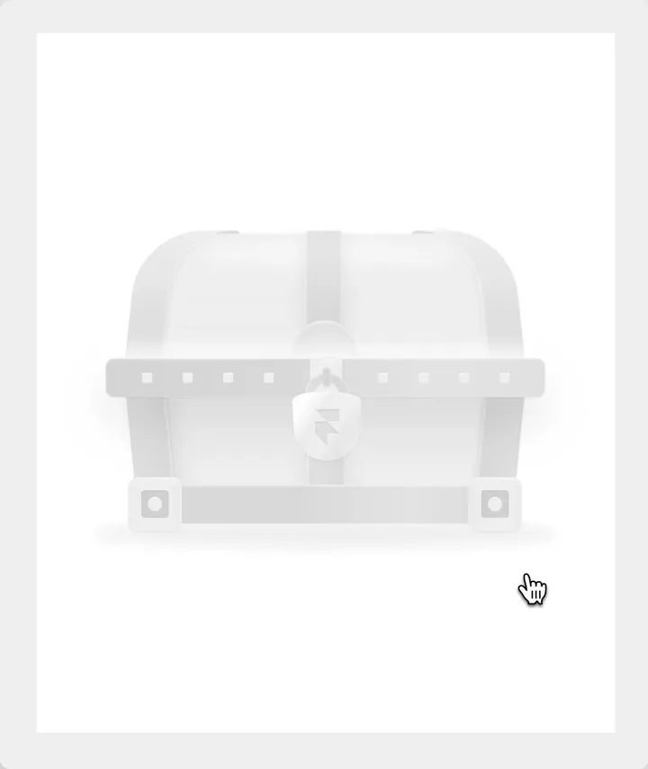
Framer Template Chest — I designed and animated this only using Framer, a treasure chest to keep my Framer templates.
"A symbol" — I'm new here, sharing some of my designs. Hope you like it. If you are eager to communicate, please follow me.
#web #graphic #ui
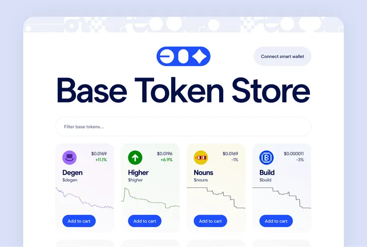
Base Token Store Front Page UI — Demonstrating a powerful idea that you can purchase a token or an NFT as easily as in any other e-commerce site
This is an exploratory concept design which got a dev inspired and got developed and available at www.basetokenstore.com
Fabio Nasci - Personal Branding — My symbol is the letter "F", developed in a rectangle √ 2.
It conveys transformation, dynamism, elegance and simplicity. From the outset I planned to use classic design shapes, such as rectangles and ellipses.
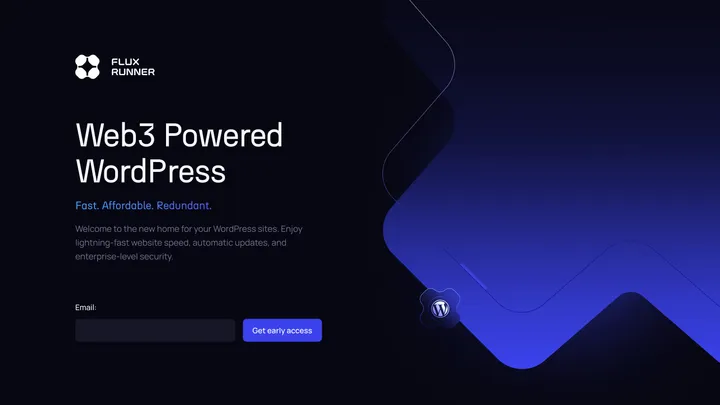
Flux Runner — Hero section design for Flux Runner early access landing page.
#web3
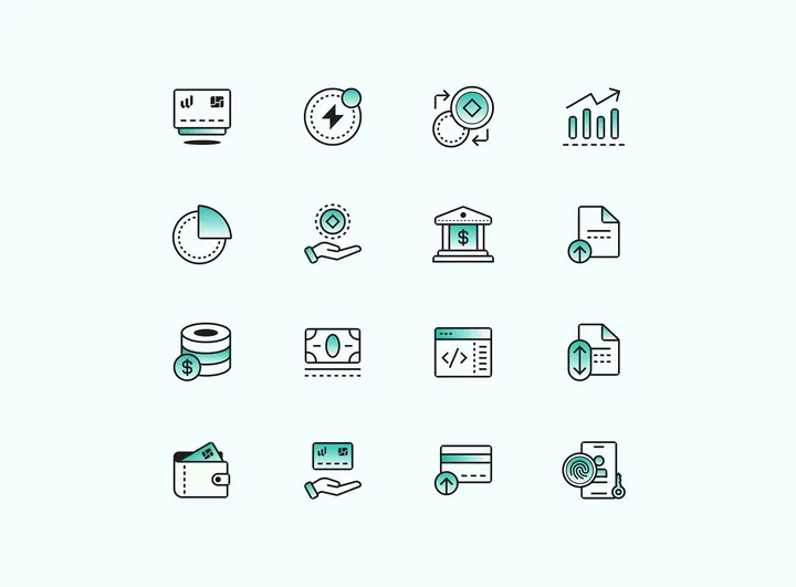
Banking Icons — some banking icons I designed for an iOS project.
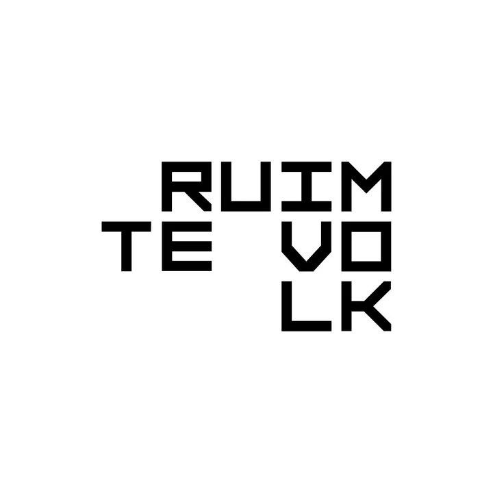
Ruimtevolk dynamic logo — The dynamic Ruimtevolk logo, composed of letters in 1:1 squares, perfectly reflects the expertise and versatility seen in their urban development projects. Its modular design ensures easy and dynamic adaptation across various assets.

