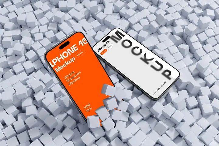
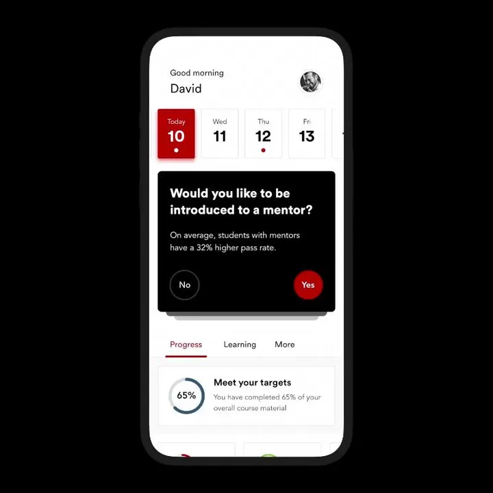
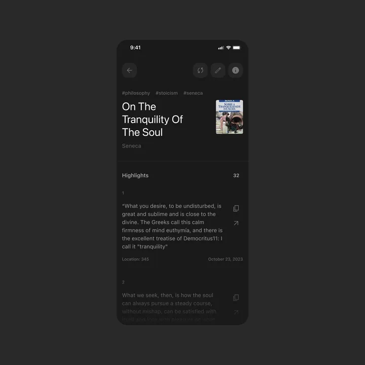
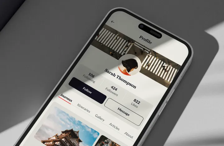
iPhone 16 Mockup — MockupDaddy provides a high-quality iPhone 16 Mockup for designers and developers to present their app interfaces and UI designs with professional precision. This mockup is offered in Photoshop format, featuring a resolution of 5000x3333 pixels at 300 dpi, ensuring superior visual clarity. Its smart object layers allow for effortless customization, enabling users to replace designs easily to suit their specific project needs. With its sleek and modern presentation, the iPhone 16 Mockup is an essential tool for crafting visually stunning mockup showcases.
Beyond the standard version, MockupDaddy offers additional options such as clay-style mockups and Figma-compatible files to cater to different creative needs. These variations expand the utility of the iPhone 16 Mockup, making it adaptable to diverse presentation styles, from client presentations to portfolio enhancements. By using these mockups, designers can elevate their work and communicate their ideas more effectively.
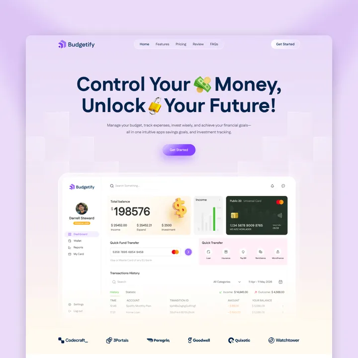
Launch Your Finance or SaaS Business in Minutes — Budgetify – an Officially Approved Framer Template!
Limited-Time Offer: Use code BUDGETIFY25 to get 25% OFF
Budgetify is a modern, high-converting Framer template designed for budgeting apps, fintech startups, and financial consulting services. With a clean layout, smooth animations, and interactive elements, it delivers a seamless user experience that builds credibility and drives conversions.
Key Features:
✔ No-Code Customization
✔ SEO-Optimized
✔ Conversion-Focused CTAs
✔ Smooth Animations & Interactivity
✔ Framer CMS Integration
✔ Fast Loading Speed
👉 framer.com/marketplace/templates/budgetify
#framer #fintech #saas
Tattoodaily monogram — Working on the identity for an app made for tattoo artists, making it easier for everyone to schedule appointments and handle payments. The monogram is based on a calendar and includes the letter 'T'.
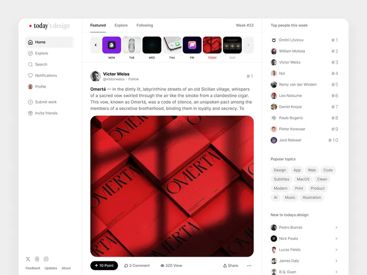
🎨 A fresh new look on todays.design! — I’m excited to share that we’ve launched a brand-new layout for todays.design! As we prepare for some fantastic upcoming updates, we realized our current layout wasn’t quite ready to handle all the amazing features we have in store. So, we decided to give it a makeover first. #layout #app #web
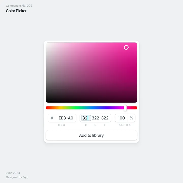
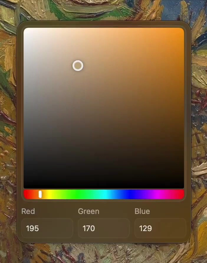
Malleable Hue Slider — For Loop, an app I designed, the hue slider gets rounded at the end, so in turn the grabber adapts when it reaches it 🙃
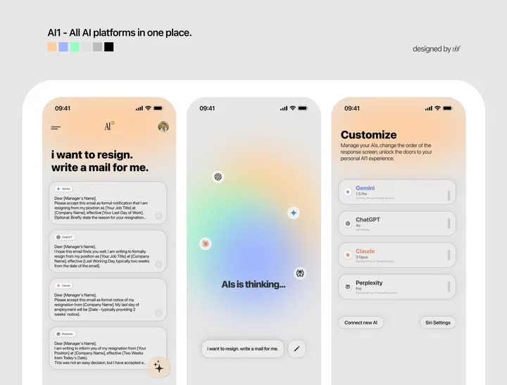
AI1 App Design — All the AIs in one place, responding to you simultaneously, and you choose the best answer and move on.
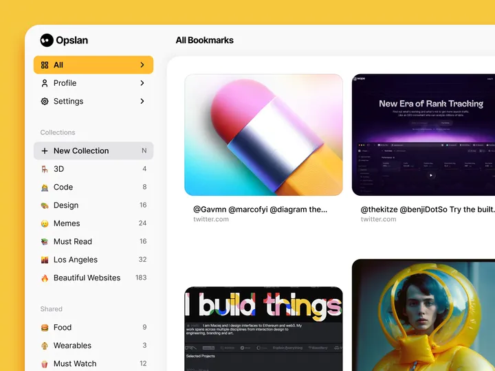
Opslan — Hi all 👋, I wanted to share Opslan, a bookmarking app I designed a while ago to help you easily save and rediscover websites that inspire you. It never saw the light, but I still feel it could be relevant.
As a designer, I aimed to create a tool that combines a visually appealing interface with powerful search capabilities. With Opslan, you can archive your favorite sites and keep them well-organized for future reference, all without the clutter of traditional bookmarks. #web #website
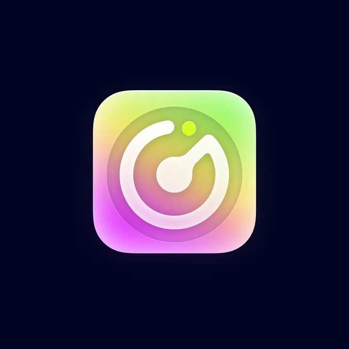
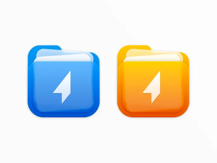
Shuttle icon — For the shuttle.zip project, I designed a two-color icon that combines the shapes of a folder and documents, while maintaining a square form to align with macOS app icon standards. #icon #macos
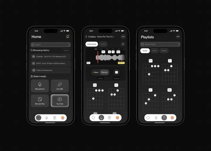
Chordai app redesign — Chordai is a mobile software that helps you find the chords and beats of any song automatically with unprecedented accuracy. i did a redesign for it.

