Rick Wong
Design Engineer in Amsterdam
Obsessed with progress. Staying unpredictable.
- rick.codes
- Amsterdam
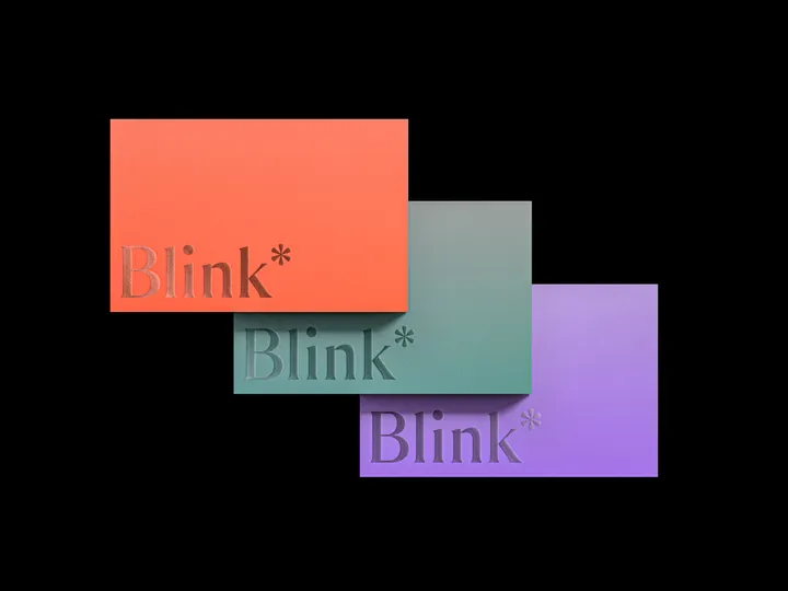
Blink* Branding — The full Blink* Brand and UI project will be posted on Behance next week. #branding #card #foil

Trinkery Visual Identity & Motion — Explore the playful world of Trinkery! 🌟 Check out the vibrant visual identity and dynamic motion graphics. This showreel captures the fun and creativity of the brand. #visualidentity #motiondesign #showreel


Leo Natsume® | New Website and Portfolio — Excited to announce my new portfolio website! 🌐 Access www.leonatsume.com to see my selected and latest 3D design and motion projects for clients like Apple, Google, Spotify, Samsung and many more. Let’s create new stories together! 🔥 #apple #portfolio #illustration

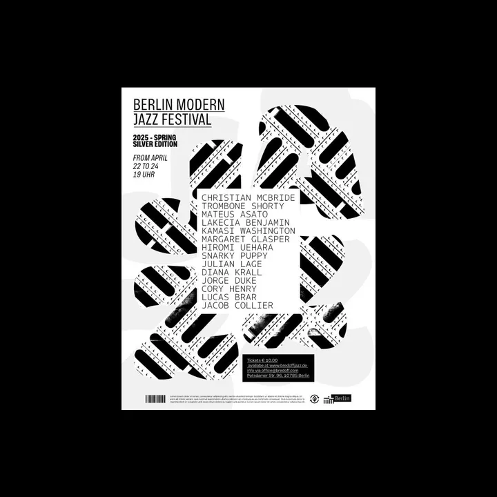
Experimental posters for a Jazz Festival — Study where I set out to create a poster for a jazz event in Berlin, experimenting with various colors featuring exotic contrasts and typographic combinations. #type #print #music

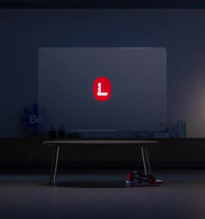
Motion Brand Logo Animation — Brand animation for a motion design course, where I explored dynamic shapes and a vibrant color palette to bring the course's visual identity to life. The result is an animation full of personality that captures the brand's creative essence. 🌟🎨 #motiondesign #logoanimation #animation


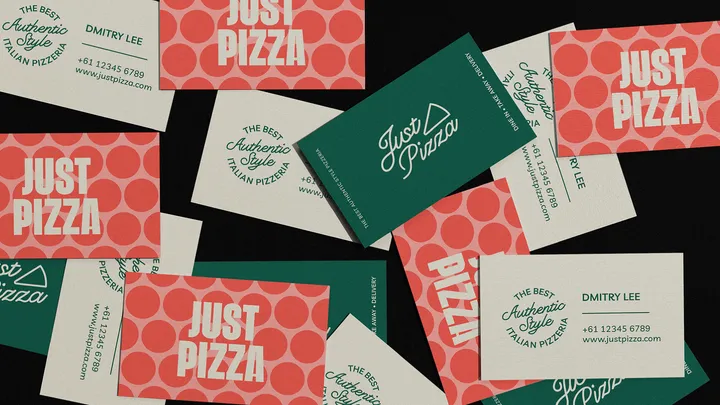
Just Pizza — A fun yet classic visual identity for a pizzeria located in Australia. #visualidentity #logo #colors

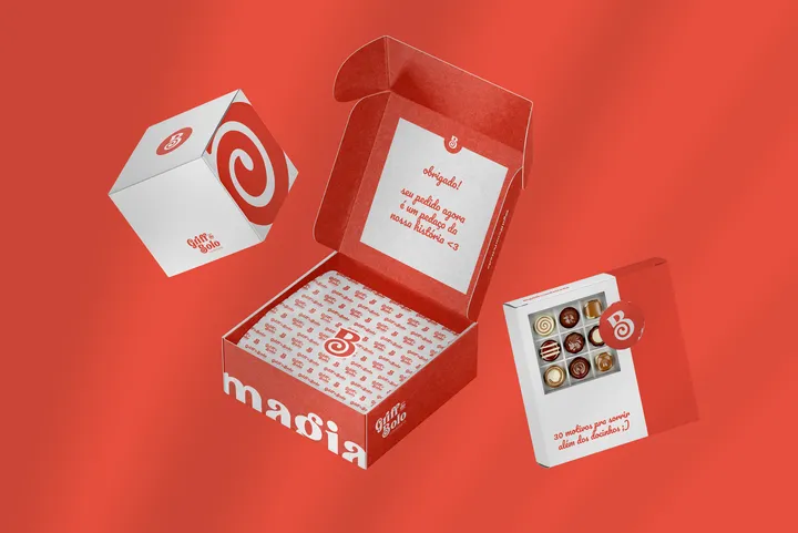
Griff do Bolo — Griff do Bolo is a confectionery and cake shop seeking to transmit magic and joy to every moment of your life. The lettermark B as a focus is to represent the entire flagship of the company.

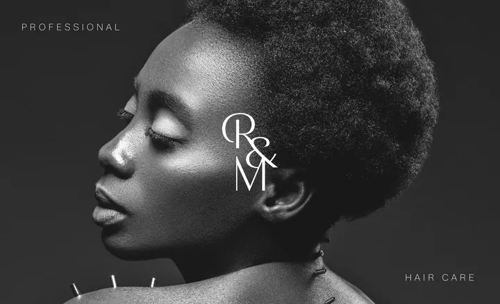
R&M Monogram — Monogram developed for a professional studio specializing in hair care. #type #logo #visualidentity

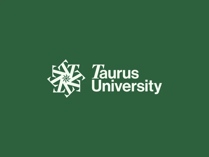
Taurus University — As an exercise, I designed a logo for a fictional institution called Taurus University. The star at the center of the monogram subtly nods to the astrological theme, inspired by the university's name. This project drew inspiration from going through the work of my favorite studio, CGHNYC, and designing a university logo has long been on my bucket list.

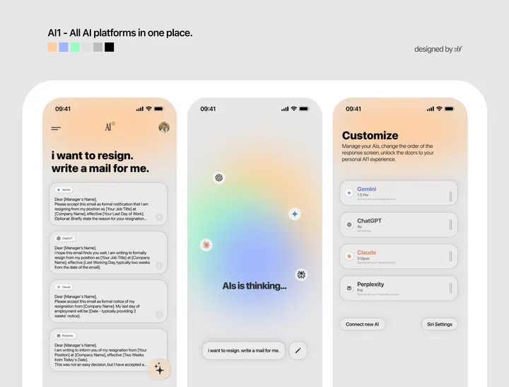
AI1 App Design — All the AIs in one place, responding to you simultaneously, and you choose the best answer and move on.

Caires Type — Typography created for the Caires logo, an architecture firm focused on human-centered projects. #type #logo #visualidentity

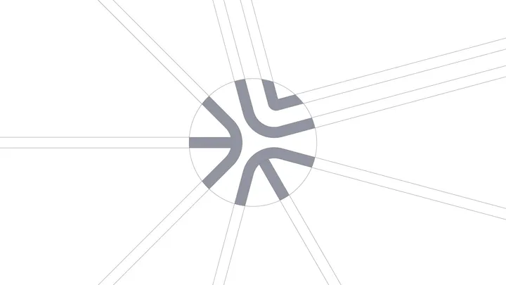
Design Dissolve | Symbol Construction — The Keep Up Agency logo was developed with the aim of representing the strategic stages of the agency's services. The symbol is made up of three arrows that form a figure similar to a target, symbolizing the setting of goals and obtaining results. Each arrow represents a key element: strategies, tactics and objectives, culminating in a central target that illustrates the focus on results and success. The sans-serif typography chosen for the logo complements the symbol, ensuring a timeless and balanced appearance.

Immersy Logo Animation — It’s not just any reveal; we added a playful spring effect to bring the logo to life, perfectly mirroring the school's energetic approach to teaching. 🎓✨ #logoanimation #motiondesign #typography


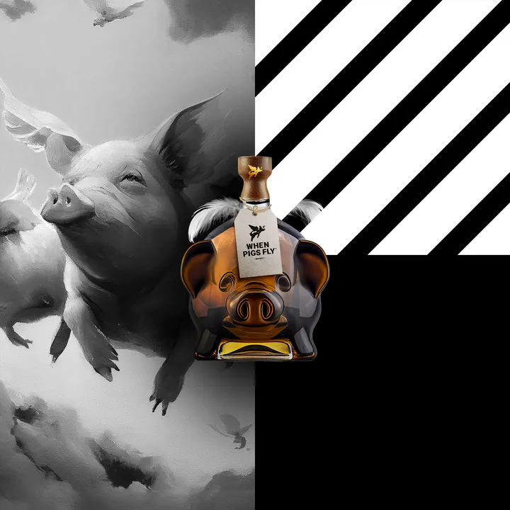
WHEN PIGS FLY — I got to find time to post this full case. But here's a little spoiler for you :) #branding #packaging #whisky

