Rick Wong
Design Engineer in Amsterdam
Obsessed with progress. Staying unpredictable.
- rick.codes
- Amsterdam
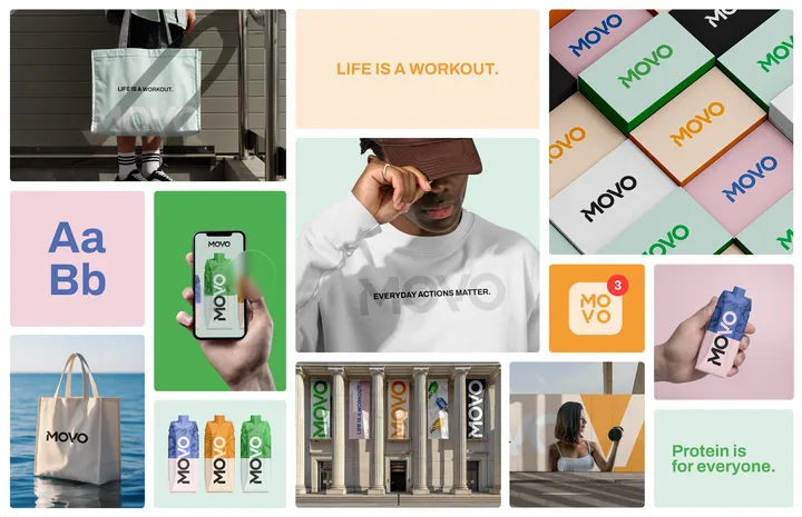
MOVO Brand Identity Bento — Brand Identity display in Bento format for MOVO, a protein based juice brand. #branding #packaging #logo

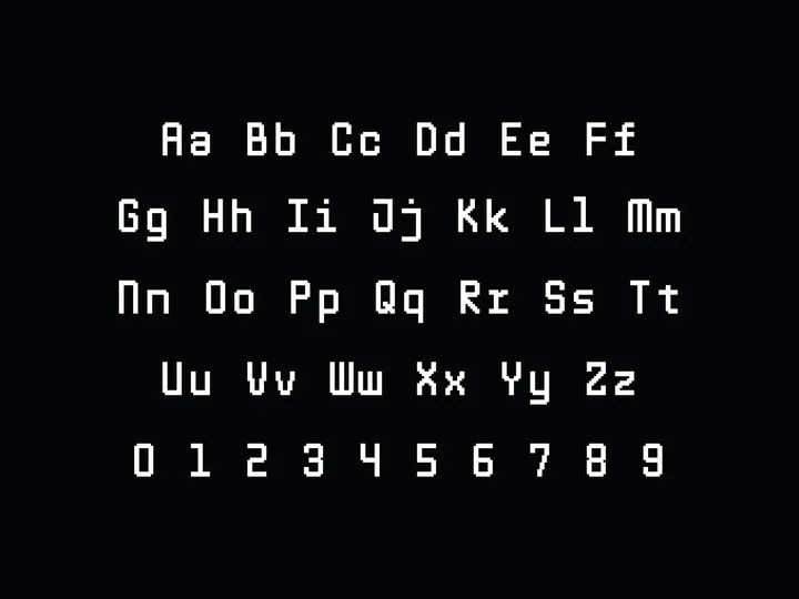
Pixel mono font '%' — I'm working on a pixel mono font, and due to limited space, I've had to get creative with some symbols. The percentage sign, in particular, took some time, but I'm very happy with the result and think it looks interesting.


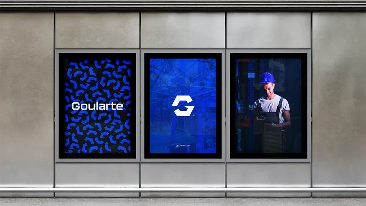
Goularte Engenharia — Visual identity designed for a company specializing in mechanical projects for industrial machines. #logo #branding #visualidentity

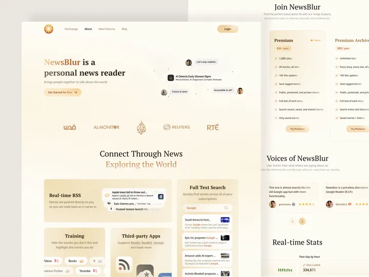
NewsBlur news reader landing page — It's an unofficial redesign for NewsBlur A personal news reader brings people together to talk about the world. #web #ui #landingpage

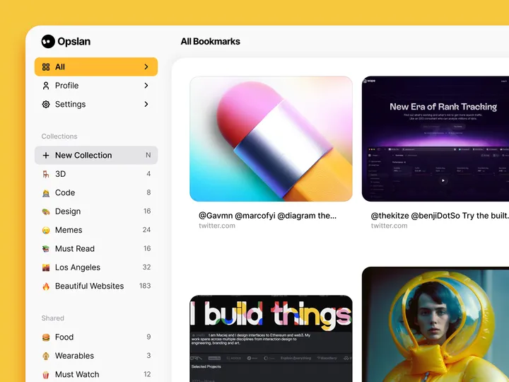
Opslan — Hi all 👋, I wanted to share Opslan, a bookmarking app I designed a while ago to help you easily save and rediscover websites that inspire you. It never saw the light, but I still feel it could be relevant. As a designer, I aimed to create a tool that combines a visually appealing interface with powerful search capabilities. With Opslan, you can archive your favorite sites and keep them well-organized for future reference, all without the clutter of traditional bookmarks. #web #website

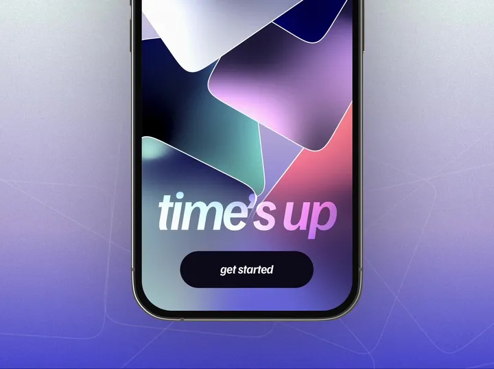
Hypnotic welcome screen for Time's Up game — Just peacefully moving cards for a gentle, calm animation ✨ #app #onboarding #animation

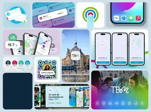
TBM, app design & branding ✨ — Bordeaux's public transport navigation app, rebranding and app design. Proud to offer a better mobility experience in the city where I was born ✨. #bento #app #navigation

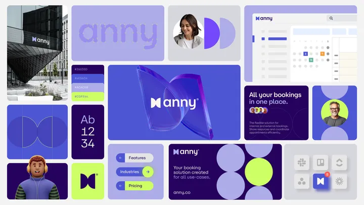
Bento for Anny — Visual identity developed for a modern and flexible collaborative platform. #bento #visualidentity #logodesign

Terrance Header — Terrance is a premier financial consulting firm based in the United States, renowned for its exceptional expertise and commitment to delivering personalized financial solutions.


Arthur Fontes Visual Identity — Arthur Fontes, a real estate broker known for working with high-end properties in condominiums in the capital of Sergipe, was seeking a visual identity that would reflect both the exclusivity of the developments he represents and his unique personality in the market. #visualidentity #type


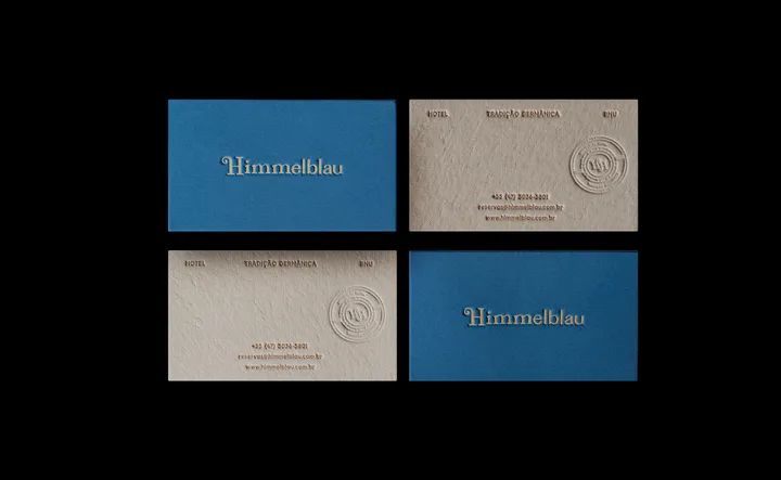
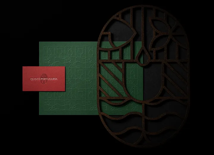
Quinta Portuguesa Branding — I've posted the alone before, but here is some stationary photography we did. Love this identity. :) (its for a Portuguese Winery and store) #branding #logo #pattern

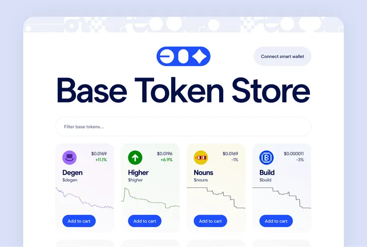
Base Token Store Front Page UI — Demonstrating a powerful idea that you can purchase a token or an NFT as easily as in any other e-commerce site This is an exploratory concept design which got a dev inspired and got developed and available at www.basetokenstore.com

