Plant Care & Tracking Dashboard — Take care of your plants, and track care schedules and reminders, Also, follow the tractors' location, agricultural records, inventory, and reports about your farm. Logo by: Wahyu Rizfi #web #dashboard #farm

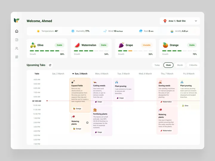
Plant Care & Tracking Dashboard — Take care of your plants, and track care schedules and reminders, Also, follow the tractors' location, agricultural records, inventory, and reports about your farm. Logo by: Wahyu Rizfi #web #dashboard #farm


Symbol Zixen Trading — A minimalist and modern symbol representing a gyroscope for an investment company. #logo #symbol #visualidentity

Bas de haan logo — Made a rooster for my friend Bas. His last name means rooster in dutch. The monogram is created on a grid, since he is a furniture maker and specialises in perfect corner-connections and details in his work.

Hi, I’m Fadul 👋 — I do logo animations & brand motion. Open for collabs 🚀 #motion #design #branding


bauplan logo and landing page — Bauplan is a small startup trying to simplify data infrastructure management. The team asked me to refresh their logo and website. We envisioned a playful Bauhaus look with modern elements. I designed the page in Figma and developed it in Framer.

Linksvoor logo exploration — Exploring logo concepts for Studio Linksvoor, a Dutch event agency. 'Linksvoor' translates to 'front left'.

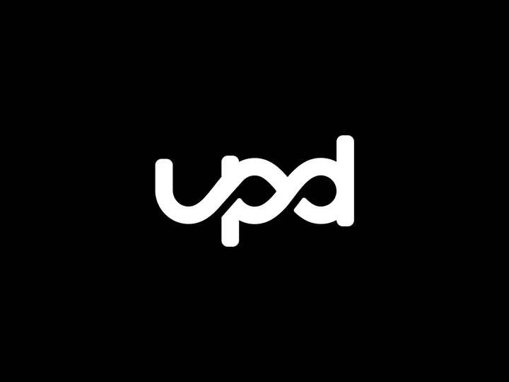
UPD consultancy Logo — UPD's logo intertwines its name with the infinity symbol, reflecting its dedication to constant improvement as consultants.

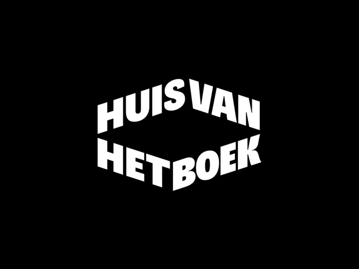
Huis van het Boek logo — In The Hague, you'll find a hidden gem for book enthusiasts: 'Huis van het Boek,' which translates to 'House of the Book.' The brand has been distilled to its core resulting in a self-explanatory logo that has given it a fitting, contemporary appearance.

Logo Animation using LottieLab — A really cool animation that I wanted to make for some time and finally did. #logo #animation #lottie


Immersy Logo Animation — It’s not just any reveal; we added a playful spring effect to bring the logo to life, perfectly mirroring the school's energetic approach to teaching. 🎓✨ #logoanimation #motiondesign #typography


Caires Type — Typography created for the Caires logo, an architecture firm focused on human-centered projects. #type #logo #visualidentity

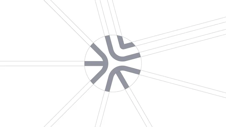
Design Dissolve | Symbol Construction — The Keep Up Agency logo was developed with the aim of representing the strategic stages of the agency's services. The symbol is made up of three arrows that form a figure similar to a target, symbolizing the setting of goals and obtaining results. Each arrow represents a key element: strategies, tactics and objectives, culminating in a central target that illustrates the focus on results and success. The sans-serif typography chosen for the logo complements the symbol, ensuring a timeless and balanced appearance.

Taurus University — As an exercise, I designed a logo for a fictional institution called Taurus University. The star at the center of the monogram subtly nods to the astrological theme, inspired by the university's name. This project drew inspiration from going through the work of my favorite studio, CGHNYC, and designing a university logo has long been on my bucket list.

3D Logo exploration for Studio F. Branding — Little 3D exploration done 100% on Adobe Illustrator. #branding #3d #logo

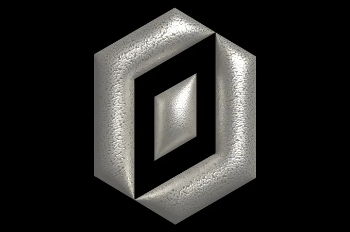
Logo for Automadeit Agency — Branding work for German marketing agency Automadeit. #branding #3d #logo

When Piggs Fly — A organic style logo for Whisky brand. Designed with subtle imperfections and inconsistencies to ornate that vintage esthetic. #branding #logo #symbol

