UPD consultancy Logo — UPD's logo intertwines its name with the infinity symbol, reflecting its dedication to constant improvement as consultants.


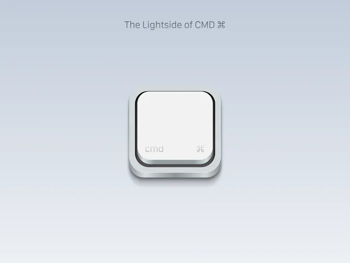
The Lightside of CMD — Project about the key that differentiates two systems, but has a very interesting background, the symbol used to enter commands in macOS operating systems. I guess you could say it’s one of the most important keys on the keyboard, and in fact the most representative of all the keys on a macOS keyboard. Project all done in Figma.

Discovery Canyon — Symbol created for a luxury hotel located in the Aparados da Serra National Park, one of the biggest tourist attractions in southern Brazil. The concept refers to the canyons that exist there.

When Piggs Fly — A organic style logo for Whisky brand. Designed with subtle imperfections and inconsistencies to ornate that vintage esthetic. #branding #logo #symbol

Birdie's Dev Agency — Birdies is a development agency owned by a couple. The brand is called Birdie's, inspired by how they met (playing golf). In golf, a "birdie" is a score achieved by finishing a hole one stroke under par. The idea was to use the classic "<>", a symbol of development, to create a pair of birds, utilizing negative space.

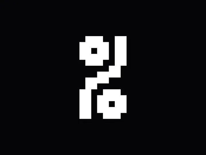
Pixel mono font '%' — I'm working on a pixel mono font, and due to limited space, I've had to get creative with some symbols. The percentage sign, in particular, took some time, but I'm very happy with the result and think it looks interesting.

Symbol Zixen Trading — A minimalist and modern symbol representing a gyroscope for an investment company. #logo #symbol #visualidentity

Newton lessen Logo — My first submit for today's design, not really from today but a visual identity project I did last year. ‘Newton lessen’ provides Science & Technology lessons and teaching materials for to primary schools in the Netherlands. I got asked to design the visual identity and make various branding materials. The brand's name, 'Newton Lessen,' pays tribute to Sir Isaac Newton, a famous scientist, astronomer and mathematician renowned for his many and important discoveries. Since Newton's work is vast and varied, I came up with the idea that Newton can’t be captured into a single symbol. Therefore I designed a dynamic and playful logo made up of four symbols, each representing something Newton discovered. F.e. an apple that symbolises the Laws of Gravity, a prism for his thoughts about the refraction of light, mathematical symbols representing calculus and the famous Newtonian telescope. #branding #science #logo

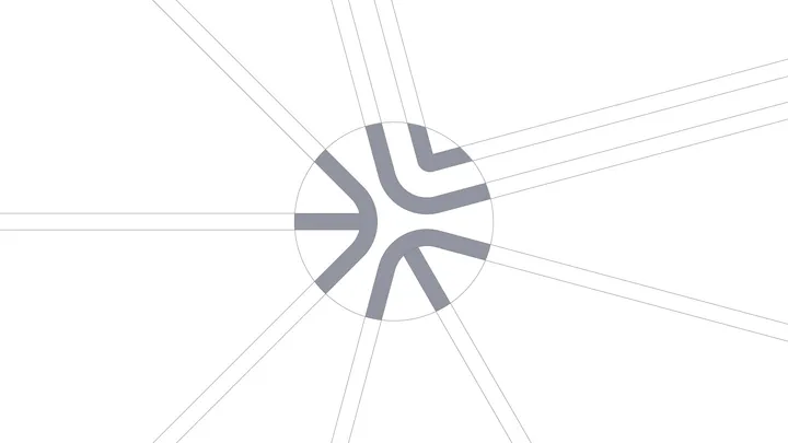
Design Dissolve | Symbol Construction — The Keep Up Agency logo was developed with the aim of representing the strategic stages of the agency's services. The symbol is made up of three arrows that form a figure similar to a target, symbolizing the setting of goals and obtaining results. Each arrow represents a key element: strategies, tactics and objectives, culminating in a central target that illustrates the focus on results and success. The sans-serif typography chosen for the logo complements the symbol, ensuring a timeless and balanced appearance.

