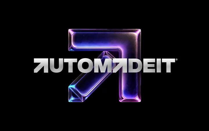
ERIKS - Project future proof — ERIKS, a specialized industrial service provider in the Netherlands, is committed to achieving its sustainability goals. To support these efforts, I designed a logo for their initiative, Project Future Proof. This dedicated division of the company will focus on enhancing sustainability and adopting more sustainable practices for the future.
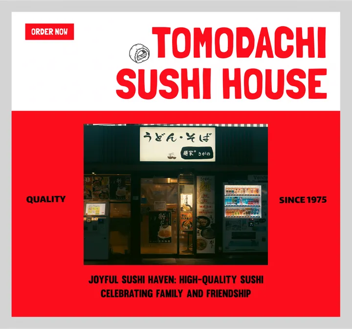
Tomodachi Sushi House — Welcome to Tomodachi Sushi House: Where Quality Meets Friendship. Enjoy high-quality sushi and celebrate family and friends with every bite. Since 1975
Ongaku Sounds — Tired of perfection and itching to do something fun and meaningful for ourselves, Oriana Gaeta and I have embarked on a music and art direction focused little project, old camcorder in hand and silly little concepts in our brains, we called it Ongaku (literally music in Japanese).
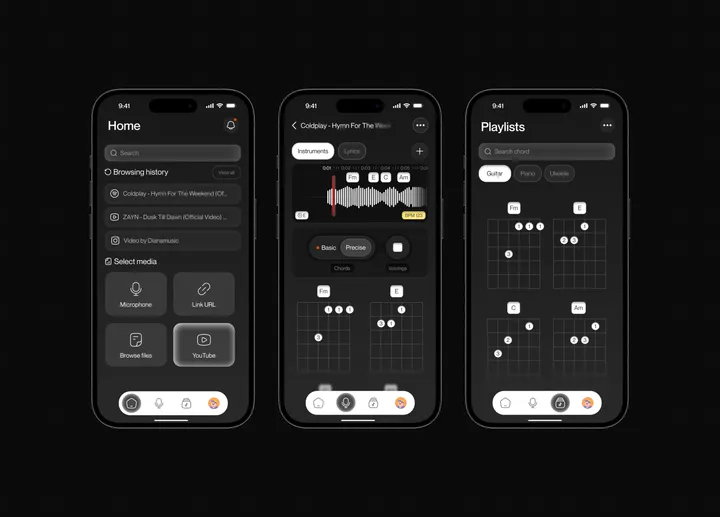
Chordai app redesign — Chordai is a mobile software that helps you find the chords and beats of any song automatically with unprecedented accuracy. i did a redesign for it.
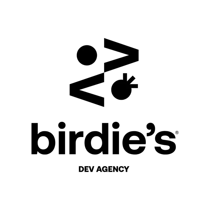
Birdie's Dev Agency — Birdies is a development agency owned by a couple. The brand is called Birdie's, inspired by how they met (playing golf). In golf, a "birdie" is a score achieved by finishing a hole one stroke under par. The idea was to use the classic "<>", a symbol of development, to create a pair of birds, utilizing negative space.
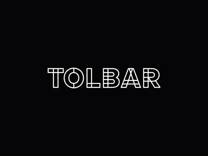
Tolbar logo — A logo for the bar (tolbar) at Cinetol in Amsterdam.
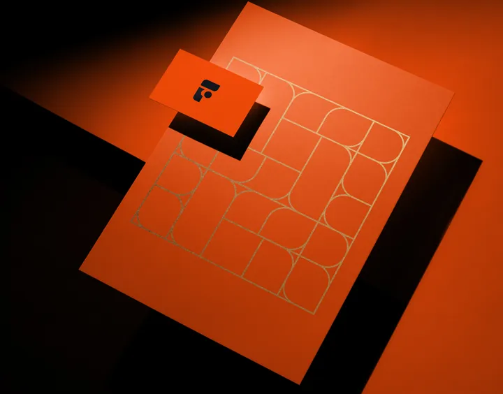
Fabio Nasci - Personal Branding — My symbol is the letter "F", developed in a rectangle √ 2.
It conveys transformation, dynamism, elegance and simplicity. From the outset I planned to use classic design shapes, such as rectangles and ellipses.

