Giel Cobben
Amsterdam
Freelance designer & developer building todays.design & shuttle.zip
- giel.works
- Amsterdam
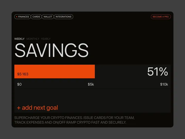
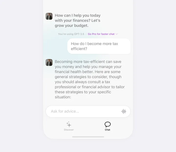
Brutal finance tracker — Check out our latest brainchild, the "Finance Tracker" app. This isn't your average budgeting tool—it's a design concept crafted in Figma and animated with Jitter, built to do more than just monitor your stash. It’s here to push your financial goals from dreams to reality with an interface so slick, it'll make your bank account look good. #web #fintech #appdesign

SmashX logo — SmashX is a startup founded by an experienced team of market experts, software developers and designers. They develop white label mobile apps for various industries that help build brand engagement and facilitate the brand user in their daily work.

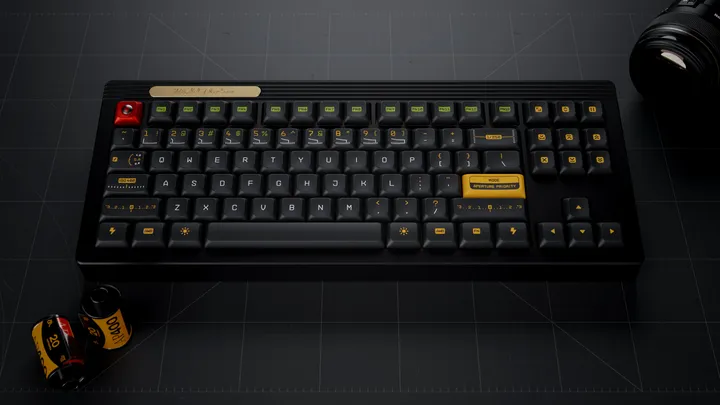
Working on kitting for a new keycap set — With Gestalt production finish I am working on my next keycap set, inspired by vintage photography and vintage photography lens hence the name Aperture Priority. This set was designed in Figma and I created a custom legends based on a monotype technical typeface. I also included familiar photography UI elements as novelty keycaps. #3d #mechanicalkeyboard

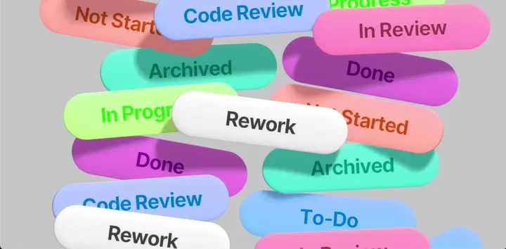
Dropping tags — I've been toying with the idea of creating an intro animation for an iOS project management app. The animation was rendered live using Spline3d.

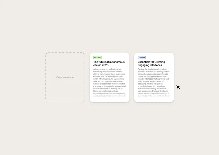
Drag-and-drop interaction for document archival — Quick mockup I made in Figma to get the idea out of my head. No project in mind. Just for fun. :)

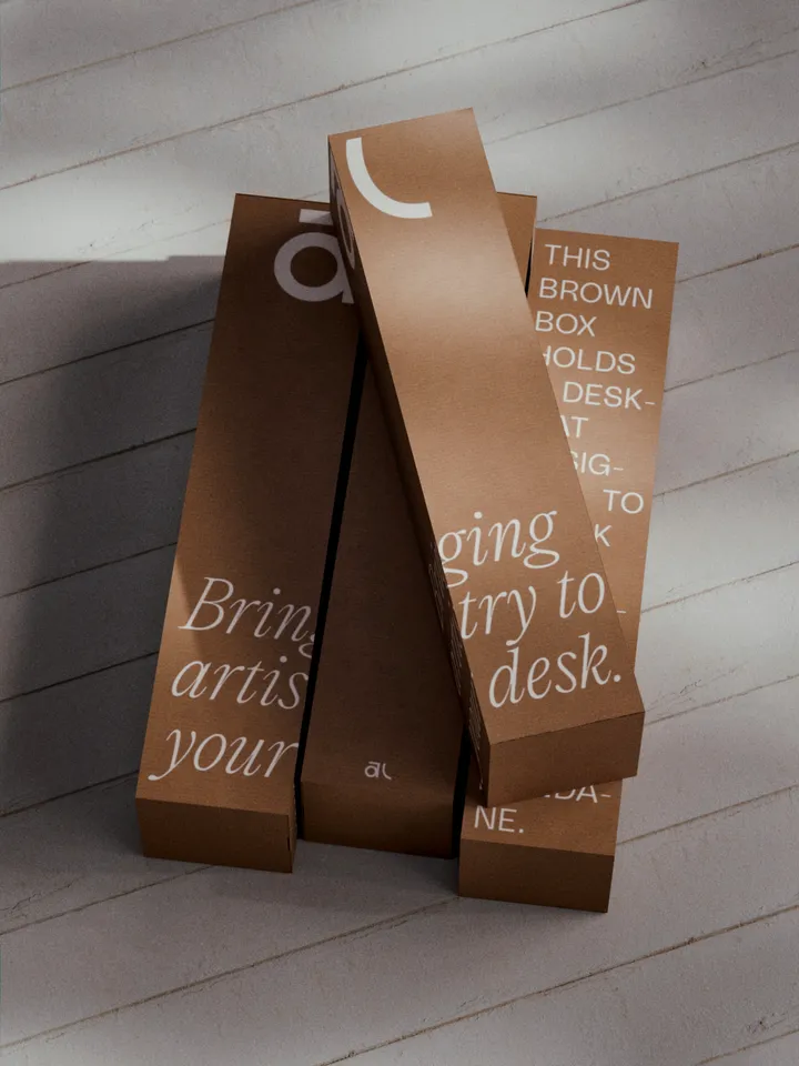
Akuko Labs Deskmat Packaging — Plain cardboard boxes are cheaper to produce, costing nearly half as much as fully printed boxes. I also find them more elegant, especially with white ink accents. Win-win. Designed in Figma, rendered in Blender.

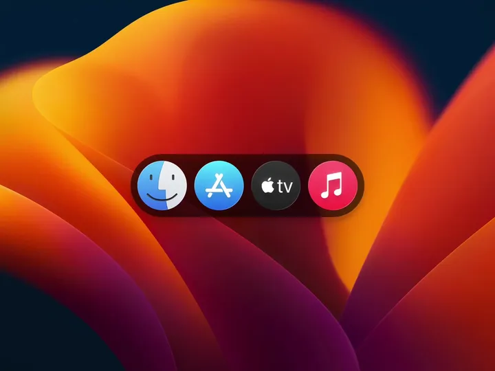
macOS Dock - Apple Music Micro Interaction — I hope that someday we'll see widgets in the Mac dock 👀 What are your thoughts? HOT OR NOT? #motion #interaction #macos

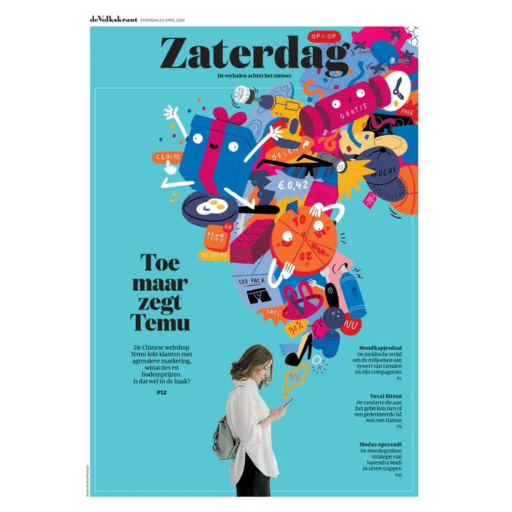
Newspaper cover — For a piece in De Volkskrant on Temu and all the tricks it uses to get people to buy more. #illustration #editorial

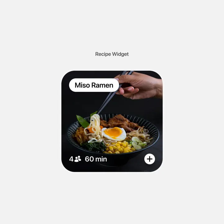
Recipe Widget — This is a concept for a recipe widget that I designed today. I'm exploring various widget ideas that I might incorporate into Waffle, a visual organization app, in the future. #widget #recipe

UPD consultancy Logo — UPD's logo intertwines its name with the infinity symbol, reflecting its dedication to constant improvement as consultants.


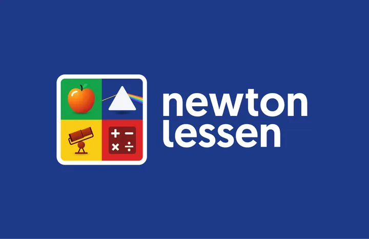
Newton lessen Logo — My first submit for today's design, not really from today but a visual identity project I did last year. ‘Newton lessen’ provides Science & Technology lessons and teaching materials for to primary schools in the Netherlands. I got asked to design the visual identity and make various branding materials. The brand's name, 'Newton Lessen,' pays tribute to Sir Isaac Newton, a famous scientist, astronomer and mathematician renowned for his many and important discoveries. Since Newton's work is vast and varied, I came up with the idea that Newton can’t be captured into a single symbol. Therefore I designed a dynamic and playful logo made up of four symbols, each representing something Newton discovered. F.e. an apple that symbolises the Laws of Gravity, a prism for his thoughts about the refraction of light, mathematical symbols representing calculus and the famous Newtonian telescope. #branding #science #logo

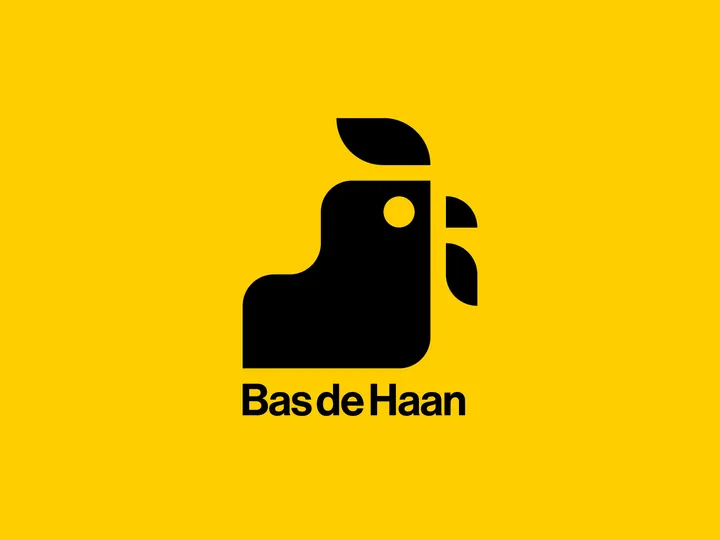
Bas de haan logo — Made a rooster for my friend Bas. His last name means rooster in dutch. The monogram is created on a grid, since he is a furniture maker and specialises in perfect corner-connections and details in his work.







![Menu [Dark]](https://media.todays.design/15c5b50b0c2f38ac5d5011d39d0b9a723294f44c14088f770b5d1074739d2cbb-md.webp)

