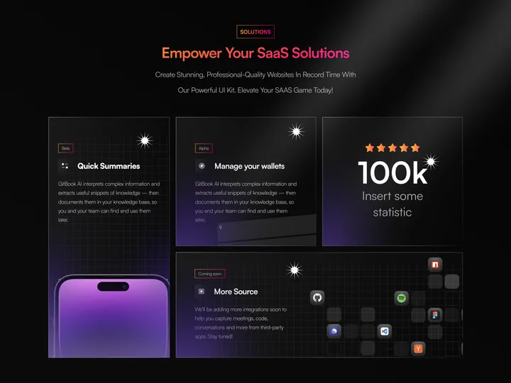
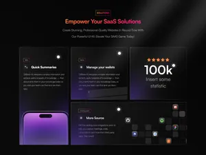
Bento Design for SaaS Website — Feature Blocks:
Quick Summaries: Provides industry insights in one place, encouraging users to build upon existing knowledge.
Manage Your Wallets: Offers analytic reports and smart notifications for informed decision-making. More Source: Encourages exploration and learning. Statistics Section: Positioned to the right, it showcases impressive stats to build credibility. Perspective: The design prioritizes readability, user engagement, and brand identity.
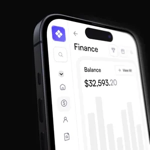
Remember, as a UI/UX designer, user-centricity and intuitive navigation are paramount. These screens aim to empower users while maintaining a visually appealing experience. 🚀#web #product #bento
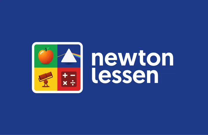
Newton lessen Logo — My first submit for today's design, not really from today but a visual identity project I did last year.
‘Newton lessen’ provides Science & Technology lessons and teaching materials for to primary schools in the Netherlands. I got asked to design the visual identity and make various branding materials.
The brand's name, 'Newton Lessen,' pays tribute to Sir Isaac Newton, a famous scientist, astronomer and mathematician renowned for his many and important discoveries. Since Newton's work is vast and varied, I came up with the idea that Newton can’t be captured into a single symbol. Therefore I designed a dynamic and playful logo made up of four symbols, each representing something Newton discovered. F.e. an apple that symbolises the Laws of Gravity, a prism for his thoughts about the refraction of light, mathematical symbols representing calculus and the famous Newtonian telescope.
#branding #science #logo
UPD consultancy Logo — UPD's logo intertwines its name with the infinity symbol, reflecting its dedication to constant improvement as consultants.

![Menu [Dark]](https://media.todays.design/15c5b50b0c2f38ac5d5011d39d0b9a723294f44c14088f770b5d1074739d2cbb-sm.webp)

