Creating a tab group — Celebrating this platform by adding todays.design to a new folder in tabOS - everything done with CSS/React, even the folder expanding/collapsing


Creating a tab group — Celebrating this platform by adding todays.design to a new folder in tabOS - everything done with CSS/React, even the folder expanding/collapsing
Antarctic research illustration — A graphic illustrating investment and development opportunities to further develop research of the Southern Ocean and Antarctic Nearshore Coastal Research.


CTC#002 – "Actually" — Trying out Jitter for animation. It's very swift to work with (this took me 5 minutes to animate), but I miss the motion blur effects on animations that After Effects can add with a click of a button. Hopefully Jitter will add this option soon. #ux #webdesign #ctc


Crates • Side-Panel — A zoomed-in view of a #music software #side-panel displaying detailed track information, including release date, genre, and label name.


App Store Screenshots for Purp app — I designed a series of App Store screenshots for a social networking app called Purp, aiming to resonate with its primary audience, predominantly under 22 yo. The design captures the essence of youth interests and connectivity that’s both inviting and comfortable for app's users.


brijr/components — components.bridger.to is a free and open-source collection of Next.js components for building landing pages and websites. They are built using brijr/craft, shadcn/ui, Typescript, and Tailwind. #web #nextjs #engineering


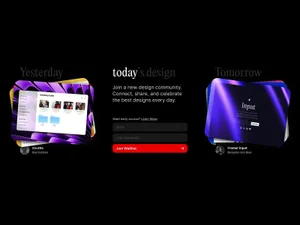
Today's Design logo — Great to see a new site enter the fray. To celebrate the inauguration of the site, I'll evaluate its logo. I can see what @giel is attempting to do here with the logo, turn the "today" into a sort of implicit UI element in the form of a day indicator. I observe that he wants to center the circle with the x-height, in that the evenness of the height lends itself to the centered red indicator. But day indicators of this sort, especially in this context would seem to call for title case or sentence case. Moreover, elsewhere in the UI, headings set in PP Editorial New are set in sentence case. In this subtle revision, I've cleaned up the kerning, adopted title case, and used a matching ellipse rather than a standard circle, which comes off as somewhat generic. Most importantly, I've used a curly quote rather than the straight quote used which is an incorrect usage, and curly quotes look more elegant to boot. Cheers to Giel on the launch.


