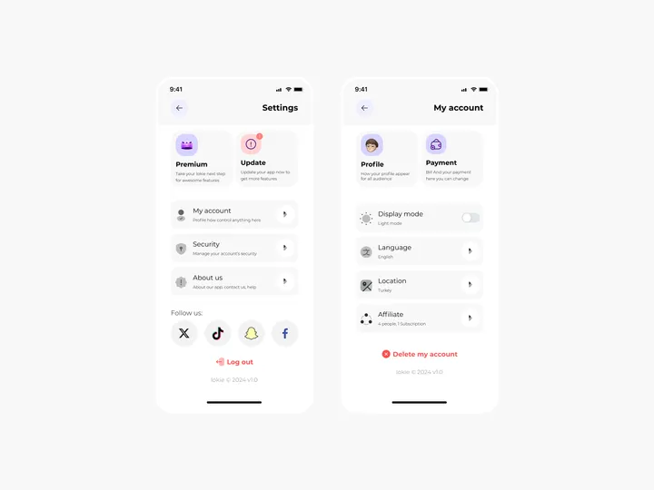
Settings Page for Mobile App - Lokie App — ◑ Design Elements:
Clean Layout: The screens maintain a clean and organized layout, ensuring clarity and ease of use.
Consistent Typography: The use of consistent fonts and font sizes enhances readability.
Iconography: Icons represent various settings and categories, aiding quick recognition.
Color Scheme: The light mode employs a soft color palette, reducing eye strain. #appdesign #figma #settings
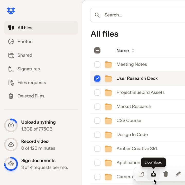
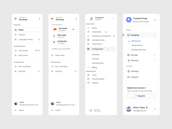
Sidebar Navigation Patterns — I'm excited to share another design pattern with you all!
This one includes nested menu elements and emphasizes clarity in the current state.
Enjoy and follow for more content.
Need assistance with your product?
Let's connect!
#design #dashboard #saas

