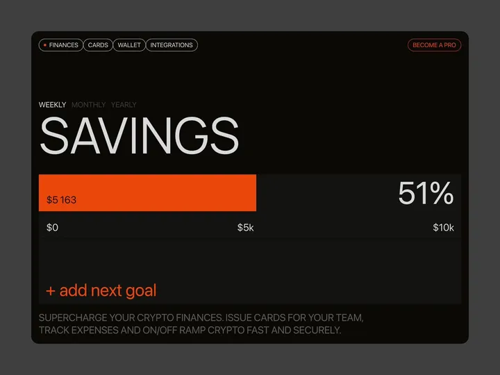
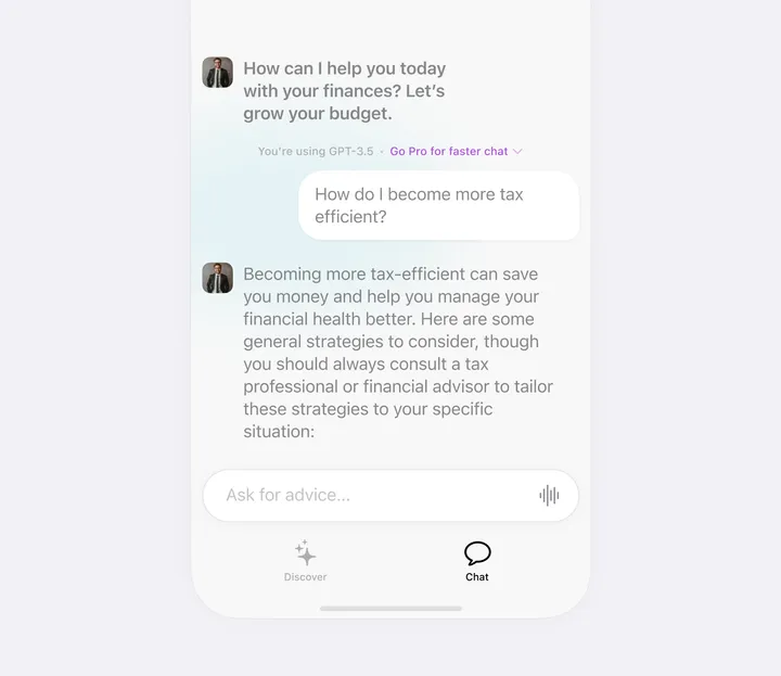
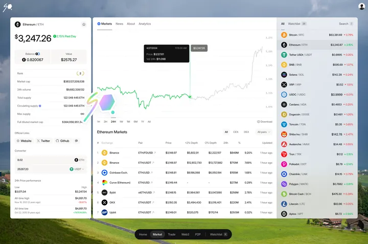
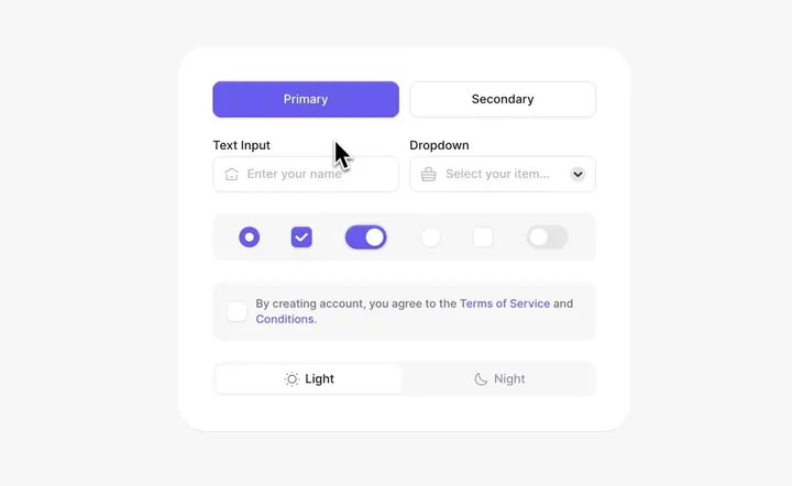
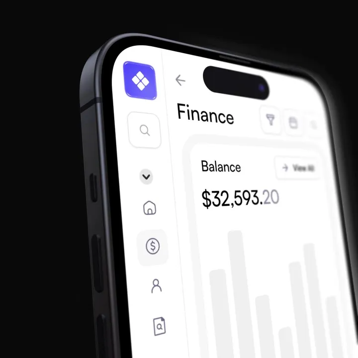
Brutal finance tracker — Check out our latest brainchild, the "Finance Tracker" app. This isn't your average budgeting tool—it's a design concept crafted in Figma and animated with Jitter, built to do more than just monitor your stash. It’s here to push your financial goals from dreams to reality with an interface so slick, it'll make your bank account look good.
#web #fintech #appdesign
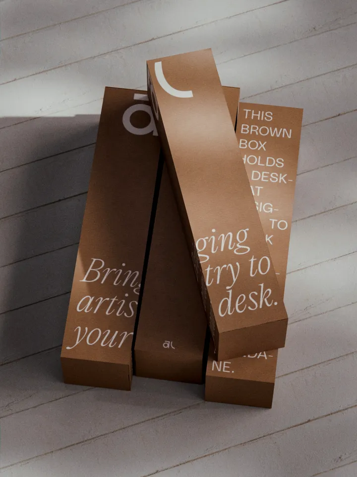
Akuko Labs Deskmat Packaging — Plain cardboard boxes are cheaper to produce, costing nearly half as much as fully printed boxes. I also find them more elegant, especially with white ink accents. Win-win. Designed in Figma, rendered in Blender.
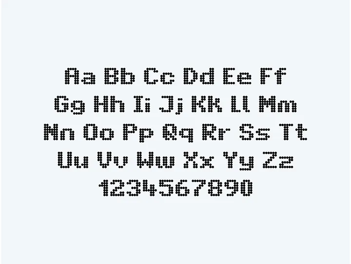
Intransit — The recreation of a typeface commonly used in Amsterdam's public transport system. The grid inspired by the LED screens used for displaying messages, intrigued me.
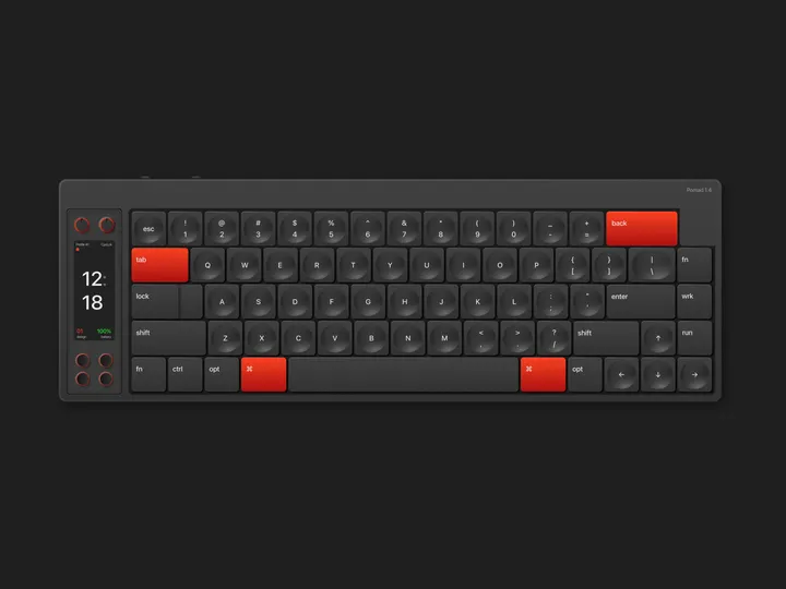
Keyboard Illustration Pomad 1.4 — Vector illustration inspired by a keyboard called Nomad Keyboard, this illustration was made entirely using only Sketch. A very interesting work and with many learnings in its construction.
Using sketch to achieve this kind of results seemed interesting to me, however there is no comparison with what can be optimized in time, with an app focused on the construction of vector graphics like Affinity Designer.
#illustration #sketch #vector
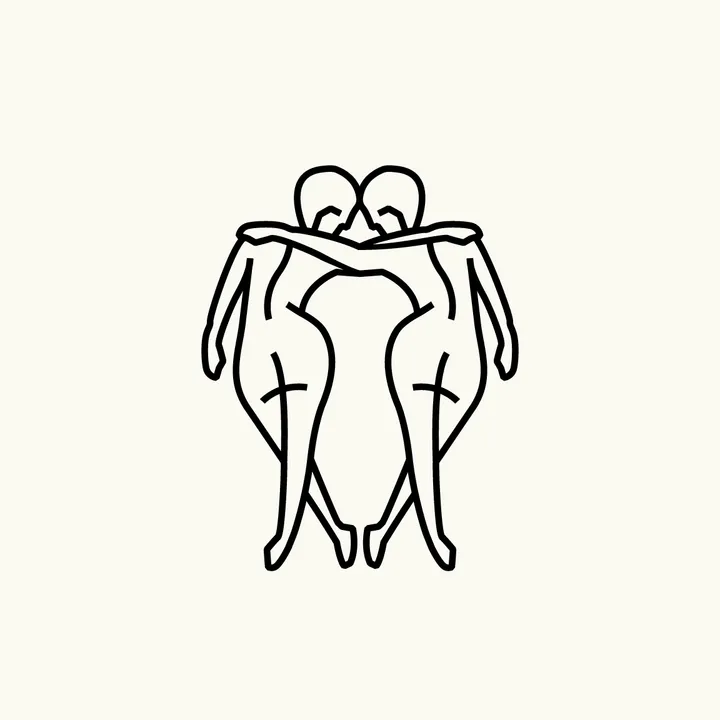
Linksvoor logo exploration — Exploring logo concepts for Studio Linksvoor, a Dutch event agency. 'Linksvoor' translates to 'front left'.
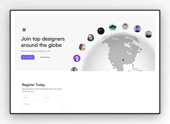
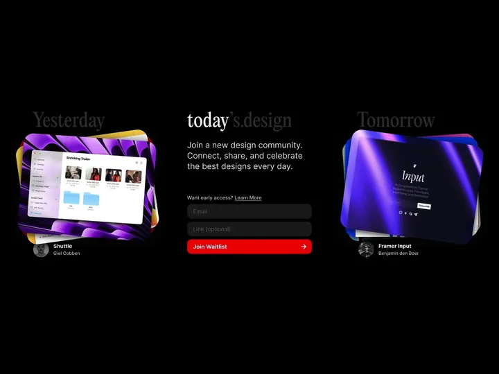
todays.design landing page — I'm thrilled to announce the launch of todays.design! We're building a vibrant new community where designers can connect, share their work, and celebrate the best in design each and every day. Join us to explore inspiring designs, engage with fellow creatives, and showcase your own unique projects. #community #website
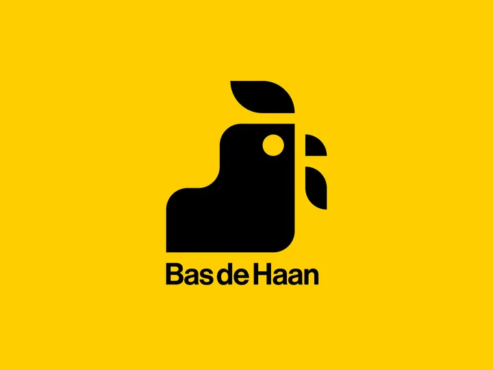
Bas de haan logo — Made a rooster for my friend Bas. His last name means rooster in dutch. The monogram is created on a grid, since he is a furniture maker and specialises in perfect corner-connections and details in his work.
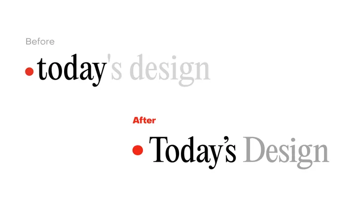
Today's Design logo — Great to see a new site enter the fray. To celebrate the inauguration of the site, I'll evaluate its logo.
I can see what @giel is attempting to do here with the logo, turn the "today" into a sort of implicit UI element in the form of a day indicator. I observe that he wants to center the circle with the x-height, in that the evenness of the height lends itself to the centered red indicator.
But day indicators of this sort, especially in this context would seem to call for title case or sentence case. Moreover, elsewhere in the UI, headings set in PP Editorial New are set in sentence case.
In this subtle revision, I've cleaned up the kerning, adopted title case, and used a matching ellipse rather than a standard circle, which comes off as somewhat generic. Most importantly, I've used a curly quote rather than the straight quote used which is an incorrect usage, and curly quotes look more elegant to boot.
Cheers to Giel on the launch.
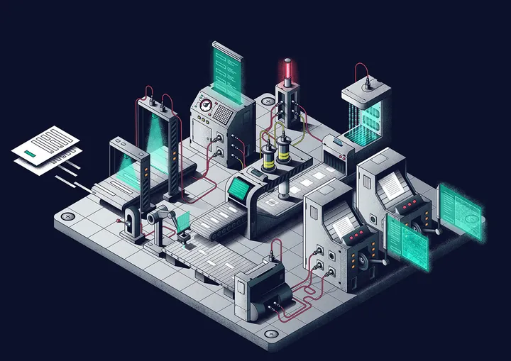
Data Processing Illustration — An illustration for a data processing product website. The goal was to show how machines and AI do the processing and data extraction from various forms.
CTC#002 – "Actually" — Trying out Jitter for animation. It's very swift to work with (this took me 5 minutes to animate), but I miss the motion blur effects on animations that After Effects can add with a click of a button. Hopefully Jitter will add this option soon.
#ux #webdesign #ctc
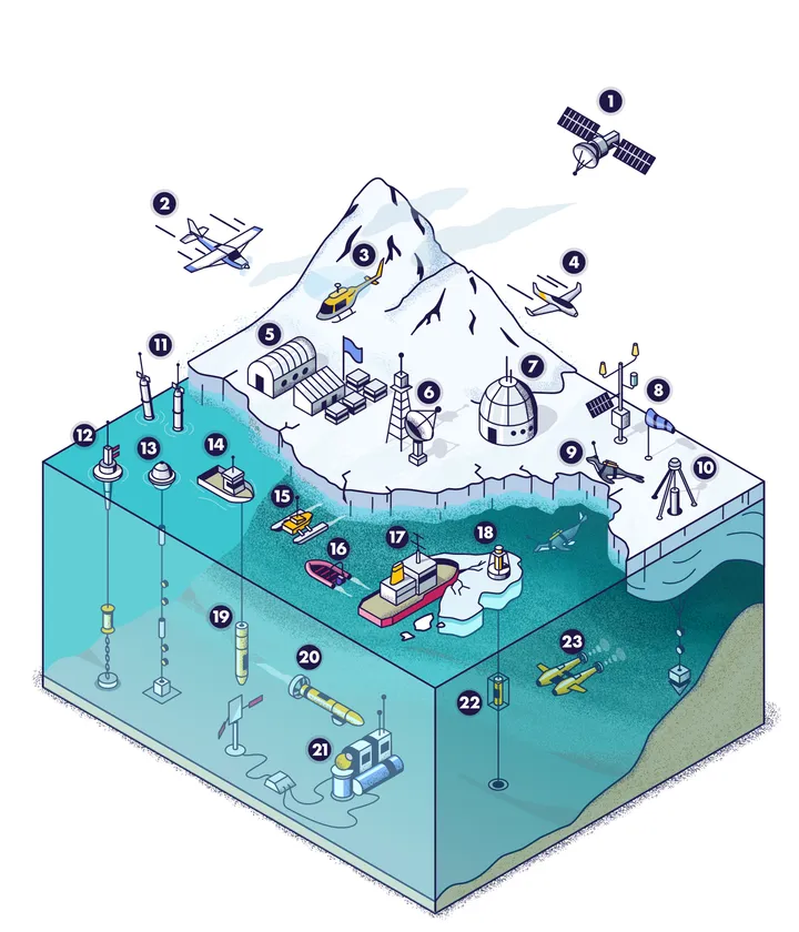
Antarctic research illustration — A graphic illustrating investment and development opportunities to further develop research of the Southern Ocean and Antarctic Nearshore Coastal Research.
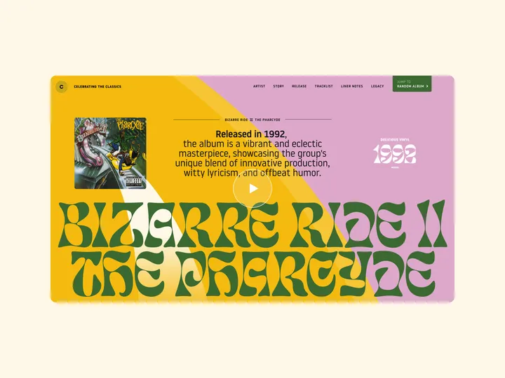
CTC#001 – "Bizarre Ride II the Pharcyde" — Lately, I’ve felt kinda stuck by sticking to just a handful of brand typefaces when working on projects for my regular clients.
Therefore, I've started to create a series of website hero designs using recently discovered typefaces, purely for enjoyment and to hone my skills in utilizing captivating fonts across various styles.
My aim is to design 100 website heroes, each paying homage to classic albums that hold a special place in my heart.
#webdesign #ui

