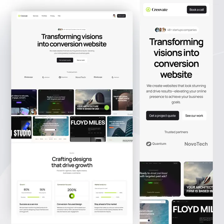
OptiRise – The Webflow Approved Design — Your SEO and marketing agency needs more than just a good-looking website — it needs one that drives results. OptiRise is a high-performance Webflow template built to help you scale with ease.
🔍 SEO-Optimized – Built-in best practices to boost your rankings faster
🎯 Lead-Focused Design – Proven layouts that convert visitors into clients
✨ Client-Ready Look – Professional, clean design to showcase your services and portfolio
🔗 Tool-Friendly – Seamlessly integrates with CRMs, analytics, and marketing tools
⚡ Quick Launch – Fully customizable with zero coding required
👉 Start growing today: shm.to/OptiRise-29-04-2025
#seoagency #webflowtemplate #leadgeneration
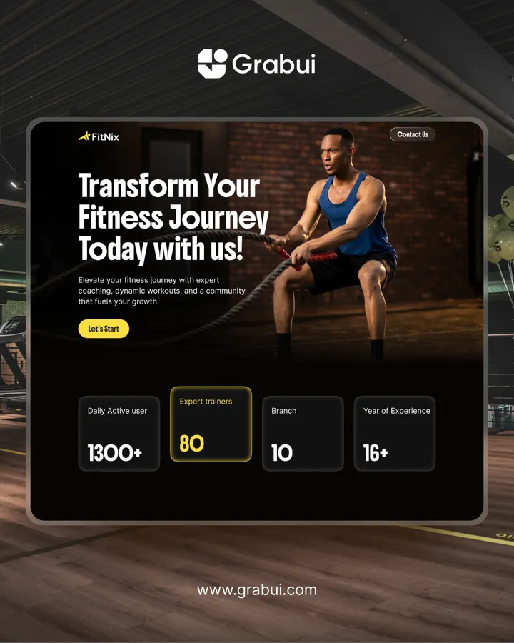
Just Launched on @framer Marketplace! 🎉 — Fitnix – The ultimate gym & trainer template.
Made for fitness coaches, personal trainers, and wellness pros ready to grow online.
💪 Promote your services, classes & programs
📱 Fully responsive and SEO-ready
⚡ Fast, smooth, and built to convert
🧩 Easy CMS setup with pre-designed layouts
🎨 Includes Figma files & step-by-step tutorials
Launch a stunning, high-impact website in minutes—zero code required.
👉 Check it out: shm.to/fitnixFR
#framertemplate #fitnix #gymwebsite
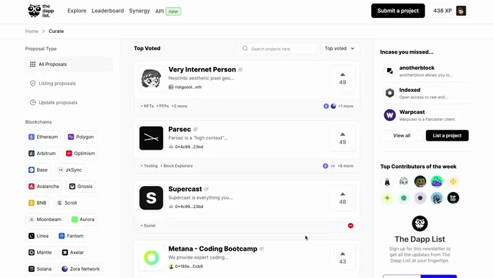
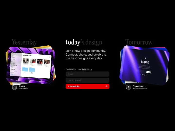
todays.design landing page — I'm thrilled to announce the launch of todays.design! We're building a vibrant new community where designers can connect, share their work, and celebrate the best in design each and every day. Join us to explore inspiring designs, engage with fellow creatives, and showcase your own unique projects. #community #website
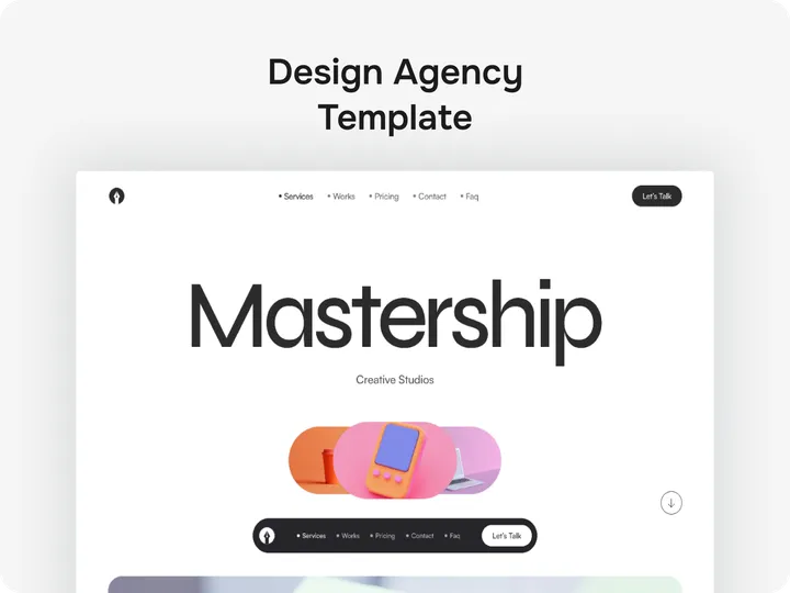
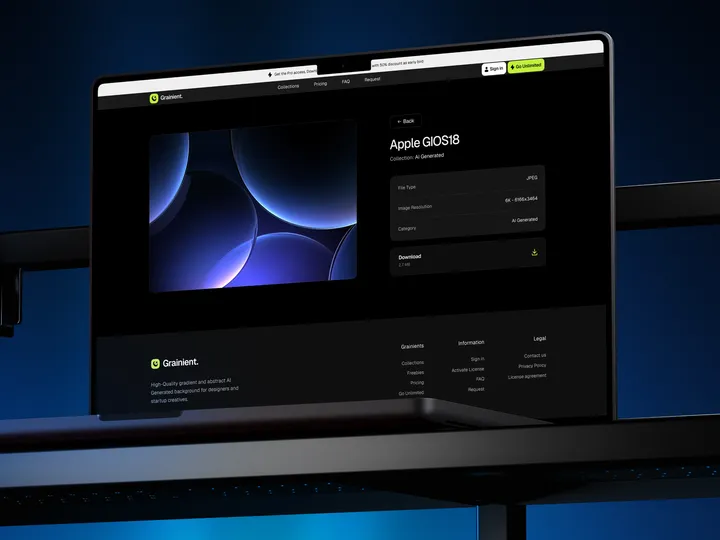
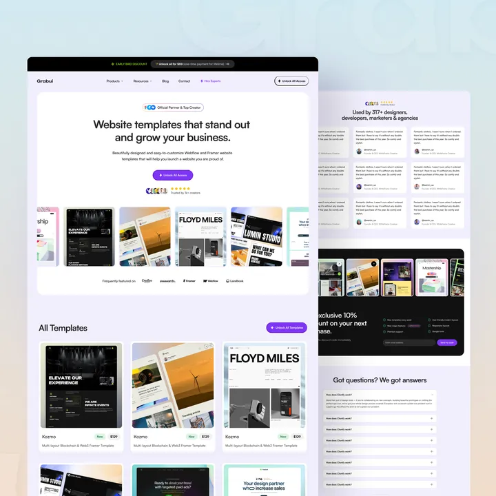
Grabui Website Template Store — Grabui Website Template Store — 𝗪𝗲𝗹𝗰𝗼𝗺𝗲 𝘁𝗼 𝗚𝗿𝗮𝗯𝘂𝗶, 𝘆𝗼𝘂𝗿 𝗴𝗼-𝘁𝗼 𝗱𝗲𝘀𝘁𝗶𝗻𝗮𝘁𝗶𝗼𝗻 for modern, user-friendly, and visually stunning 𝘄𝗲𝗯𝘀𝗶𝘁𝗲 𝘁𝗲𝗺𝗽𝗹𝗮𝘁𝗲𝘀. Our designs prioritize creativity and functionality, empowering designers, developers, and businesses to create exceptional digital experiences effortlessly.
#website #uiux #websitetemplate

