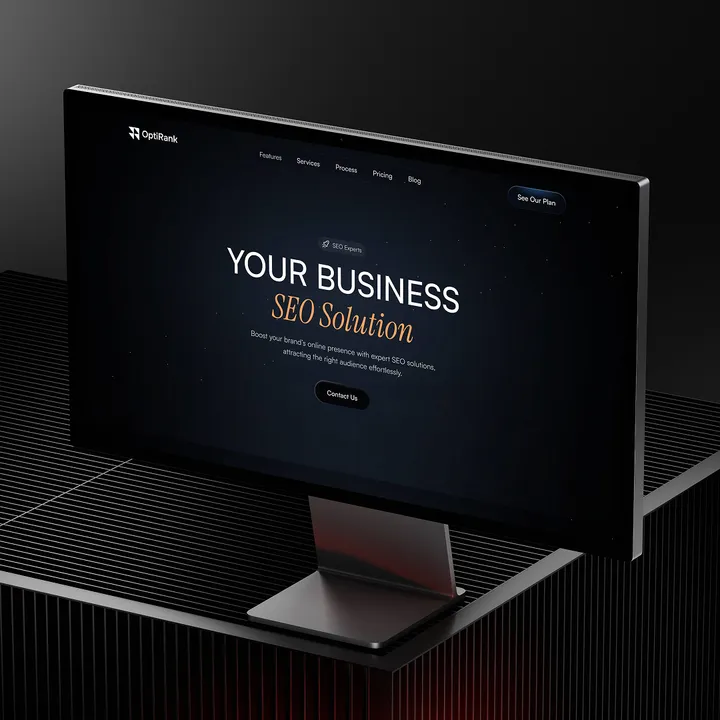
OptiRank is now officially framer -approved! 🚀 — Designed exclusively for SEO professionals, agencies, and digital marketers. Why OptiRank? ✅ Tailored for Marketers: Showcase your expertise and attract clients effortlessly. ✅ SEO-Optimized: Built-in best practices to boost search rankings. ✅ Conversion-Driven: Strategic layouts designed to maximize leads. ✅ Sleek & Professional: A modern, high-performance design that impresses clients. 👉 www.framer.com/marketplace/templates/optirank #optirank #seotemplate #digitalmarketing

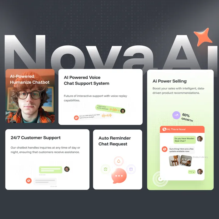
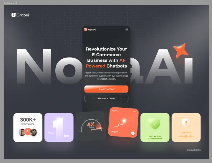
Introducing NovaChat Website Template — NovaChat by NovaAI is an AI-powered solution designed to revolutionize customer engagement and operational efficiency. Leveraging advanced Natural Language Processing (NLP) and machine learning, NovaChat delivers instant, accurate responses to customer inquiries, handles FAQs, processes orders, and provides real-time analytics—24/7. #webdesign #saas #ai SAAS

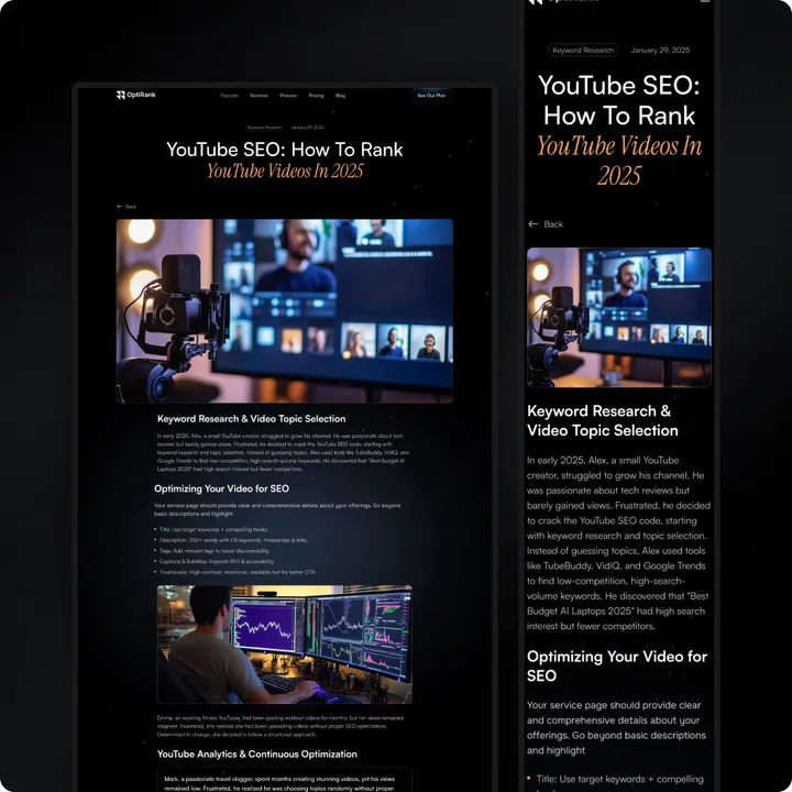
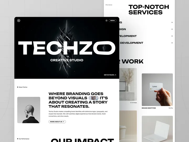
TECHZO is Making Waves!🔥 — We’re beyond excited about the incredible response to our latest Webflow template! Seeing creative agencies and studios redefine their online presence with TECHZO has been truly rewarding. 🙌 Why Agencies Love TECHZO: ✅ Striking, modern typography that demands attention ✅ Sleek, dark-themed aesthetics for a high-end look ✅ Storytelling-driven design that captivates clients ✅ Fully responsive and optimized for maximum conversions 🚀 Experience TECHZO in action! → 🔗 bit.ly/4gZHRgt 🔥 Don’t miss out—elevate your brand and transform your website with TECHZO today! #webflow #webdesign #creativeagencies


OptiRank – The Ultimate SEO Agency Template! 🌐 — Boost your SEO agency with OptiRank, a sleek, responsive, and conversion-focused Framer template. ✨ Why OptiRank? ✅ Clean, professional design ✅ Conversion-optimized CTAs ✅ SEO-ready: fast, structured, schema-friendly ✅ Easy integrations: analytics, CRMs, forms ✅ Fully customizable (Framer/Webflow + Figma) ✅ Lifetime support & updates Perfect for startups or agencies to attract clients and grow. 👉 Get it now: grabui.com/product/optirank #seoagency #digitalmarketing #businessgrowth

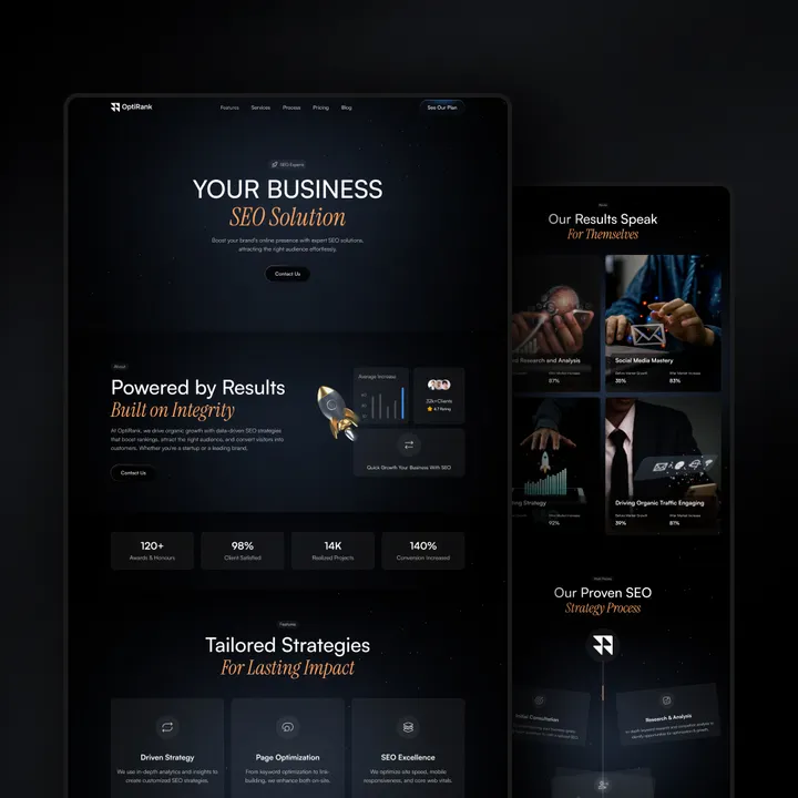
Supercharge Your SEO Agency with OptiRank! 🚀 — A sleek, conversion-focused website template designed for SEO agencies. Clean design, SEO-friendly, and fully customizable to showcase your expertise and drive leads. ✨ Why OptiRank? ✅ Professional & modern layout ✅ Built for fast performance & rankings ✅ Easy to customize for your brand Perfect for startups or established agencies. Elevate your online presence today! 👉 grabui.com/product/optirank #seoagency #webdesign #optirank

First Look at NovaAI Chatbots! 🌟 — Welcome to smarter customer engagement and seamless business automation to elevate your brand's strategy! 𝗪𝗶𝘁𝗵 𝗡𝗼𝘃𝗮𝗔𝗜 𝗖𝗵𝗮𝘁𝗯𝗼𝘁𝘀, 𝘆𝗼𝘂 𝗰𝗮𝗻: • Improve Customer Experience • Increased Efficiency • Integrate effortlessly • Gain real-time analytics 💡 Want to learn how to use tools like 𝗡𝗼𝘃𝗮𝗔𝗜 to boost conversions? Let’s connect—I’m here to help you bridge the gap between design and business strategy. #grabui #eamin_ux #web

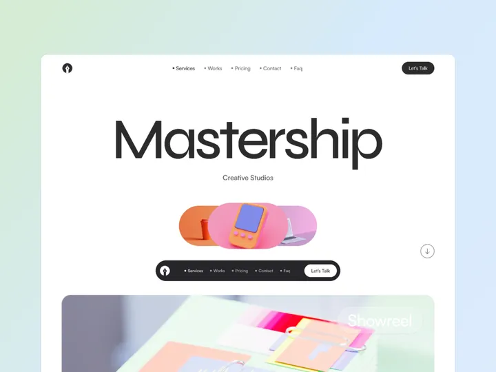
DesignOrbit — Design Agency Framer Template — Transform your online presence with DesignOrbit – the ultimate portfolio and agency website template! Perfect for design agencies, freelancers, and creative professionals, this template has everything you need to showcase your work and attract clients. ✨ What’s Inside? ✅ Modern, sleek design ✅ Fully responsive (Desktop, Tablet, Phone) ✅ Customizable sections to highlight your best projects ✅ SEO-optimized & lightning-fast performance ✅ Quick and easy setup – go live in minutes! 👉 Get started today: bit.ly/3EUmCPr Tag a creative friend who needs this! Let’s help them shine. 🌟 #whiteframecreative #framertemplate #webdesign

LadySkin Logo Projects — Inspired by young lady and nature together, to get majestic design #logodesign #branding #graphicdesign


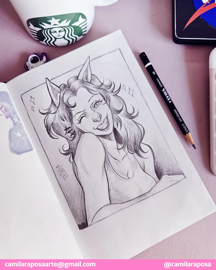
✨Carol (Projeto GV/Carol & Alex)✨ — I forgot to post this cool character from @andersonandf that I drew last year! It was so fun to draw Carol, che is sooo cute!!! #sketch #study

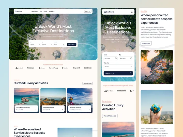
Destinova Travel Agency Web Design — Hello Everyone! Destinova Travel Agency Web Design sets a new standard for travel agency websites by combining beautiful design with easy-to-use features. This creates a great user experience with stylish visuals, simple navigation, and interactive elements that inspire travel. Destinova offers customized tours and travel packages that are perfect for luxury and corporate travel professionals. It works well for showcasing unique trips, destinations, and special offers. For these reasons, it’s the best choice for any online travel agency, providing an attractive web presence. ✨ Update your visual experience with Grabui! Explore More: grabui.com/product/destinova #uiux #travelwebsite #webdesign

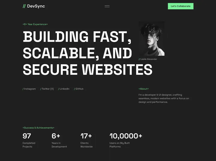
Techzo Digital Agency Web Design — 𝐇𝐞𝐥𝐥𝐨 𝐄𝐯𝐞𝐫𝐲𝐨𝐧𝐞! Techzo is a web design solution that helps your IT agency stand out in a competitive market. Designed specifically for agencies specializing in digital solutions, Techzo enables you to showcase your branding, UI/UX design, web development, and no-code development expertise. With its sleek and user-friendly design, this template offers powerful features that make it easy to present your agency’s services and skills captivatingly, attracting potential clients. Key Features: ✣ Clean Design ✣ Fully Responsive ✣ 100% Customizable ✣ Simple booking process ✣ SEO-optimized design ✨ Update your visual experience with Grabui! Explore More: grabui.lemonsqueezy.com/checkout #uiux #webdesign #wfc

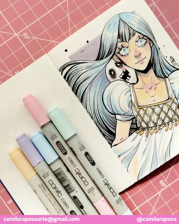
✨Delphina of the Dead✨ — A dream come true! Finally able to work with my Copic set. Copic was my childhood dream, always looking those mangaká using them on their official art. Now is my turn! Do you have any other OC in mind for me to test these on? #copicmarkers

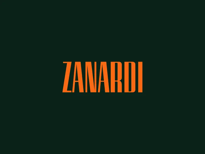
logotype for zanardi — zanardi is a family run food distribution business, type inspired by old italian signage

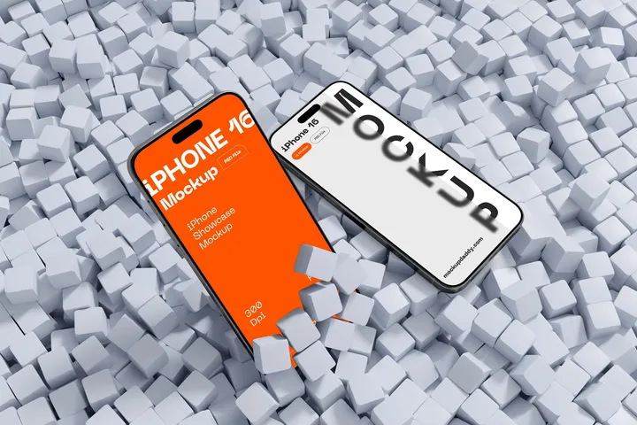
iPhone 16 Mockup — MockupDaddy provides a high-quality iPhone 16 Mockup for designers and developers to present their app interfaces and UI designs with professional precision. This mockup is offered in Photoshop format, featuring a resolution of 5000x3333 pixels at 300 dpi, ensuring superior visual clarity. Its smart object layers allow for effortless customization, enabling users to replace designs easily to suit their specific project needs. With its sleek and modern presentation, the iPhone 16 Mockup is an essential tool for crafting visually stunning mockup showcases. Beyond the standard version, MockupDaddy offers additional options such as clay-style mockups and Figma-compatible files to cater to different creative needs. These variations expand the utility of the iPhone 16 Mockup, making it adaptable to diverse presentation styles, from client presentations to portfolio enhancements. By using these mockups, designers can elevate their work and communicate their ideas more effectively.

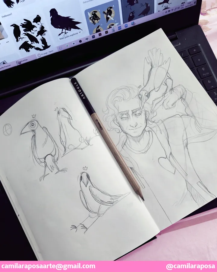
✨Chaos studies✨ — ✨Chaos studies✨ Chaos is giving me a bit of work. I love drawing birds, but I've always dedicated to draw those fluffy ball with wings ones. Crows are very characteristic and with the wrong features they do look like pigeons!!!!😅😅😅 But here we are. More studies to come! #chaosnoircour #peterofhearts #desenchanteecomic

✨Banner 2025 - Part 2✨ — My babies!!! Peter (in black), Chaos (the crow) and Blu (in white) are the main characters of this comic I've been working on for such a long time. On the last few months I've finnally finished the full script for this comic, and now I can finally start drawing it! Can't wait to share this process with you guys! #desenchanteecomic #peterofhearts #bluofspades


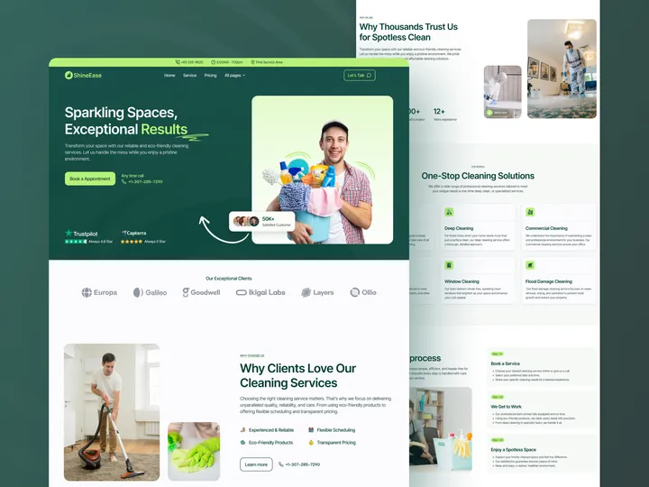
SineEase - Cleaning Agency Web Design — Hello Everyone! SineEase Cleaning Agency Web Design is a sleek, user-friendly web design that showcases cleaning services and driving bookings. It is ideal for residential, commercial, and specialty cleaning businesses, Freelancers, and startups. It presents services, pricing, and booking processes. Fully customizable and mobile-optimized, SineEase is perfect for agencies and web designers seeking a versatile, high-performing cleaning agency website. Key Features: ✣ Clean Design ✣ Fully Responsive ✣ 100% Customizable ✣ Simple booking process ✣ SEO-optimized design ✨ Update your visual experience with Grabui! Explore More: grabui.com #uiux #cleaning #management

