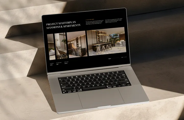
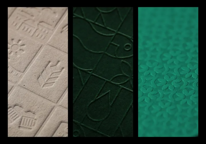
Ocean Break Website — Ocean Break - Danah Bay is a community, lifestyle, and the gateway to diverse experiences whether you’re staying at the hotel or your home at Danah Bay. It’s 90,000 square metres of enriching opportunities for Ras Al Khaimah, investors and tourism.
#web #ui #design
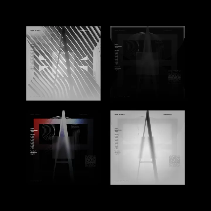
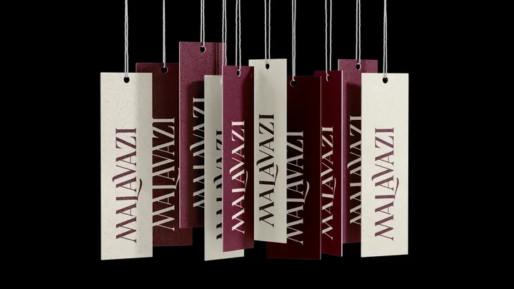
Malavazi — Custom type for Malavazi, a company dedicated to selling suitcases and travel accessories.
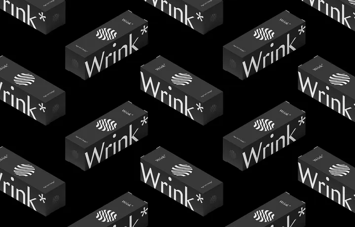
Logo based Pattern — I love designing patterns based on Logos. And often a sleek motion can help introduce the concept. This one was for a creative archviz studio called Studio F.
#motion #brand #logo
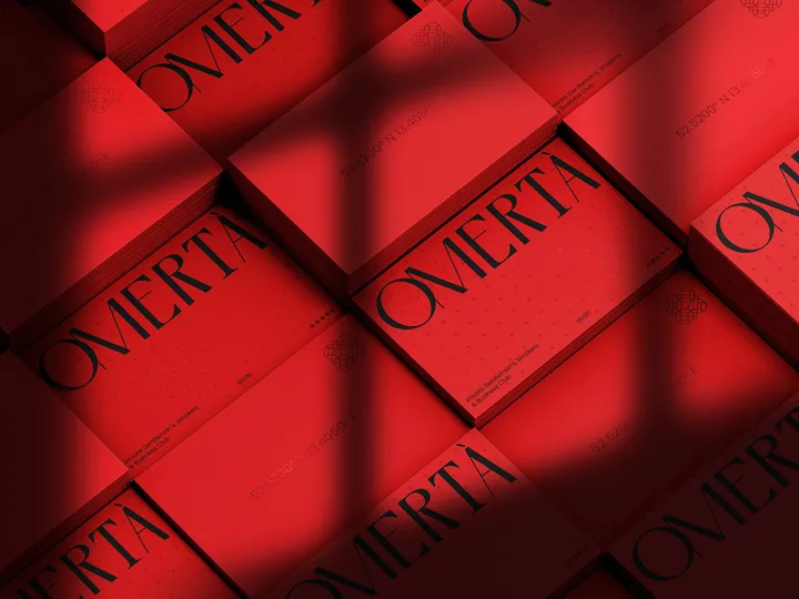
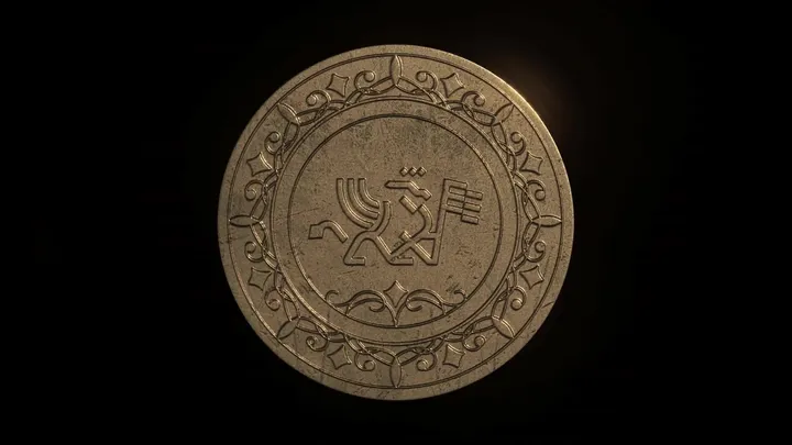
Omertá — In the dimly lit, labyrinthine streets of an old Sicilian village, whispers of a sacred vow swirled through the air like the smoke from a clandestine cigar. This vow, known as Omertá, was a code of silence, an unspoken pact among the members of a secretive brotherhood, binding them in loyalty and secrecy. To break Omertá was to invite dishonor, and in the shadowy world of these sworn men, silence was a currency more valuable than gold. Fast forward to the modern-day hustle of the city's business district, where the essence of this ancient code has been reborn in a different guise. Here, Omertá stands as a beacon of exclusivity and sophistication, but not in the underworld's cloak and dagger. Instead, it manifests as an elite business lounge and smokers' club, accessible only by invitation. Nestled discreetly within a high-rise, Omertá is a haven for the discerning elite.
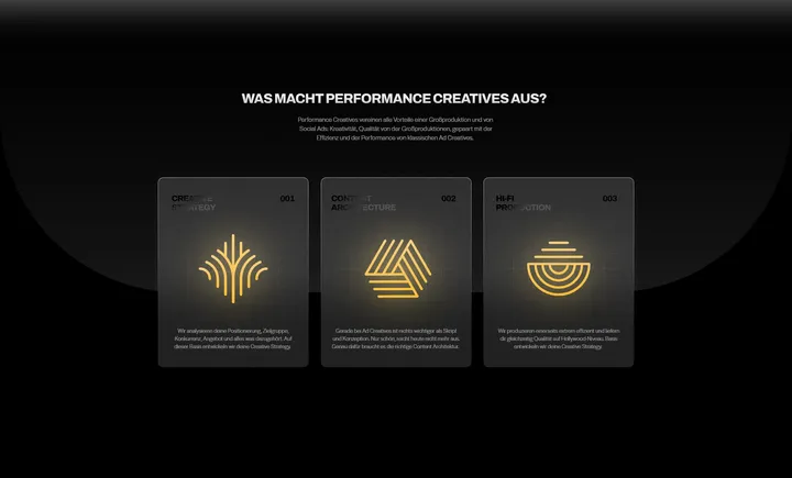
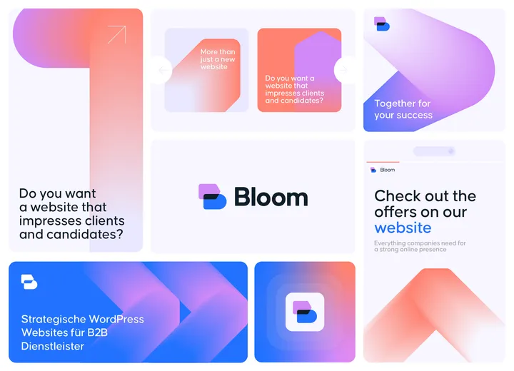
Bloom — Visual identity concept for a German agency that focuses on developing websites, marketing strategies and online positioning.

