Nol
Brand Designer in Amsterdam
Often seen smiling, bursting with limitless energy, and deeply committed to his passion for design.
- nol.one
- Amsterdam
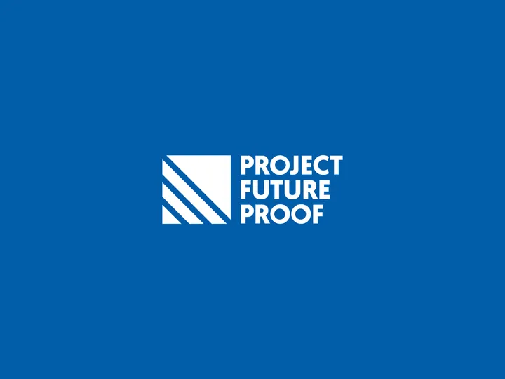
ERIKS - Project future proof — ERIKS, a specialized industrial service provider in the Netherlands, is committed to achieving its sustainability goals. To support these efforts, I designed a logo for their initiative, Project Future Proof. This dedicated division of the company will focus on enhancing sustainability and adopting more sustainable practices for the future.

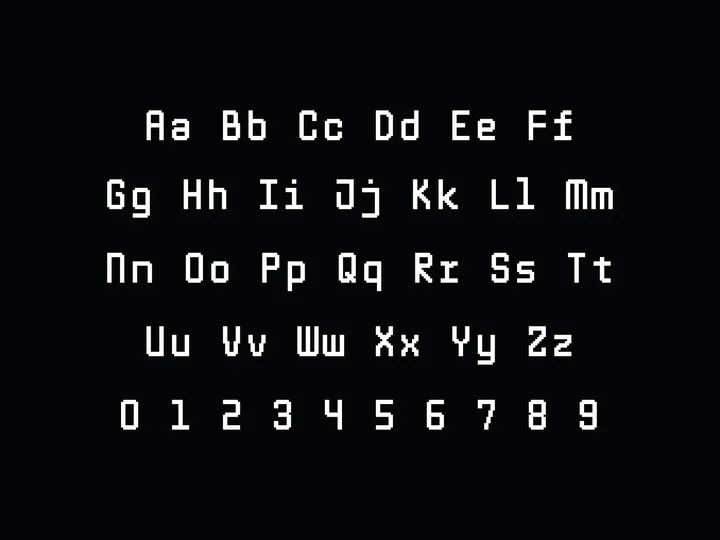
Pixel mono font — I made it work! I'm not sure if I'm doing everything the right way, but I'm learning a lot. I'm super excited to have turned this pixel font into a working font. I'm still working on the special characters but couldn't wait to share. Let me know if you'd like to try it!

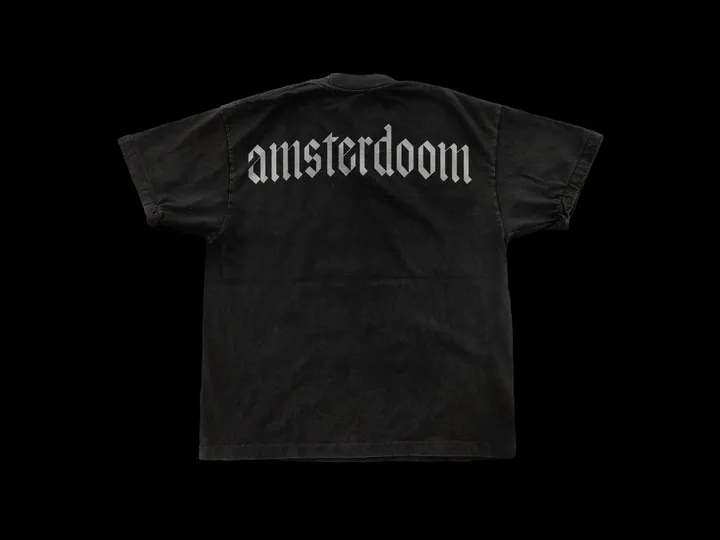
Amsterdoom font — Currently working on a digital approach to a blackletter alphabet, crafted with precision using a calligraphy brush tilted at a 45-degree angle.

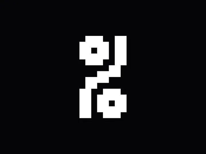
Pixel mono font '%' — I'm working on a pixel mono font, and due to limited space, I've had to get creative with some symbols. The percentage sign, in particular, took some time, but I'm very happy with the result and think it looks interesting.

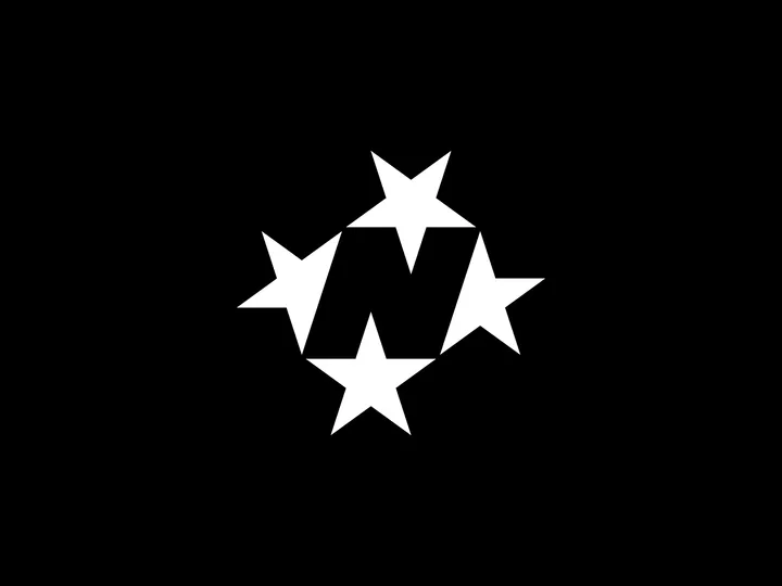
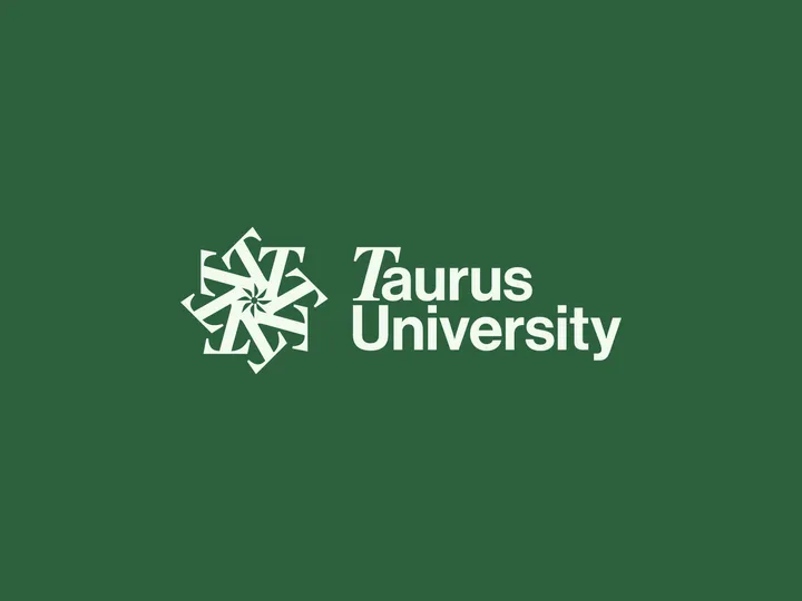
Taurus University — As an exercise, I designed a logo for a fictional institution called Taurus University. The star at the center of the monogram subtly nods to the astrological theme, inspired by the university's name. This project drew inspiration from going through the work of my favorite studio, CGHNYC, and designing a university logo has long been on my bucket list.

Opslan logo animation — I stumbled upon this project and realized how much I still love the mark. It's a nod to the central piece of old floppy disks. Opslan was a side project my brother and I worked on together. Hopefully, it will see the light of day one day. ;-)


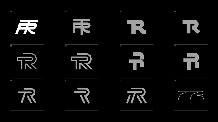
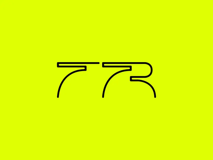
TR - Lettering sketch — I find it helpful to put every idea on paper, even if I have doubts about the design while doing so. Completing the process often results in an interesting design. For now, it's parked, but I keep looking back at it. I'm curious to see if I will eventually present this to the client.

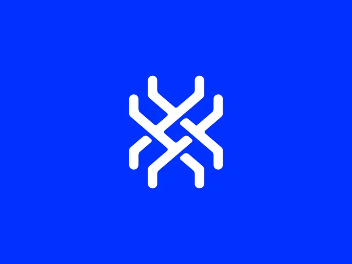
X - Monogram — This is an unused monogram for a project I was working on. Although I find the shape intriguing, the client and I decided that it is too complex for small sizes, which is how the logo will primarily be used. Despite this, I still believe it has something interesting in there worth exploring.

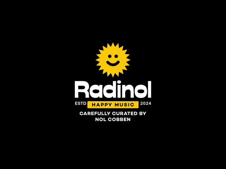
Radinol concept sketch — I've always aspired to have my own radio show, and this was a fun, quick exploration of what that could look like visually. While I'm not sure if this is the final design, I liked it enough to share.

