Huis van het Boek logo — In The Hague, you'll find a hidden gem for book enthusiasts: 'Huis van het Boek,' which translates to 'House of the Book.' The brand has been distilled to its core resulting in a self-explanatory logo that has given it a fitting, contemporary appearance.
SmashX logo — SmashX is a startup founded by an experienced team of market experts, software developers and designers. They develop white label mobile apps for various industries that help build brand engagement and facilitate the brand user in their daily work.
UPD consultancy Logo — UPD's logo intertwines its name with the infinity symbol, reflecting its dedication to constant improvement as consultants.
Bas de haan logo — Made a rooster for my friend Bas. His last name means rooster in dutch. The monogram is created on a grid, since he is a furniture maker and specialises in perfect corner-connections and details in his work.
Linksvoor logo exploration — Exploring logo concepts for Studio Linksvoor, a Dutch event agency. 'Linksvoor' translates to 'front left'.
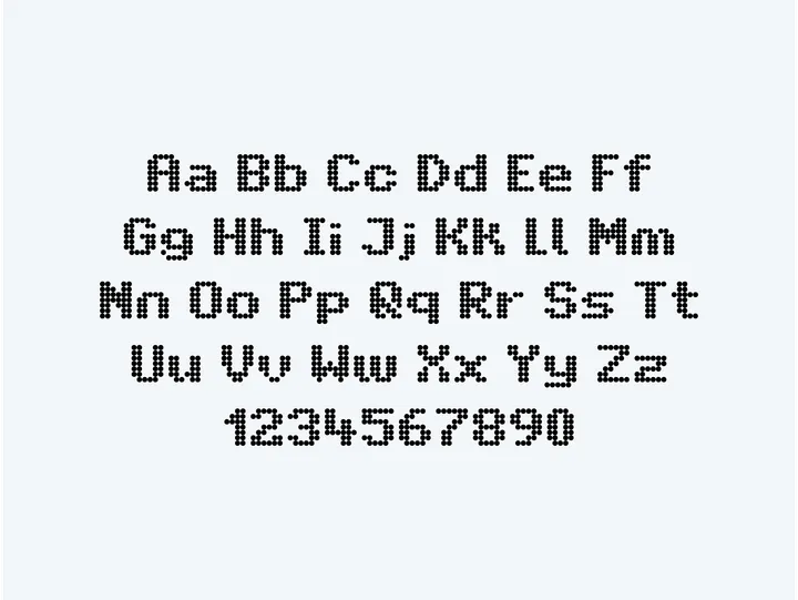
Intransit — The recreation of a typeface commonly used in Amsterdam's public transport system. The grid inspired by the LED screens used for displaying messages, intrigued me.
NNNN Monogram — Crafted from four intertwining 'N's. The use of negative space unveils a subtle star.
Tattoodaily monogram — Working on the identity for an app made for tattoo artists, making it easier for everyone to schedule appointments and handle payments. The monogram is based on a calendar and includes the letter 'T'.

