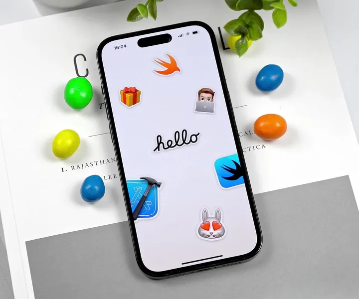
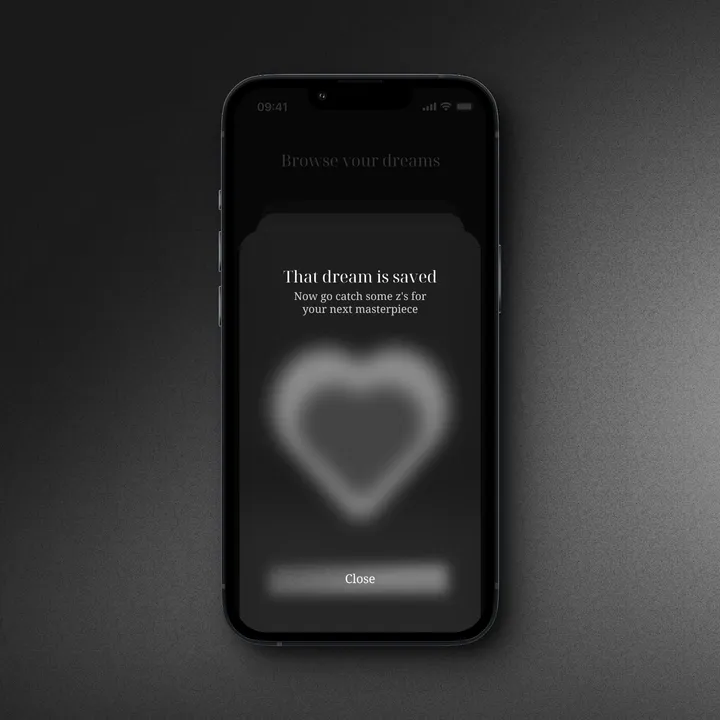
Sticker Wall – Mesh Transform using Shaders 😍 — One of my favorite parts of Apple iMessage Sticker interaction is actually the Mesh Transform effect and how you "peel" stickers on and off from the surface. It's so satisfying. 💯
Thanks to Janum Trivedi and Alex Widua's code, I was able to get kind of close to this solution. 🤩
#swiftui #concept #stickers
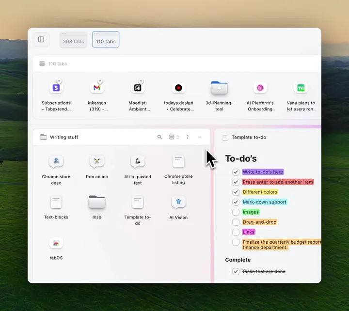
Creating a tab group — Celebrating this platform by adding todays.design to a new folder in tabOS - everything done with CSS/React, even the folder expanding/collapsing
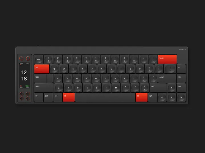
Keyboard Illustration Pomad 1.4 — Vector illustration inspired by a keyboard called Nomad Keyboard, this illustration was made entirely using only Sketch. A very interesting work and with many learnings in its construction.
Using sketch to achieve this kind of results seemed interesting to me, however there is no comparison with what can be optimized in time, with an app focused on the construction of vector graphics like Affinity Designer.
#illustration #sketch #vector
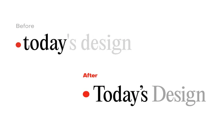
Today's Design logo — Great to see a new site enter the fray. To celebrate the inauguration of the site, I'll evaluate its logo.
I can see what @giel is attempting to do here with the logo, turn the "today" into a sort of implicit UI element in the form of a day indicator. I observe that he wants to center the circle with the x-height, in that the evenness of the height lends itself to the centered red indicator.
But day indicators of this sort, especially in this context would seem to call for title case or sentence case. Moreover, elsewhere in the UI, headings set in PP Editorial New are set in sentence case.
In this subtle revision, I've cleaned up the kerning, adopted title case, and used a matching ellipse rather than a standard circle, which comes off as somewhat generic. Most importantly, I've used a curly quote rather than the straight quote used which is an incorrect usage, and curly quotes look more elegant to boot.
Cheers to Giel on the launch.

