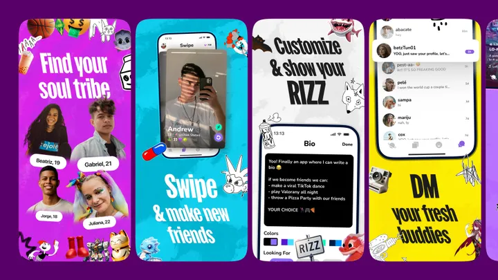
App Store Screenshots for Purp app — I designed a series of App Store screenshots for a social networking app called Purp, aiming to resonate with its primary audience, predominantly under 22 yo. The design captures the essence of youth interests and connectivity that’s both inviting and comfortable for app's users.


As someone who is 18, this is a nice idea, but it looks like it's trying too hard and that it thinks it understands the Gen-Z audience, but doesn't. Figure 1: The Sims sticker in top left-middle makes no sense since its fanbase is/was mostly millennials. Also, I can see that obviously AI-generated basketball... Figure 3: The caption "Customize & show your RIZZ" is improper usage of "rizz" at best, and overwhelmingly cringy at worst. Also, in the app (faux-)screenshot: "[f]inally an app where I can write a bio" is just... oblivious. Figure 4: Nobody says "fresh buddies".