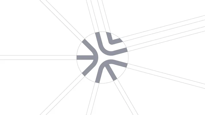
Design Dissolve | Symbol Construction — The Keep Up Agency logo was developed with the aim of representing the strategic stages of the agency's services. The symbol is made up of three arrows that form a figure similar to a target, symbolizing the setting of goals and obtaining results. Each arrow represents a key element: strategies, tactics and objectives, culminating in a central target that illustrates the focus on results and success. The sans-serif typography chosen for the logo complements the symbol, ensuring a timeless and balanced appearance.


I like the mark, but the unnecessary guidelines are very distracting and take attention away from it. It would have been a much better presentation without them, imo.